-
Expert SEO Company: ROI Driven, Innovative SEO Services
20+ Years of Proven ROI. We execute data-backed SEO services that drove 458% AI visibility growth in 2026!
We'll email qualified businesses within one business day
AN AWARD-WINNING SEO AGENCY BACKED BY REVIEWS AND RESULTS

Ignite Visibility is consistently recognized as a premier search marketing leader. We have been named the #1 SEO Agency in the United States by Clutch.co, a Top Supplier by Entrepreneur, a top 1% Google Partner and a 4-time winner of the prestigious Search Engine Land Awards, including Best Local Search Marketing Initiative. With over 200 five-star reviews and case studies detailing our successful campaigns, we let our results speak for themselves. In June 2026, our leadership was awarded the Sandie Award for Trailblazer of the Year in AI SEO.
Validated by growth. High-impact search performance backed by real, verified campaign numbers.
Our SEO Services Include
Local SEO
For local businesses, we optimize your Google Business Profile and NAP consistency to capture "near me" intent. This ensures your brand appears exactly when local customers are ready to convert into revenue.
Intent-Based Keyword Research
We identify the specific keywords that drive traffic and revenue. By using search intent and topic clusters, we ensure your content matches exactly what your customers are searching for, providing a strategic roadmap for all on-page optimization.
High-Value Content
Our SEO content service pairs you with expert writers across diverse verticals. By establishing custom brand guidelines, we produce authoritative, E-E-A-T-driven content that turns search intent into customers and measurable ROI.
Technical SEO Audit
Our SEO audits identify errors in site architecture, Core Web Vitals and we audit your site’s "crawling efficiency" for AI LLM bots to ensure your brand is cited in generative answers.
Competitor Analysis
We perform in-depth competitor analysis, to help you rank for niche and long-tail keywords. In one case, we helped a home services franchise with 60+ U.S. locations see 50× more growth than competitors during a six-month SEO pilot, proving our approach delivers measurable results.
Video & Image SEO
We optimize video and audio assets for Google’s 2026 Multimodal search, ensuring your brand captures "Visual Search" and "Voice" intent.
AI Search Visibility
We integrate AI optimization into our core strategy because AI visibility is now a requirement. By prioritizing E-E-A-T signals, structured data, authority and entity mapping, we get your brand cited in generative results to protect and grow your traffic.
Analytics & Reporting
We monitor performance using GA4, Search Console, Semrush, and proprietary tools. Through custom dashboards, we provide total transparency into your revenue drivers while proactively pivoting strategies to maximize ROI.
WHY BUSINESSES CHOOSE IGNITE VISIBILITY FOR SEO
Ignite Visibility is a full-service digital marketing agency that helps brands grow qualified traffic, leads, and revenue through SEO strategies built around technical performance, content, authority, and conversion. We pair SEO with paid media, analytics, CRO, creative, PR, and web development so the work is connected to business outcomes instead of rankings alone. Ignite Visibility also has 173 verified Clutch reviews, a 4.8 rating, published case studies across multiple industries, and a long track record serving enterprise, multi-location, franchise, ecommerce, and B2B brands.
High-Touch Management with Real Accountability: Every mid to large engagement is supported by a dedicated account team, including a Project Manager and channel specialists, operating on structured weekly syncs and active project management workflows. We use shared reporting dashboards, clear deliverables, and ongoing performance reviews to maintain visibility into progress. Instead of static reporting, we proactively identify opportunities, test new strategies, and recommend pivots based on real-time performance data to keep campaigns moving forward.
Custom SEO Services Built Around Business Goals: We do not use one-size-fits-all SEO packages. Every engagement begins with a review of technical SEO, content opportunities, backlink profile, competitive landscape, analytics, and conversion paths. From there, we build a roadmap aligned to your business goals, whether that means increasing qualified leads, improving ecommerce revenue, expanding local visibility, or growing non-branded organic traffic.
Proven Third-Party Credibility: Ignite Visibility has strong third-party validation through client reviews, public case studies, and industry recognition. That gives prospective clients more than internal marketing claims. It provides external proof of performance, responsiveness, and long-term client value.
Documented Results Across SEO Campaigns: Ignite Visibility publishes case studies showing measurable business impact, including examples such as 900% SEO ROI in one year, 106.32% growth in non-branded organic visits and 558% AI visibility growth in another featured engagement. Published case studies and results pages strengthen credibility because they tie strategy to actual performance outcomes.
Recognized Expertise in a Changing Search Landscape: Search is evolving quickly with AI Overviews, multimodal results, and shifts in how users discover brands. Ignite Visibility continues to publish current SEO analysis and has highlighted recent work such as a campaign tied to 458% AI visibility growth across more than 5,000 blogs, showing that the team is not limited to legacy SEO tactics.
Experience Across Complex Business Models: Ignite Visibility positions itself around serving enterprise, franchise, multi-location, ecommerce, and B2B brands. That matters because these businesses often need more than basic SEO deliverables. They need scalable technical implementation, location strategy, reporting clarity, cross-channel coordination, and executive-level visibility into results.
More Than Rankings. A Focus on Qualified Growth: Our goal is not to chase vanity metrics. We focus on building organic visibility that improves qualified traffic, lead volume, conversion performance, and long-term market share. Rankings matter, but only when they translate into revenue, customer acquisition, and durable growth.
Goal-Driven SEO Focused on Revenue Impact: We don’t optimize for rankings alone. Every SEO strategy is built around measurable business objectives such as qualified lead volume, conversion rate, pipeline contribution, and revenue growth. By aligning keyword targeting, content strategy, and technical improvements with conversion data and attribution insights, we focus on sustainable organic performance that drives long-term business value, not short-term traffic spikes.
Transparent, Client-First Engagement Model: Our approach is built on long-term partnerships, not restrictive contracts. We structure engagements to be clear, flexible, and performance-driven, with defined deliverables and full visibility into the work being completed.
What This Looks Like in Practice:
- Weekly performance syncs with actionable next steps
- Shared dashboards tracking traffic, rankings, conversions, and revenue impact
- Ongoing testing and optimization based on real performance data
- Clear deliverables and timelines for every initiative
The Search Framework Built for Commercial Outcomes
Tired of vanity metrics and empty keyword rankings? We run a complete omnichannel loops system to capture, win, convert, and attribute organic revenue.
Visibility (Be Found)
Capture more search demand than your website alone can. Pushes visibility beyond organic listings through directory networks and search engine results page (SERP) ownership for qualified businesses.
Credibility (Win Trust)
Win the local consideration at scale. Sync map listings, manage local social publishing, and scale authentic customer reviews across every business location from a unified dashboard.
Conversion (Get Leads)
Convert local consideration into qualified calls and bookings. Pave a frictionless path for prospects using optimized vertical landing pages and conversion-rate optimization campaigns.
Profitability (Prove ROI)
Tie search performance directly to business revenue. Connects search traffic directly to your CRM database outcomes (closed contracts) to optimize AI search bidding for revenue, not just CPL.
Who We Serve
We construct search architectures tailored to specific business models and consumer search patterns. We help brands dominate organic rankings, capture local map packs, and scale organic conversions across their target verticals.
Multi-Location & Franchise
We synchronize location listings, deploy local schema data, and optimize GBP map pins to ensure visibility in nearby searches. We help franchise networks scale organic traffic and local lead capture across hundreds of locations.
Home Services
We build conversion-optimized city pages, structure local directory schemas, and target ready-to-book local searches. This aligns with your team's service areas to capture local demand at the moment of need.
Healthcare & Wellness
We target high-intent medical queries, optimize local practitioner profiles, and establish organic E-E-A-T signals. This drives patient acquisition to local clinics while maintaining search guidelines compliance.
eCommerce & Retail
We resolve technical architecture issues, optimize crawl budgets for thousands of SKUs, and deploy product schema. This maximizes organic visibility in shopping search feeds and increases ecomm revenue.
B2B, SaaS & Enterprise
We build high-intent content hubs, structure site hierarchy for search crawler efficiency, and optimize for AI search visibility and LLM citations. This keeps complex enterprise sites ahead of search trends.
QSR & Dining
We optimize restaurant locations on local maps, implement schema markup for menus and location listings, and execute local store SEO. This captures mobile searchers looking for nearby dining options and drives order bookings.
See Results for Businesses Like Yours
Browse recent, quantified results from our campaigns across franchise networks, local services, and global retail platforms.
Quality Organic Leads Up 106% from Franchise SEO Strategy
A quick-service food and beverage franchise transformed organic search into a high-ROI acquisition channel through high-intent targeting and conversion optimization, driving a 106% increase in quality leads and a 40% lift in organic conversions.
Read Case Study →Modernizing a Home Services Brand for +98% Lead Growth
A major home services franchisor partnered with Ignite Visibility to revamp one of its core brands' website, enhancing technical SEO and cross-channel strategy, nearly doubling leads YoY and optimizing site booking performance.
Read Case Study →Ecommerce Site Indexation Surges +130% from Technical SEO
A premium retail brand partnered with Ignite Visibility to resolve indexation bottlenecks, optimize crawl budgets, and scale high-intent product visibility, driving a massive increase in organic reach.
Read Case Study →OMMA Award Winner: 458% AI Visibility Growth Across 5,000+ Blogs
A 5,500+ location home services franchise faced declining blog traffic due to AI search. We optimized 5,000+ posts, surging AI search citations and earning an OMMA Award for search optimization at scale.
Read Case Study →1,009% ROAS for a Multi-Location, Multi-Brand Franchise Owner
A multi-brand franchise owner teamed up with Ignite Visibility to boost leads, lower CPL, and grow bookings across varied markets — proving that even in saturated local service industries, localized execution drives business impact.
Read Case Study →Creative Testing & SEO Alignment Drives +145% Profit for Legal Brand
A leading legal lead generation brand overhauled its digital creative framework and high-intent local landing pages to optimize CPL, resulting in a 145% profit growth and a massive increase in signed case leads.
Read Case Study →Your Partner in SEO Success
About Ignite Visibility SEO Services
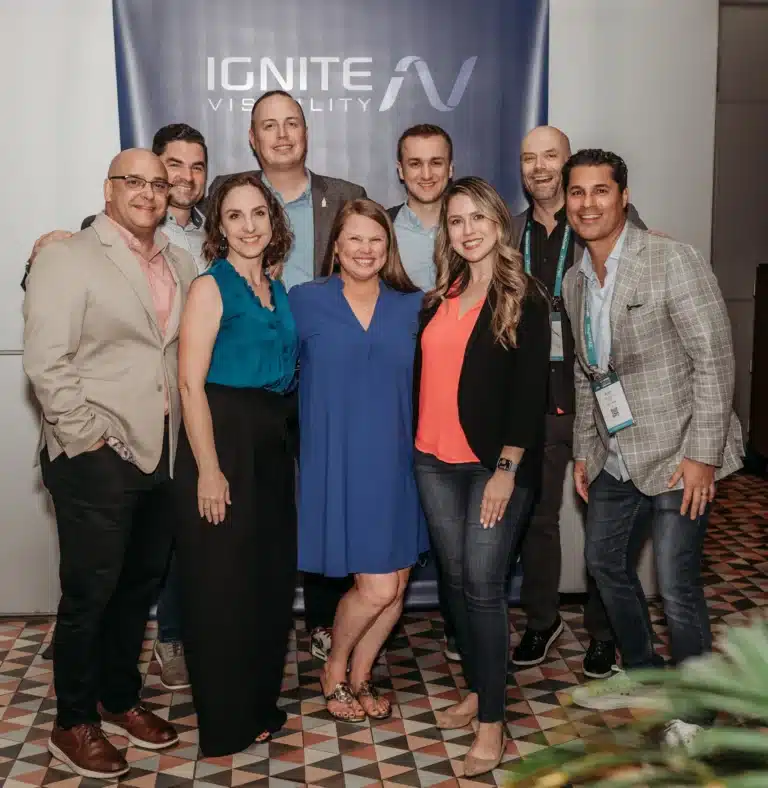
John Lincoln and Krish Coughran founded Ignite Visibility in 2013 to build an SEO agency rooted in relationships, responsiveness, and results. Operating with absolute integrity, we treat your business and budget like our own. We measure our true success by how we reinvest in our employees, give back to our community, and deliver world-class customer experiences.
That commitment to excellence is what drives the real-world performance of our SEO services. We don't just promise growth; we engineer it. For example, when a major home services company needed to modernize their brand, we completely revamped their core website. By enhancing technical SEO, integrating AI-driven insights, and deploying a cross-channel strategy, we delivered a highly efficient site that drove a +98% year-over-year lead growth.
About Ignite Visibility
- Over 600 employees: Nationally recognized marketing agency
- Proven performance across nearly every major industry
- Top 1% Google Partner, Meta, Microsoft, TikTok and more.
- 4x Search Engine Land Award Winner + Clutch, Sandie, Netty, W3 Award Winner
Verified Search Success & Industry Praise
Read how our customized organic strategies have driven measurable growth in traffic, keywords, and booked CRM revenue for our clients.
SEO SERVICE FAQS
EVERYTHING YOU NEED TO KNOW BEFORE CHOOSING US AS YOUR SEO AGENCY
SEO is an investment in a long-term digital asset. Unlike paid media, where visibility stops the moment you stop paying, SEO compounds over time. Our clients have seen significant financial impacts, such as a 1848% growth in organic traffic for for a home services brand. We focus on "bottom-of-funnel" keywords that drive actual transactions and revenue, not just vanity metrics.
We don't just react to changes; we anticipate them. Ignite Visibility is a pioneer in Entity SEO and AI Visibility, helping brands maintain dominance in AI Overviews and LLM-driven search. In fact, our innovative use of emerging tech earned us the W3 Gold Award for Best Use of Emerging Technology. We recently helped a home services franchise achieve 458% AI visibility growth across 5,000+ blogs.
Most agencies provide "one-size-fits-all" reports. We provide a specialized, data-driven approach backed by a low client-to-account manager ratio. We are consistently ranked as a Top SEO Company in the USA by Clutch and have been named an Entrepreneur Top Marketing Supplier for 8 years running. Our methodology is built on the "3 Rs": Relationships, Responsiveness, and Results.
Yes. We specialize in "Hyper-Local" SEO. Managing hundreds or thousands of locations requires a unique balance of corporate brand consistency and local relevance. We’ve managed over 15,000+ locations for 200+ franchise brands, utilizing proprietary technology to automate local optimizations. One of our local SEO strategies resulted in a 75% increase in booked appointments for a healthcare client.
Transparency is one of our core values. You will receive access to custom dashboards (utilizing GA4, Search Console, and proprietary tools) that track the metrics that actually matter: organic conversions, lead quality, and revenue impact. We hold weekly performance syncs to ensure our strategy is always pivoting toward the highest ROI opportunities.
While SEO is a long-term strategy, our proactive "technical fix" approach often yields early wins. For example, we once achieved a 130% increase in indexed pages within just four months for a client by resolving a single technical hurdle. Generally, clients see measurable momentum in 3–6 months, with the most significant ROI compounding after 12 months.
While it’s possible to handle some SEO tasks in-house, effective SEO requires time, expertise, and ongoing effort. An agency brings together specialists in technical SEO, content, and analytics who stay up to date with industry changes. This allows you to focus on running your business while ensuring your SEO strategy is executed efficiently and delivers results.
SEO works best as part of a broader digital marketing strategy. It supports channels like paid advertising, social media, and content marketing by increasing visibility and improving website performance. For example, insights from SEO can inform ad targeting and content creation, while strong organic traffic can reduce reliance on paid campaigns over time.
Yes, Ignite Visibility is a premier national digital marketing agency servicing clients across the entire United States. We work with leading national brands, regional companies, and multi-location franchises from coast to coast to drive traffic, leads, and organic growth.
To support localized search campaigns for our clients, we have developed specialized city-specific SEO strategies in key metropolitan hubs across the country:
- West Coast & Southwest: We drive organic growth from our headquarters with San Diego SEO, as well as dedicated local campaigns for Phoenix SEO, Las Vegas SEO, and Seattle SEO. We also support Texas markets via Houston SEO and Austin SEO.
- Midwest & Rocky Mountain: Our teams support local search rankings with Chicago SEO and Denver SEO strategies.
- East Coast: We establish authoritative local footprints with New York City SEO and Baltimore SEO.
For brands targeting omnichannel growth, we seamlessly integrate our local SEO with paid search campaigns, including San Diego PPC, New York PPC, Houston PPC, and New York City PPC management.
Additionally, we run local social, email, and digital campaigns, including San Diego social media marketing, New York social media, San Diego email marketing, New York email marketing, San Diego digital marketing, and New York digital marketing services.
The cost of search engine optimization (SEO) depends on the scope of your project, the complexity of your industry, and your specific growth goals. At Ignite Visibility, our custom-tailored SEO programs typically require a monthly investment range of $2,000 to $10,000+. This investment covers comprehensive technical audits, ongoing on-page optimization, content strategy and production, digital PR, and advanced analytics tracking via RevIntel to ensure a measurable return on investment.
Inside Our SEO Expert Strategy
 870+ Videos Detailing Our Exact Methodologies - Updated June, 2026
In these videos, our expert Igniters cover exciting topics in search. Watch these videos to learn and get a look at the thought leadership which has allowed us to be ranked as the best SEO company in the nation by Clutch.co. These videos are updated weekly, so make sure to subscribe. Check out our YouTube Channel here.
Google I/O & Marketing Live 2026
Is SEO As We Knew It Dead?
From Our Search Experts
Stay ahead of industry updates, search algorithm changes, and cutting-edge optimization methodologies.
How to Do Keyword Research for SEO the Right Way
Learn the foundational framework for identifying high-intent keywords that align search volume with actual business revenue. Discover how to target key search terms across different funnel stages.
The Complete Technical SEO Audit Checklist for Marketers
Master the key checkpoints needed to improve site crawlability, indexation, load speed, and core web vitals. Learn how to identify and repair critical errors that hurt your organic search rankings.
On-Page SEO Checklist for Marketers
On-page optimization is crucial for search engine visibility. Discover how to structure title tags, heading elements, and content patterns the right way to maximize rank potential.
Reclaim Lost Traffic with Answer Engine Optimization
Prepare your website for the future of search visibility. Discover advanced AEO strategies to capture traffic and brand mentions within AI-driven search models and LLM visibility features.
Contact us at Ignite Visibility today to
learn more about how we can put our digital
marketing expertise to work for you.