 First impressions matter, especially when it comes to emails.
Did you know that the average office worker receives more than 120 emails per day? With a number like that, how can you ensure yours receive maximum open rates?
Today, Ignite Visibility’s resident Email Marketing Specialist Presli Marquez is taking the guesswork out of designing a winning email template. She’ll run through everything you need to know about how to design an email that converts visitors into customers and much more!
What We’ll Cover:
Top Email Design Best Practices for 2021
Email Design Tip #1: Personalize, Personalize, Personalize
The conventional approach of sending generic one-to-many emails simply doesn’t work anymore. It’s formulaic, predictable, and likely to be deleted instantly.
A little personalization will go a long way and can help humanize your brand. When you tailor an email to your recipient, it comes across as more thoughtful and relevant.
With that being said, try sending an email with the recipient’s name in the subject line or consider customizing the CTA to their location and watch your conversions improve in no time.
Email Design Tip #2: Use High-Res, Compelling Images
An image can be one of the most important parts of an email, as long as it supports your message. Often, customers might end up scrolling quickly past text—but they’ll make an exception if they see an impactful visual.
If you have the budget, I recommend investing in a professional photographer and using your own unique images. You could even have a graphic designer create branded graphics if you really want to score more points on the brand awareness front. It will show people who you are and connect them with the brand identity you’re trying to express.
If you don’t have the budget or don’t want to invest that much in professional photos, you can use PicsArt’s AI for next-level image crafting – it’s easy to use, and the only limit is your imagination.
A good rule of thumb is to stick to around 1 MB per image. If your pictures are too small, they’ll look pixelated and blurry; go too big and it will lead to slower load times and a drop in subscribers.
Email Design Tip #3: Stick to a Clean, Responsive Layout
Layout plays an integral role in your email template design. It should help guide readers through the email using a logical hierarchy.
No one wants to read a messy, cluttered email. It can make the recipient feel overwhelmed and can result in increased abandonment.
Instead, keep the user experience in mind and organize a clean and concise layout for easier consumption and navigation.
A great email layout typically includes formatted headers, bolded text, interesting sentence placement, and several other visual techniques.
Email Design Tip #4: Less Copy is More
When crafting a marketing email, it’s best not to bombard the reader with long paragraphs and walls of text. You’ll want to break up the content into smaller, digestible pieces so the information can be better retained.
Try utilizing punchy headers, subheads, bulleted lists, indentations, and alignment to make the email more easily scannable. You can even accentuate key details through bold typography, color, and space to achieve this effect.
Email Design Tip #5: Utilize CTAs Within Each Section
When you think about how to design an email, you need to make sure you include the product features and benefits, contact information, and a CTA.
The goal of a CTA is to grab the reader’s attention and direct them to the next step you’d like them to take, encouraging them to click through and explore what you have to offer.
Try to always include a CTA above the fold in order to encourage increased engagement.
Email Design Tip #6: Don’t Go Overboard with Font Sizes and Colors
To give your readers a cohesive brand experience, you’ll need to incorporate the same colors and fonts that you use in your other marketing materials.
Try not to exceed more than 2 fonts per email and make sure the size is legible. The font title size should be 22 px or higher, the body copy should be 12-14 px, and the CTA button should be around 16 px or more.
You don’t want your readers to have to pull out their reading glasses, so the bigger, the better.
Email Design Tip #7: Be Mobile-Responsive
Mobile accounts for more than 45% of all email opens. And according to mobile usage statistics, 70% of mobile email users delete poorly formatted messages in less than 3 seconds.
This means your email needs to look just as good and function just as well on a smartphone screen as it does on a laptop or desktop computer.
Emails that feature a simple template (ie. single column) will look best on smaller screens. If you prefer to utilize two-column layouts, make sure the font is legible and the image is high-quality and properly sized.
Email Design Tip #8: Keep Message Clear and Concise
The visual design of your email needs to compliment your copy. From the subject line to your preview text, you need to have a clear, focused message.
As I mentioned earlier, people have short attention spans as they receive over 100 emails a day. So only include information that will bring value to your audience.
You don’t want them to have to guess what your brand is offering and what action they should take next.

Examples of the Best Email Designs that Convert Like Crazy
Luckily, there are brands out there that have already perfected the art of email marketing design.
If you’re looking to take your email design to the next level, we’ve curated a selection of the most effective email campaigns you can draw inspiration from:
Tock
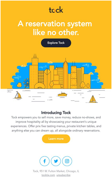
Right from the get-go, Tock positions itself as the best place to book reservations for readers by highlighting the different solutions they offer.
From an email campaign design perspective, the contrasting color palette immediately grabs the reader’s attention. These colors also happen to be Tock’s brand colors.
The email also features two CTAs—one geared towards potential customers who are ready to use Tock’s services and one for those who are still in the awareness stage of the sales funnel.

Judy
In this example, Judy wastes no time in getting their message across. The header captures your attention right from the get-go and there are 2 CTAs—one placed strategically above the illustration and fold, and another located right underneath the “6 Tips for Traveling in Snowstorms” list.
The email provides just enough information to encourage users to download the guide and learn more.

All Year Round (AYR)
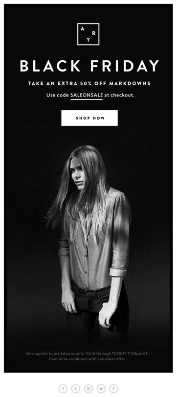
AYR uses a darker theme and a minimalistic design approach to promote its Black Friday offer. The headline is short and to the point, the image is visually arresting, the CTA is above the fold/scroll, and the overall color scheme is restricted to black, grey, and white.

Airbnb
When it comes to above-the-fold content, this email from Airbnb checks all the right boxes. Not only does it feature a haunting hero image that aligns with the theme of the email, but a clever CTA. Who wouldn’t want to “Explore spooky stays?”

Wrapping Up
Less is more, and the same principle applies to your emails.
Short, expertly-crafted emails allow for better engagement and drive more sales. If you put these tips into practice, you’ll be well on your way to designing emails that stand out in a crowded inbox.
Remember—as with everything else in marketing, you need to continue running tests to determine what works for your audience and refine your email campaign design strategy accordingly.
