
Content without a call to action is like a peanut butter sandwich without jelly. Great but not quite finished.
In this blog, CRO Sr. Strategist, Justin Kevalaitis, will explain why a weak CTA (or no CTA at all!) could mean you’re leaving money on the table.
What You’ll Learn
- The Definition of a CTA & Why It’s Important
- Different Types of CTAs
- How to Create a Compelling CTA
- Common Mistakes to Avoid
- FAQs on Calls to Action
What is a Call to Action (CTA)?
A call to action is that short text you usually see inside a button that tells you what will happen if you click on it.
A common call to action you might have come across is “Get Started” or “Sign-up.” These statements prompt the audience to take specific actions that will move them down the sales funnel to the next step in the buyer journey.
The best call-to-action examples will appeal to audiences of all types. Even when addressing specific pain points, they use the right language to speak to their respective audiences, sucking them in and driving action. It’s the perfect blend of creativity and methodology.

My Expert Insight on The Importance of a Call-To-Action
There’s a lot that goes into a solid call-to-action, or CTA. Whether you want to compel your readers to book an introductory call or inspire them to join your membership, you have to tell them what to do next.
If you leave it vague with no direction, you’ll lose them. A well-written CTA will inspire them to take the next step and give them the direction to do so, boosting your conversion rates and creating meaningful interactions.
To create well-crafted CTAs, you need to understand the psychology behind persuasive language and understand how to integrate it into your copy.
Expert Tip: Examine your competitors’ strategies, perform A/B tests with your CTAs, and experiment with your language. Keep track of the numbers behind your tests. This will help you understand which CTAs are resonating with your audience and which ones aren’t.

The Importance of CTAs in Marketing
The best call to action examples out there demonstrate the benefits of a good CTA.
Here are some of the ways the best CTAs can optimize your marketing strategy:
Driving Conversions
One of the main benefits of trying to create the best CTA for your marketing is the ability to boost conversions. Specifically, a CTA gives people a clear direction to go with their actions as they progress down the sales funnel.
Personalization for certain CTAs can also lead to more conversions as you speak to audiences directly and establish a stronger connection.
For example, in a personalized email campaign, a call to action example might appear in the subject line for someone interested in a particular product, “You viewed [product]. Buy it now and get 15% off!”
Improving the User Experience (UX)
Think of CTAs as a kind of signage that guides users along the customer journey. They can clearly indicate where to go when engaging with content, especially when indicating what kind of path the user will take.
A better UX using CTAs will also help keep more people on your website as they explore various pages with clear navigation, leading them naturally to the information they want as they supplement other forms of navigation.
Boosting SEO
Additionally, the best CTAs can improve SEO in a couple of ways.
For one, more engagement from users signals to Google that your content is valuable and relevant, which can lead search engine bots to rank your pages higher than less helpful competing pages.
Also, certain calls to action could include keywords to help their linked pages rank higher for the anchor text term.
Different Types of CTAs
There are several types of CTAs you can use to connect with audiences across the customer journey, depending on your promotion and the type of action you want your audiences to take.
The following are some of the different types of CTAs and specific examples of calls to action for each:
Lead Generation CTA
Calls to action often attempt to boost conversions through certain buttons and messaging. These CTAs appear on websites to encourage visitors to add their contact information, generating leads through clicks and the submission of contact information.
One call-to-action example could include a clear lead generation CTA at the bottom of a blog post that asks people to download a free ebook or another resource expanding on the topic. In exchange, the connected form could ask for a name and email address, which would put the person in your contact list.
Email marketing platform Mailchimp is one company that offers up some of the best call to action examples to generate leads, with many CTAs for various materials to connect with prospective users.
One of these CTAs encouraged users to explore Mailchimp’s expansive library of integrations, indicating the kind of compatibility that the platform offers.
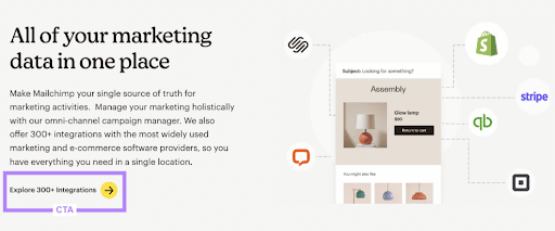
Call to action examples like this show how businesses can speak to the specific benefits of their offerings as they connect with leads looking for various benefits or features.
Contact Us CTAs
Another common type of CTA is a “contact us” button that asks people to reach out to the company. Often, these CTAs will appear at the bottom of a blog post or a web page, asking people to request more information. These CTAs could also ask people to schedule an appointment or request a free quote/estimate.

Some call-to-action examples requesting actions from people could include messages like:
- “Get in touch with an expert today!”
- “Discuss your needs with a member of our team.”
- “Request a free quote for our services today.”
- “Schedule a consultation with us to get started!”
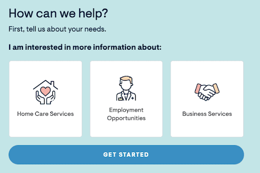
An example of a call to action here is one BrightStar Care’s website. This healthcare franchise offers home care and staffing support to provide effective elderly care. On the company’s contact page, the different audiences can choose which topic to discuss based on their needs, selecting from “Home Care Services,” “Employment Opportunities,” and “Business Services” with convenient icons.
Sales CTAs
Sales CTAs are designed to get that sale. It’s going to entice your reader to hand over their hard-earned money for your product or service.

Take this example from Dr. Squatch. Are you a manly man who wants a natural product in a fresh, manly scent? Click that button to get started. You can shop their products and they can make a sale. It’s a win-win for everyone!
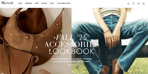
Another good example of a call to action that can drive sales is Madewell, which not only gets people to shop immediately after landing on their homepage but also caters to seasonal trends based on the time of year.
Sales calls to actions aren’t relegated to retail, either. One of the shining call to action examples for restaurants is Teriyaki Madness, an up-and-coming quick-service restaurant franchise that knows how to connect with audiences as soon as they land on their website.
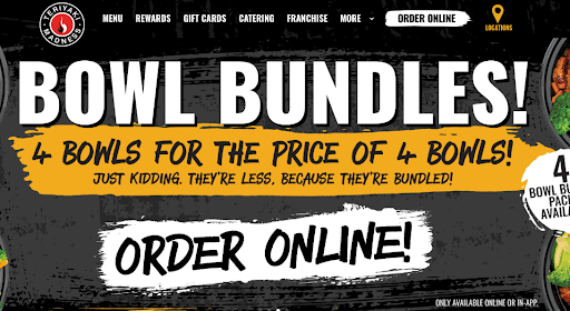
As soon as you land on the Teriyaki Madness website, the brand encourages you to order online and find a location near you right in the top navigation with a highlighted link.
Then, in the header images, you’ll see additional call to action examples promoting specific deals, including bundles and daily specials.
These call to action ideas illustrate how restaurants can drive immediate action with compelling offers.
Engagement CTAs
Engagement CTAs are designed to get your audience to engage with your content or brand.
It can be something as simple as Does this resonate with you? Let us know in the comments below!” on a social media post or inspire them to get involved with your organization, like the example below from the Leukemia and Lymphoma Society.

Engagement messaging can make for the best CTA type to spark a conversation regarding just about any topic, whether for an academic essay, a whitepaper, an article, or another piece of long-form content looking to persuade or attract discussion.
Event Promotion CTAs
Event promotion CTAs are intended to get people interested and excited about your upcoming event. Sometimes, they’re intended to get people to buy a ticket right then and there and sometimes they’re simply intended to capture those who are interested.

In addition to encouraging registration, you could also say things like:
- Add this to your calendar!
- You don’t want to miss this event!
- Add your name to our VIP list.
- Share this event with your friends!
- Register now!
- Join the VIP list
Social Sharing CTAs
Everyone wants to go viral, right? Part of that is encouraging others to share your content on social media. Popular CTAs include simple things like “Share This Post Now” or “Friend Us on Facebook!” Some are even as simple as the social media platform buttons at the bottom of a landing page.

See those little social icons next to the word “share” in the example above? Those are social sharing CTAs.
Some social sharing CTAs also exist in the form of a referral button. If you share the brand’s content on your social platforms, you can get a referral bonus, like the example below from Grammarly.

Feedback CTAs
Feedback CTAs are a great way to get actual first-party feedback while boosting engagement between you and your customers.
Take this example from Target.com. It encourages the consumer to engage with your brand but also works to provide first-party data that you can use in other aspects of your marketing.

Some other examples include:
- Review your purchase!
- Tell us what you liked!
- How did you enjoy your purchase?
- Tell us about it!
To give you some other call to action ideas, consider J. Crew’s examples of a call to action requesting customer feedback. What makes their CTAs stand apart is their request for thoughts about specific clothing items.
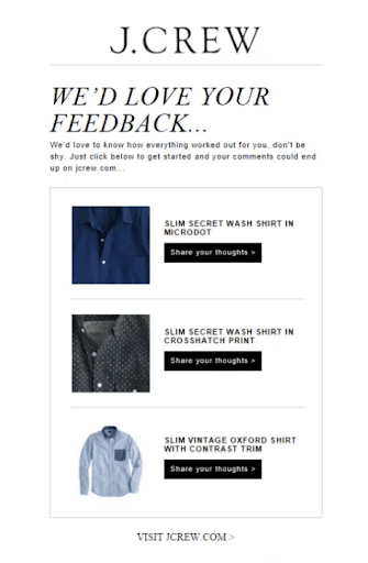
What’s especially effective about these call to action ideas is that they can get more specific opinions on individual products rather than a collective experience. The customer feedback will also appear as a review of sorts on the company website for each product, contributing to customer review collection.
Customer Support CTAs
Customer support CTAs encourage the reader to contact the brand directly. Examples include language such as:
- Reach out for help!
- Contact customer service
- Contact sales
Let’s take a look at this example from Square. Their buttons give you the option of getting started immediately or reaching out to customer service for assistance. Either way, the consumer is covered!

Content Upgrade CTAs
The point of a content upgrade CTA is to get an already subscribed or engaged customer to upgrade to higher level by offering enhanced services or a deeper discount.
Take this example from Asana. It gives the options to upgrade to different levels, while explaining the different benefits to each level.

Product Discovery CTAs
CTAs could also help people navigate your site clearly, leading them down the specific path you want them to take, from landing pages and blogs to main web pages.
Examples of calls to action involving product or service discovery could include:
- “View the new features!”
- “Learn more about these products.”
- “Find out which service is right for you.”
Language like this send people to the next logical page on your site, where they can continue to learn about your services.

Urgency CTAs
Urgency CTAs are exactly that: they encourage the reader to act quickly by offering some type of discount or offer that will expire if they don’t act right now.
Take this example from meal-delivery service, Blue Apron. The beauty of the CTA is two-fold: First, it doesn’t just give you the option to accept the coupon. Instead, if you want to get rid of the pop-up, you have to click a “Reject $30 off” button.
Who doesn’t feel a little silly rejecting free money? It makes you stop and think before clicking, which is exactly the point of a well-designed CTA.

You can also create an even bigger sense of fear of missing out (FOMO) by including a countdown timer when appropriate.
Some of the best call to action examples use a clock to let people know precisely how much time they have, which can be particularly effective when people have mere hours or even minutes to buy before a deal disappears.
Take women’s clothing company Betabrand, for example. Their call to action examples feature very short countdown clocks to advertise limited-time offers before they disappear.
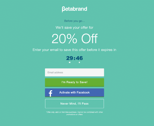
The CTA encourages email recipients to enter their email or otherwise sign up to take advantage of an offer within 30 minutes before expiry, creating a strong sense of urgency to drive more conversions.
How to Create a Compelling Call To Action
Creating a compelling CTA is an art that requires finesse and strategy. Here’s how you can conjure up CTAs that practically beg to be clicked:
1. Be Creative: Infuse your CTAs with a dash of imagination. Stand out from the crowd by thinking outside the box. Blend creativity with clarity to intrigue your audience.
2. Keep It Simple: In a world of information overload, simplicity shines. Keep your CTAs straightforward and uncluttered. A clean, concise message is more likely to resonate with your audience.
3. Use Actionable Verbs: Words hold power, but verbs hold action. Use commanding verbs in your CTAs. Transform ‘Read More’ into ‘Unlock Expert Insights’ for a dynamic touch.
4. Create a Sense of Urgency: Nothing ignites action like a ticking clock. Leverage phrases like ‘Limited Time Offer’ to fuel immediate responses.
5. Provoke Emotion: Appeal to your audience’s emotions. Make them feel something – excitement, curiosity, FOMO. By touching their heartstrings, you can compel them to take action.
6. Strategize for Mobile: Most people surf the web on their mobile phones. Make sure any CTAs are large enough to read and easy to tap.
7. Leverage the Power of Color: Contrast works in your favor when used correctly. Your CTAs should be high-contrast to the rest of the page. Your most important calls to action, “Add to Cart,” “Sign-Up,” “Buy Now,” etc., should be a unique color that stands out from other CTAs on your site.
8. Be ADA-Compliant: This means making sure your content is usable by everyone, helping you reach your entire target audience. Make sure your CTAs are formatted correctly so assistive technology can access your content.
Common Mistakes When It Comes to CTAs
As you work on creating the right CTAs for your website and ads, there are some mistakes to avoid in the process. The following are some examples of CTA missteps that could hurt your efforts:
1. Incorporating Too Many CTAs
You might think giving people a lot of information is a good thing but if they don’t have a clear next step, they can’t make a clear decision.
Too many CTAs are going to confuse people. And confused people will click right off of your page. Like many other aspects of marketing, simple is often best regarding CTAs.
2. Not a Clear Value Proposition
People won’t want to perform the desired action in your CTAs if you don’t make it clear what benefits they’ll get. Show people what they can get in a brief format, such as the relief of a highly specific pain point while compelling people to learn more about this and other benefits.
3. Not Personalizing CTAs When Appropriate
When possible, it’s often best to personalize CTAs, as these types of CTAs can convert up to 202% more effectively than conventional CTAs.
While general call-to-action ads—like a TikTok call-to-action—might be less personal, you might include personalized CTAs in marketing emails and other personal correspondence once people become leads. Some call to action examples here could include:
- “Learn more about the products you love!”
- “Find the right solution based on your preferences!”
- “Interested in [specific product/service]? Explore it here!”
4. Poor Placement
Another major mistake businesses can make with CTAs is placing them poorly. Call to action examples of this could include neglecting to put CTAs on the homepage, which is detrimental seeing as a homepage CTA can boost conversions by as much as 121%.
In addition, another poorly placed call to action example could include a button that’s in a location on a page that’s hard to see or too far down after long-form content. In some cases, it might be best to include a CTA to break up content if people aren’t as likely to reach the bottom of the page, and you should make buttons visible without obstructing the user experience.
5. Using Vague Language
The best CTAs are clear and leave no confusion as to what the person gets when taking the desired action. When possible, avoid simple messages like “Click Here” and “Submit” when a more specific action fits a button or link description.
Also, it can help to express the particular value of a CTA to drive more high-intent clicks from people compelled to follow through with a purchase, schedule an appointment, or complete another bottom-of-the-funnel action.
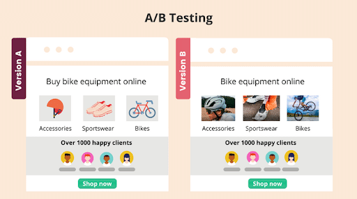
6. Failing to Test Sufficiently
When trying to determine the best CTA for your marketing and sales efforts, it always helps to conduct A/B testing. This step involves running two versions of the same CTA with a component differing between the two, such as the text or color of a button.
Running both versions simultaneously could help you see which drives more conversions, which will ultimately dictate which to use in your official campaign.
Call to Action FAQs
1. What is a Call to Action?
A call to action is the most important element of a webpage. The CTA is a directive statement that leads the user to their goal.
It is, literally, calling the customer to take a decisive positive action lower into the sales funnel.
2. Why Do You Need a Call to Action?
Having any boring CTA that does not pop out to the customer means you will miss out on valuable customers and conversions.
A strong CTA will convince customers to act right now for the benefit of your business.
The two main functions of a CTA are to direct the customer on what to do and motivate them to take action to do it.
A good CTA will give the potential buyer the basis for pulling the trigger to make a final purchase.
3. How Do You Write a Call to Action?
Writing a strong call to action (CTA) includes some of the following steps:
- Start your CTA with a command verb such as “order,” “subscribe,” and “Find out.”
- Give your audience a reason to take action
- Take advantage of people’s fear of missing out
- Be creative
- Demonstrate enthusiasm and an emotional response
4. Can One Call to Action Suit Every Audience?
Not quite. Crafting a CTA that clicks requires catering to your target audience’s mindset. Each audience segment might respond differently to varying CTAs. Tailoring your CTAs to resonate with specific groups ensures you’re hitting the right chords and maximizing conversions.
5. How Do Calls to Action Align with Brand Messaging?
Think of CTAs as the rhythm that matches your brand’s melody. Seamless integration is key. Whether your brand conveys playfulness or professionalism, a consistent tone between your CTA and your brand narrative cultivates trust and familiarity.
6. Are Visual Elements Important in Calls to Action?
Absolutely. Visual elements in CTAs play a pivotal role. A well-designed button, strategically placed on your page, can draw attention like a moth to a flame. Vivid colors, distinct typography, and concise messaging can work together to create a CTA that’s impossible to ignore.
7. What Are Examples of Calls to Action?
There are plenty of call to action examples you can incorporate, depending on the specific action you want people to take. Some specific call to actions examples include:
- “Sign up with us now!”
- “Get started with us today!”
- “Learn more about our offerings here!”
- “Discover what this product can do for you.”
- “Get the details here!”
Including these and other messages with buttons or links can go a long way in attracting new prospects, leads, and customers.
Ready to Improve Your Call to Action?
A great CTA can make or break your conversions. Ignite Visibility has a team of digital marketing experts who are ready to leverage the power of compelling calls to action to help businesses drive targeted traffic to achieve their marketing goals.
Our strategists work closely with clients to understand their unique needs and design customized campaigns that maximize return on investment.
We can help you improve your CTAs and boost you conversion rates on everything including:
- Social media marketing
- Email marketing
- Landing pages
- Local SEO pages
- And more!
Want to learn more about our services?
Contact us for a free proposal!