It’s not enough for a landing page to simply look good. The best landing pages are strategically built to guide users toward action, reduce friction, and maximize conversions. That means understanding not just design, but also messaging, user experience, trust signals, and conversion psychology.
In this blog, Justin Kevalaitis, CRO Sr. Strategist, breaks down what makes a good landing page by analyzing real landing page examples and the best practices behind them, so you can build pages that don’t just attract visitors, but convert them.
What You’ll Learn:
- What Is a Landing Page?
- Landing page best practices
- Best Landing Page Examples by Type
- Common Landing Page Mistakes
What Is a Landing Page?
Landing pages are standalone web pages with a specific goal to get people to complete a certain action, whether it’s to generate leads, boost signups, make a purchase, or perform another type of conversion.
There are multiple types of landing pages you can use, such as:
- Lead generation pages that capture data, usually with lead magnets
- Squeeze pages that function as shorter versions of lead gen pages
- Click-through landing pages bridging the gap between ads and checkout pages
- Long-form sales pages that provide in-depth information for more high-ticket or complex products
- Product or service landing pages exploring features or benefits
- Thank you pages following conversions, potentially with additional offers
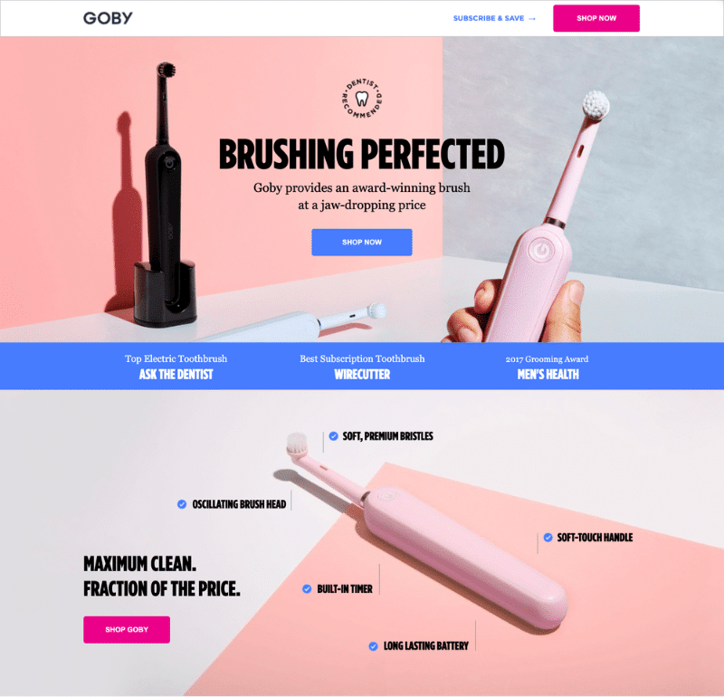
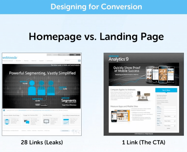
Landing Page vs. Homepage
While both are equally important, there are some key differences between landing pages and homepages to consider:
| Feature | Landing Page | Homepage |
| Goal | Immediate conversions, e.g., sales, signups, or leads | Brand awareness, user education, and navigation |
| Navigation | Little to no navigation with a singular focus | Full navigational menus to encourage site exploration |
| Target Audience | Tailored to specific traffic sources like email or PPC ads | General audiences |
| Content | Concise and targeting one key offer | Brand overviews and information about broader product and service categories |
| When to Use | Running PPC, email, or other precisely targeted campaigns with the goal of maximizing ROI | Providing audiences with a central hub to inform audiences and build trust |
Expert Insight into the Best Landing Pages
When discussing what makes a good landing page, many people focus on appearance first. Does it look polished? Is the layout visually appealing? Does it immediately grab attention?
While design certainly matters, high-performing landing pages are about far more than aesthetics. To drive conversions, a landing page needs to give visitors a compelling reason to take action. The best landing pages don’t just prevent users from bouncing, they strategically guide them toward the next step, whether that’s filling out a form, booking a consultation, or making a purchase.
Landing page optimization is a big part of what we do here at Ignite Visibility for any conversion rate optimization (CRO) strategy, with numerous clients benefiting from high-performance landing pages that supplement paid ads, search engine optimization, and other components.
One example of landing page success involved a legal lead generation brand that partnered with us to optimize their Meta Ads campaign, which entailed landing page testing and CRO, among other marketing solutions, yielding a significant decrease in cost per lead from $99.68 to $57.74, 1,635 more leads, and a 145% increase in quarter-over-quarter profit from Meta campaigns.
Meanwhile, we developed optimized location-specific landing pages for a leading home services franchise with over 60 locations, along with optimized Google Business Profiles and high-intent keyword targeting, to deliver 50 times more organic growth than the company’s top competitor.
These and other case studies show the importance of effective landing page optimization in boosting conversions while reducing the cost of acquiring new customers.
Landing Page Best Practices: What Makes a Good Landing Page?
Landing pages can take many different forms and are used to promote everything from consumer products to B2B e-books, local shops, and subscription services.
Yet, while there’s a ton of variation with landing pages, there are a few best practices that remain consistent across the board:
- Focus on One Goal: Every landing page should focus on a single goal, whether you want to generate leads, boost sales, or encourage signups or downloads.
- Use Clear Headlines: Both your headlines and copy should make the value of your brand and offerings clear to build trust and boost conversions.
- Add an Actionable CTA: The best CTAs feature bold, high-contrast visuals with a simple click or form submission.
- Incorporate Above-the-Fold Content: Toward the top of each page, include your headline, a relevant subheadline, CTA, and hero image.
- Use Visuals and Trust Signals: Build more brand authority with high-quality images and videos, along with customer reviews and testimonials that earn trust and further drive conversions.
- Align Ads With Pages: Make sure your page content matches that of your ads and other traffic sources, keeping people moving down the sales funnel.
- Keep Your Layout Simple: Don’t overcomplicate things; use appealing layouts that only include the information and visuals necessary to encourage click-throughs and lead gen.
- Optimize for Mobile: Make your pages mobile-first through mobile-responsive design, voice search optimization, and other elements that appeal to mobile users.
- Optimize for Speed: You must also optimize your content for fast load times, which will keep people on your page while appealing to Google’s Core Web Vitals metrics.
- Test Continuously: Conduct A/B tests to compare the performance of one element with another, e.g., a CTA at the top of the page vs. a sidebar form, and optimize accordingly.
The 7-Second Test
The seven-second test is a quick process for evaluating the functionality of a landing page. The idea is simple; when a visitor arrives on a landing page, they should be able to answer the following questions in seven seconds or less:
- What is this site about?
- What am I supposed to do?
- What is the core value proposition?
- Is this a brand I can trust?
- Why should I care?
Essentially, you’ll need to be able to explain who you are, what problem you solve, and how you’re different from your competitors.
Keep in mind, less is more, here. The less thinking people have to do to understand what you’re offering, the better.
Best Landing Page Examples by Type
To give you some landing page ideas to incorporate into your own strategy, the following are some winning sample landing pages across industries based on the following key categories:
- Lead generation
- Click-through
- Long-form sales
- Product and service
Lead Generation Landing Pages
These types of landing pages have the purpose of collecting information from visitors, such as names, emails, and phone numbers, adding them to a database for lead nurturing.
Some of the best landing pages in this category include:
1. Shopify
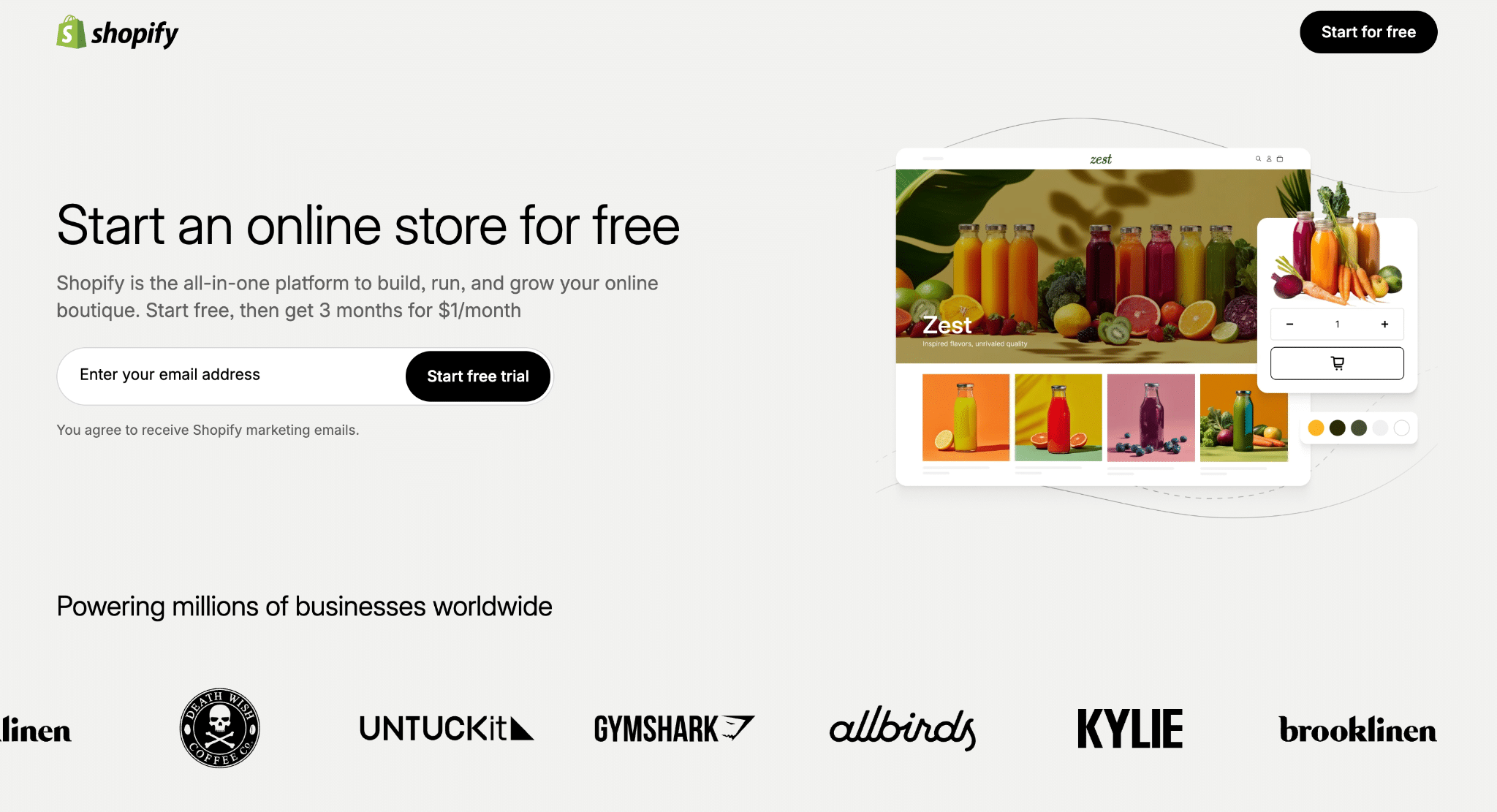
Shopify’s landing pages are consistently good, and this one is no exception. Right away, the headline tells visitors what they’re all about, builds trust by acknowledging their massive customer base, and backs it up with a high-res image that shows off their mobile-responsive website themes. Users can easily grasp what to expect, and all they need to do is enter an email to get started. Plus, if there’s any hesitation, the fine-print states they offer a 14-day trial and won’t ask for your credit card until you’re sure you want to commit.
2. Intercom
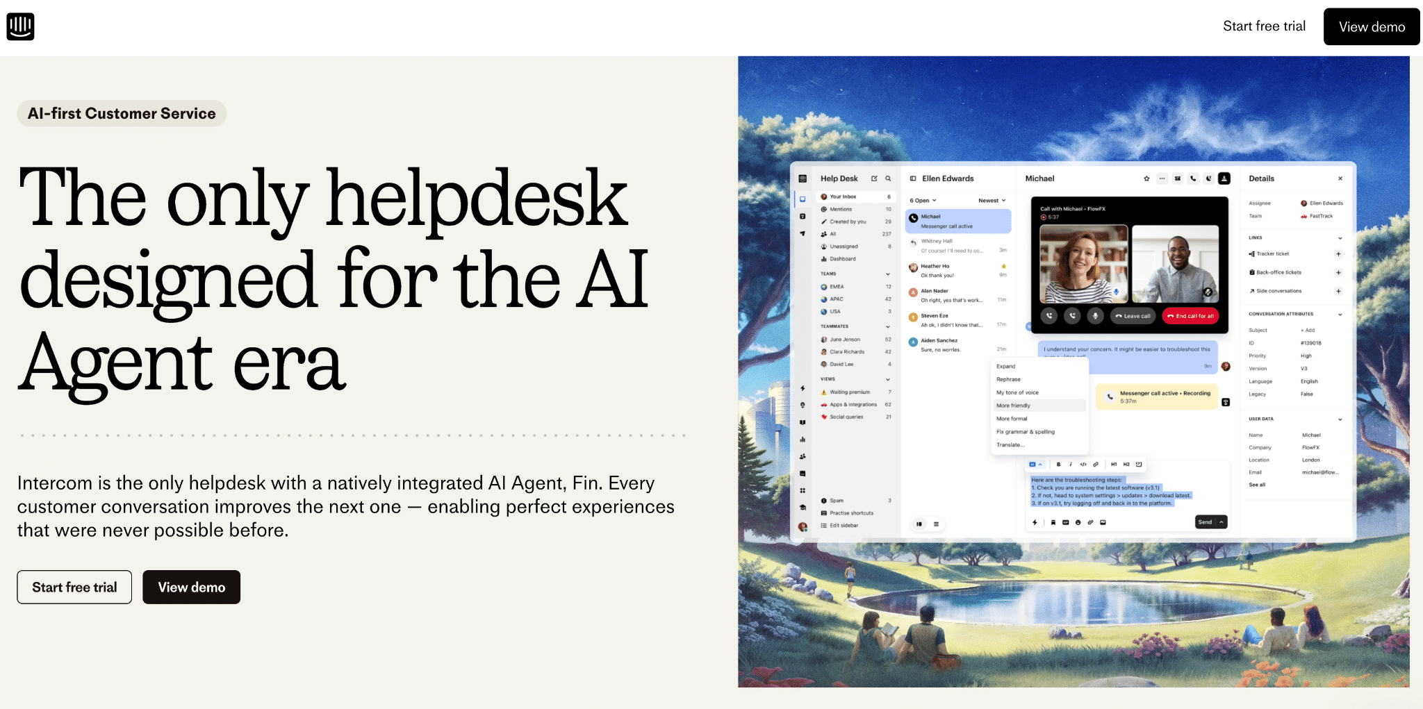
Intercom’s landing page also cuts to the chase within a few seconds–they offer chatbots designed to deliver positive customer experiences. The headline and subtitle make it clear what this product is all about, complete with an image showcasing its capabilities. As you scroll down, you get even more information about what Intercom does and its myriad features. And, as we saw with Shopify, Intercom also makes it super easy to get started with the trial.
3. Calm
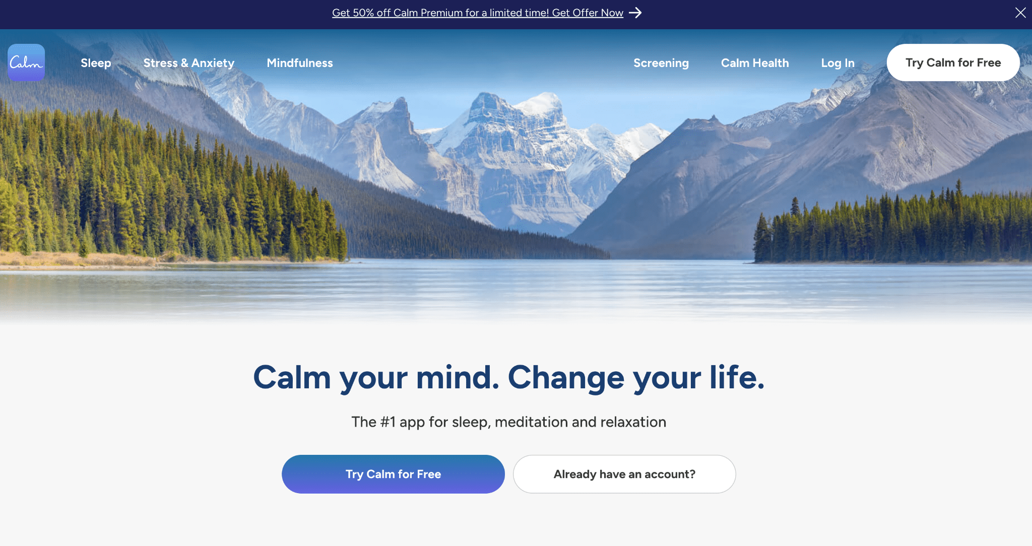
Calm has a strong example homepage that is a perfect example of less is more. With a simple standalone “Try Calm For Free” at the top of the page that will capture users that have a high-intent at converting already, they then lead with 3 use case funnel paths: Stress Less, Sleep More, & Live Mindfully. This is great below the fold content because if you can’t get your users to immediately convert on your homepage, you want them to be driven towards a content rich funnel path that speaks to why they’re interested in your product or service. In this case, they have separate funnel paths for users who either want to stress less, sleep more, or live more mindfully.
4. Canva
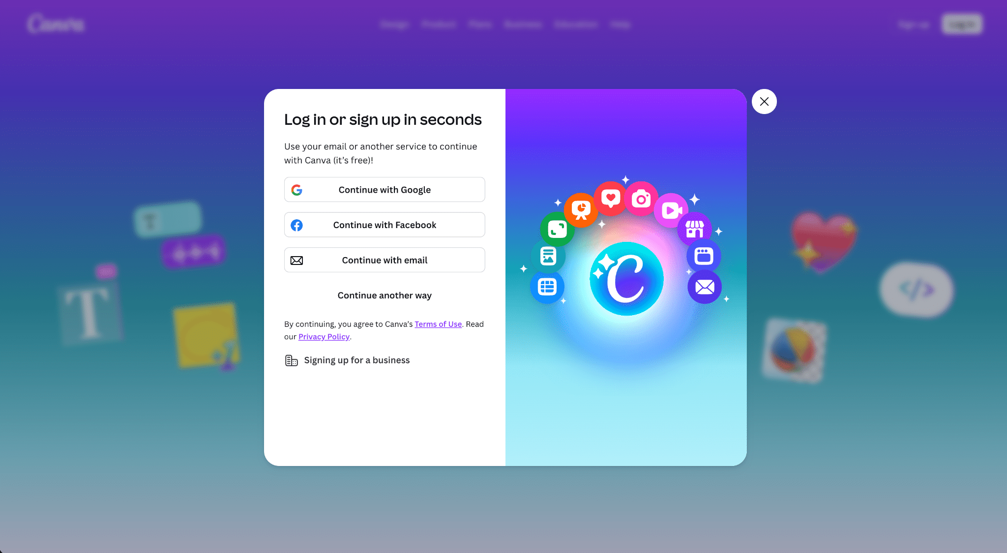
Canva removes friction in the signup process by giving users the option to sign in with Google or Facebook. This gets them up and running faster removing that extra step (as well as that need to create a new password).
5. GetResponse
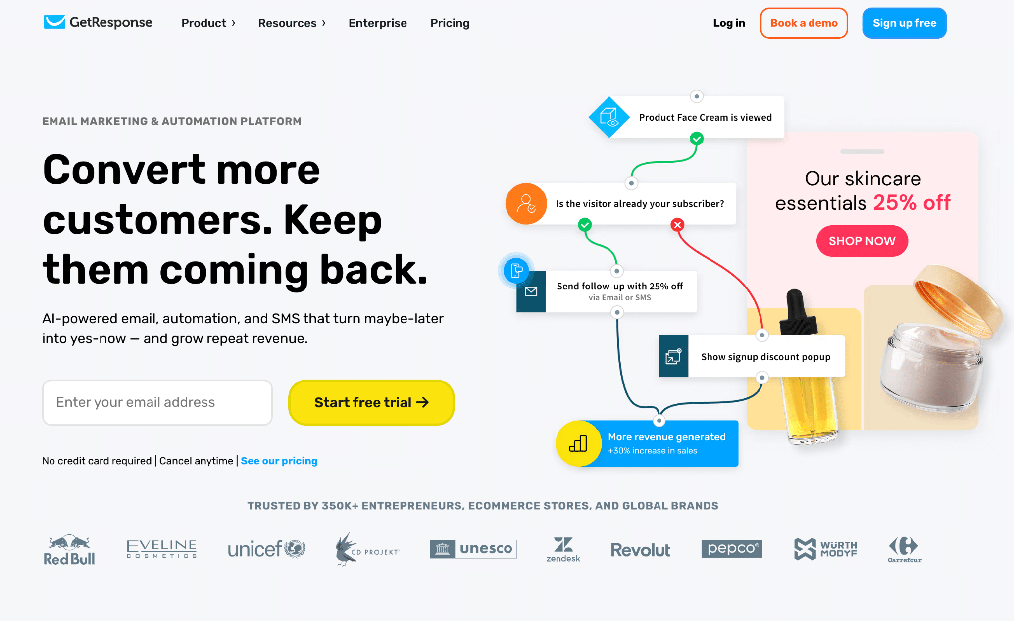
GetResponse leans into using a simple header and subheader, pushing its value prop in a concise and convincing way. Additionally, they are able to generate leads by having a low barrier to entry – only requiring an email address to start a free trial of their platform. The less barriers you can have to capture a lead, the better your lead capture rate will be. Really consider if your sales team really needs every single piece of contact information from the lead, especially if your business is currently more concerned about lead volume than lead quality. You can’t shape a hedge if you don’t let it grow big enough first.
6. Copyblogger
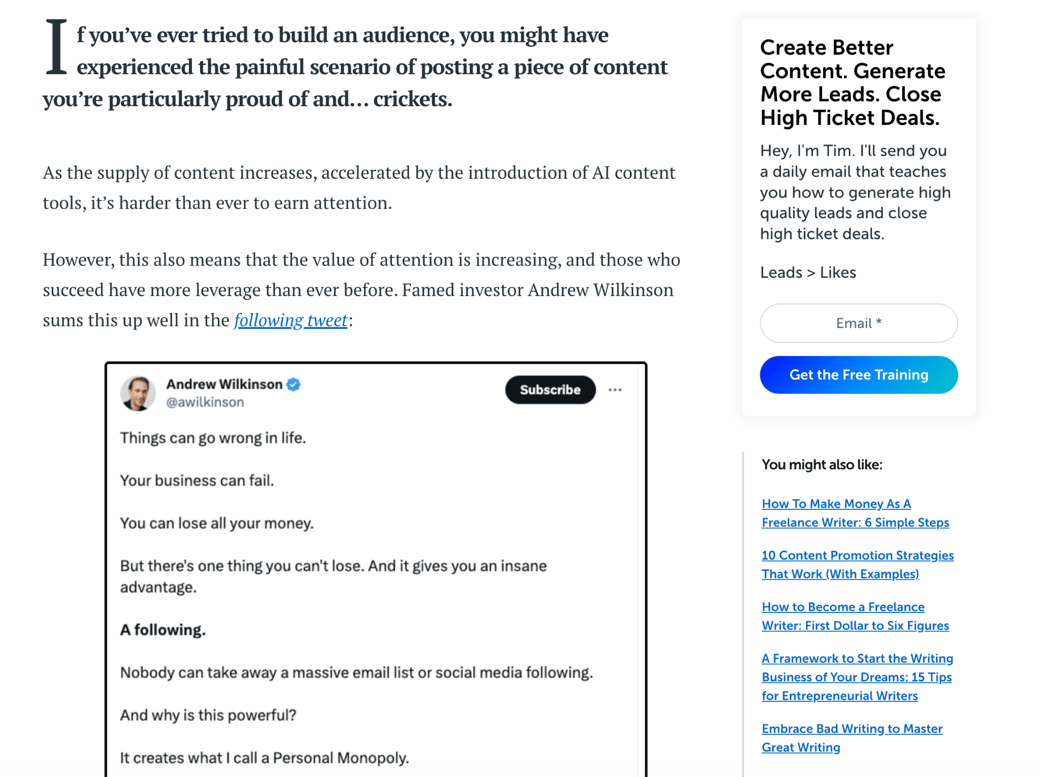
Copyblogger follows a similar structure to the Ignite blog, using a sidebar to highlight popular posts and encourage email opt-ins. It also includes a CTA mid-page that offers free training to get people started once they have read the introduction content.
7. MadCap
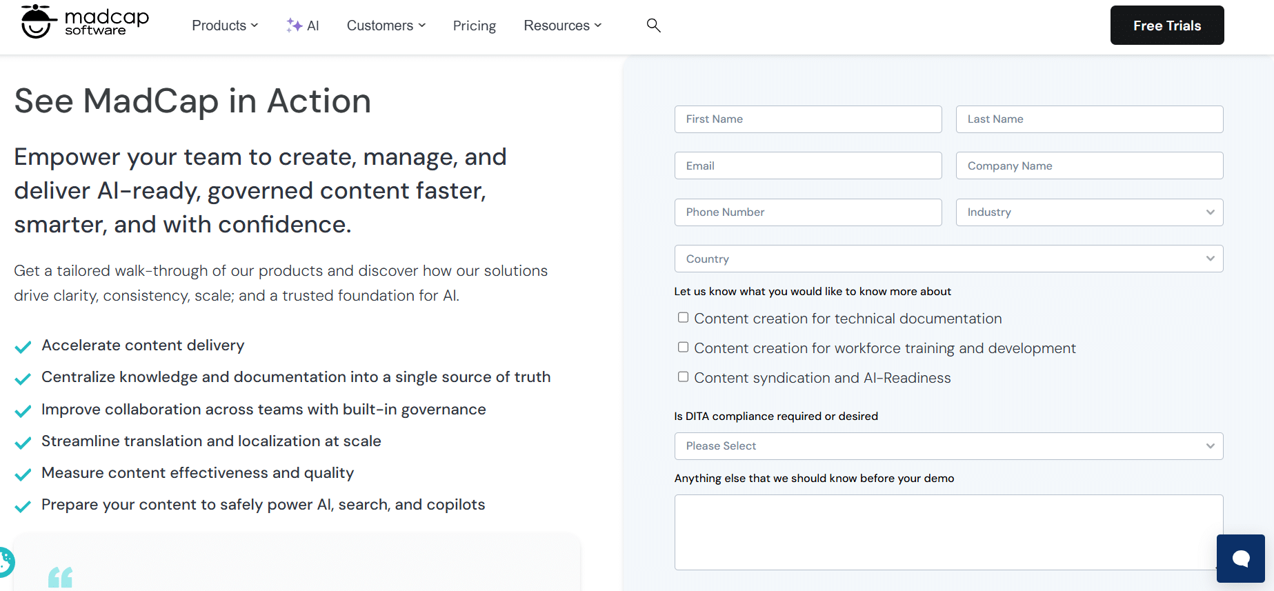
Another strong example comes from MadCap. They’ve done a nice job explaining what readers will gain, and have made it easy to request their resource by keeping form fields to a minimum.
8. Netflix
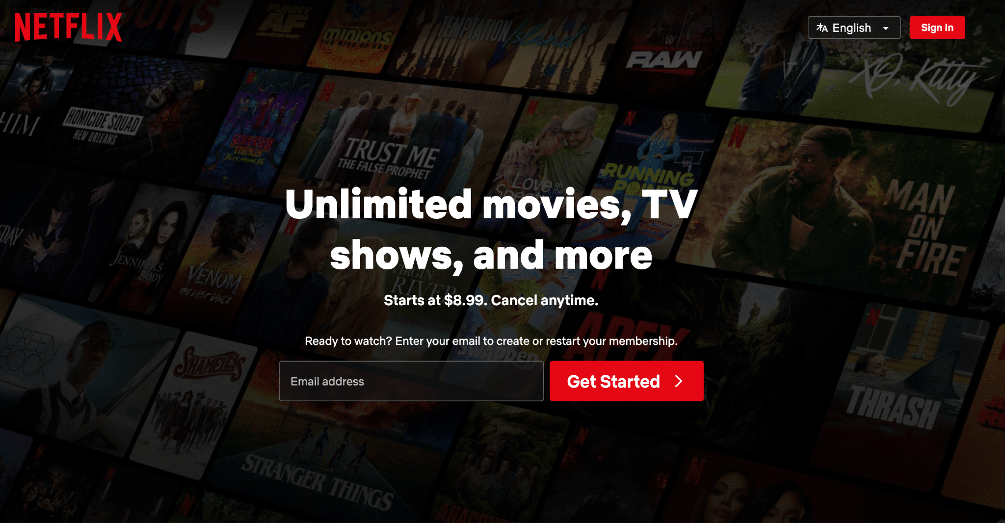
Netflix’s landing page utilizes a minimalistic design layout by having a single form field (email) underneath a direct and concise header and subheader that lists the pricing. While this may not work for every brand, for industry leaders that have strong brand awareness, they can get away with less content that explains the service offering.
This style of landing page can also be effective for landing pages that are targeting high-intent traffic, specifically those that are using branded keywords. Those users typically already know about your offering and are just looking for a way to take the next step quickly.
9. Litmus
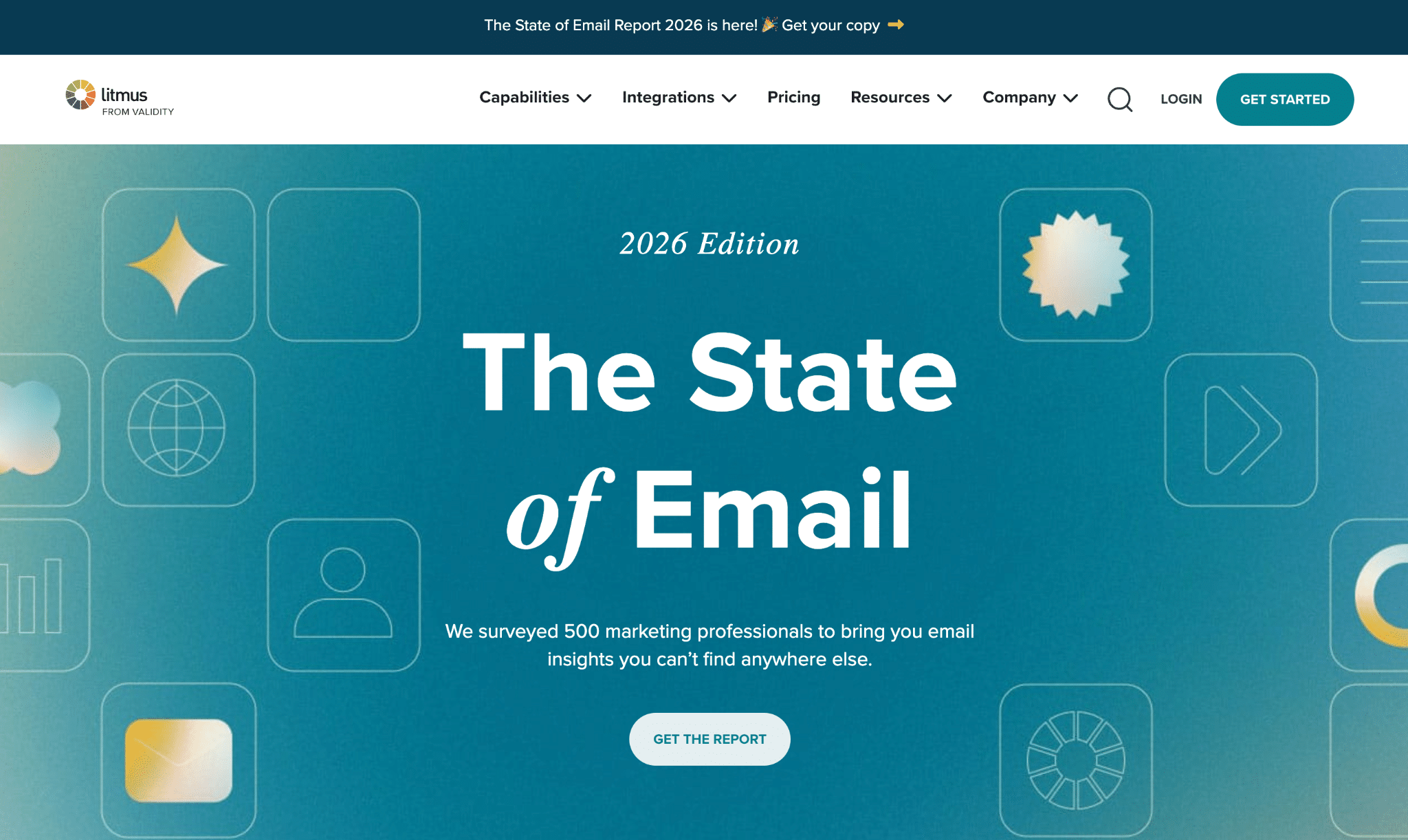
Litmus heavily promotes its State of Email Report every year, with CTAs for it appearing across the site when actively encouraging downloads. The corresponding landing page demonstrates some credibility by advertising that it surveyed 500 marketing pros to get results, with a basic button to get the report, which immediately takes people below to the basic lead form.
10. Sundae
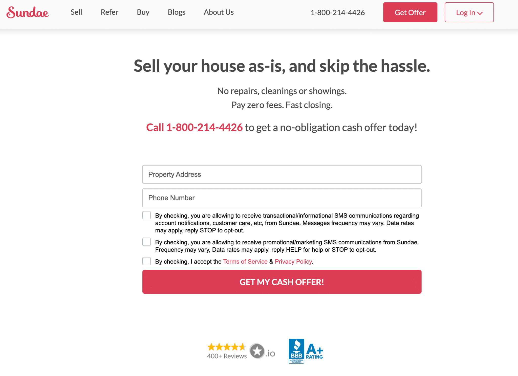
Sundae really understands its audience, which is people seeking to sell their home as quickly as possible. People simply need to submit their property address and phone number to get a cash offer on their house, focusing on the benefits and urgency without any frills. In addition to the star rating and BBB credential logos, there’s content below the fold to help instill confidence in users that may otherwise not feel comfortable submitting information yet.
11. Unbounce
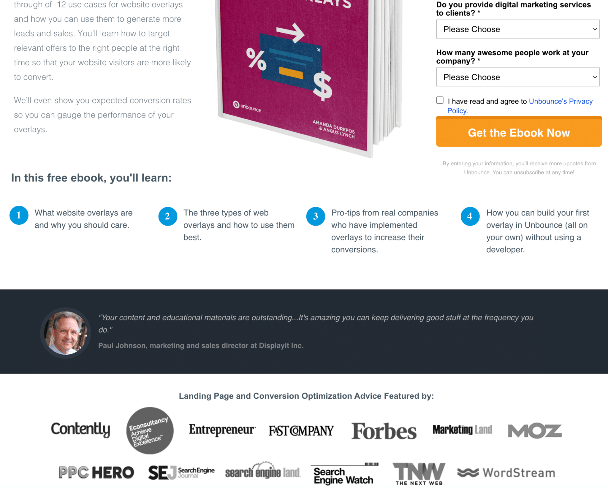
While we would like to see more visually appealing forms on this page, Unbounce does quite a few things right. They made the product image large so it is very clear what users will be receiving when they fill out the form, they briefly explain with 4 bullets the main learning points that will be taken from their ebook, and they keep the social proof just barely beneath the fold so that nearly all eyes will see it. More times than not, you’re going to see a 30-50% dropoff on scroll rate after the first content section below the fold. So while you do not need to make your landing pages this short, your most important content should be either above the fold or at least the first section below the fold.
What to Borrow From These Examples:
Here are some key takeaways for these sample landing pages:
- Offer high-value content in exchange for information, including ebooks, webinars, and whitepapers
- Make your CTA prominent and simple, with basic forms that maximize conversions
- Place CTAs in unobtrusive locations, like sidebars
- Consider implementing chatbots to encourage more engagement
Click-Through Landing Pages
Another of the most popular types of landing pages is the click-through, which has the aim of providing information to users and encouraging them to click to other pages, continuing the customer journey across the website.
Some of the best landing pages in this category include:
12. HubSpot
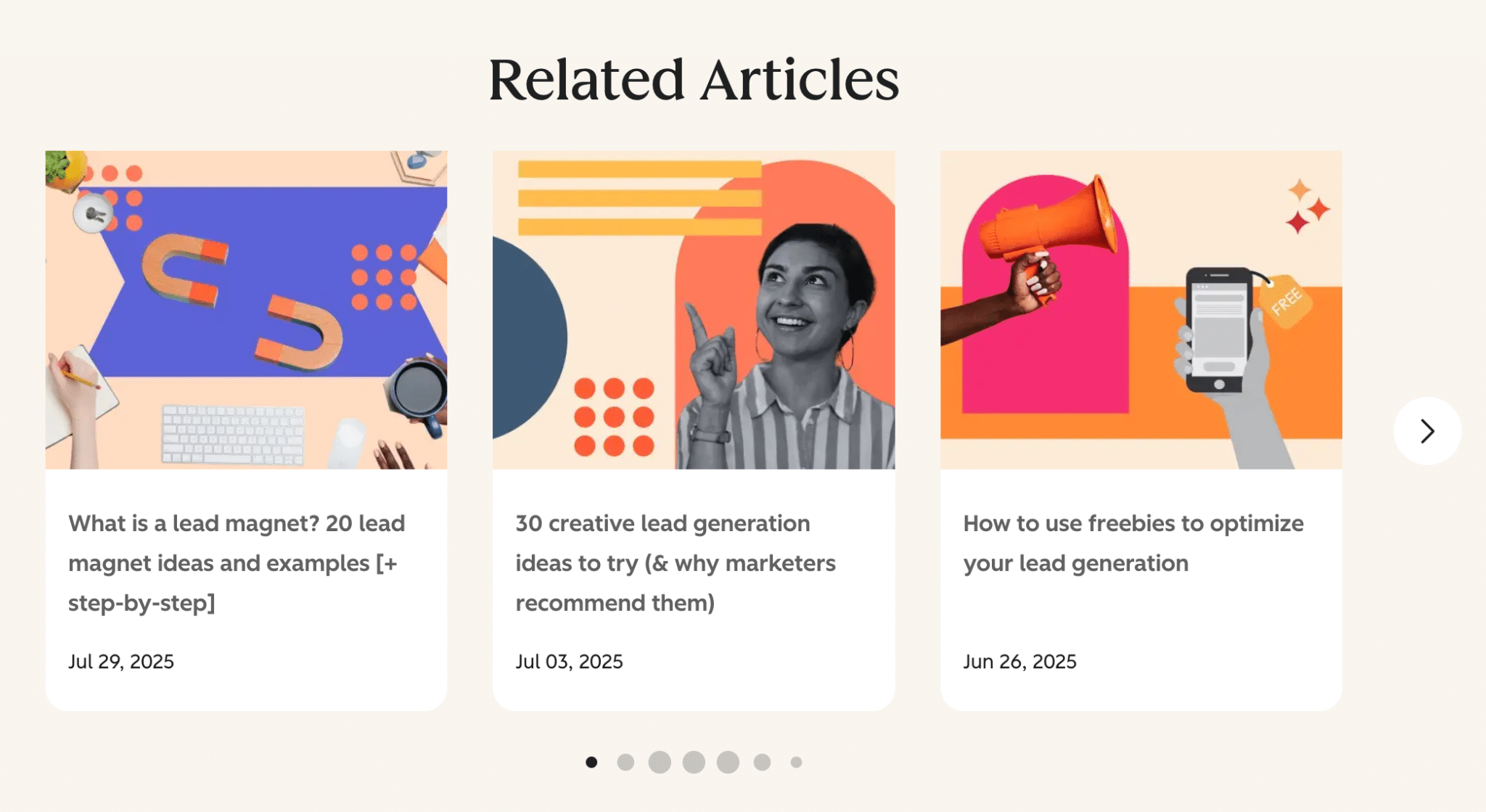
HubSpot often recommends other related content to its visitors, with thumbnails and descriptions for each to encourage more click-throughs beyond that initial blog.
13. Social Media Examiner
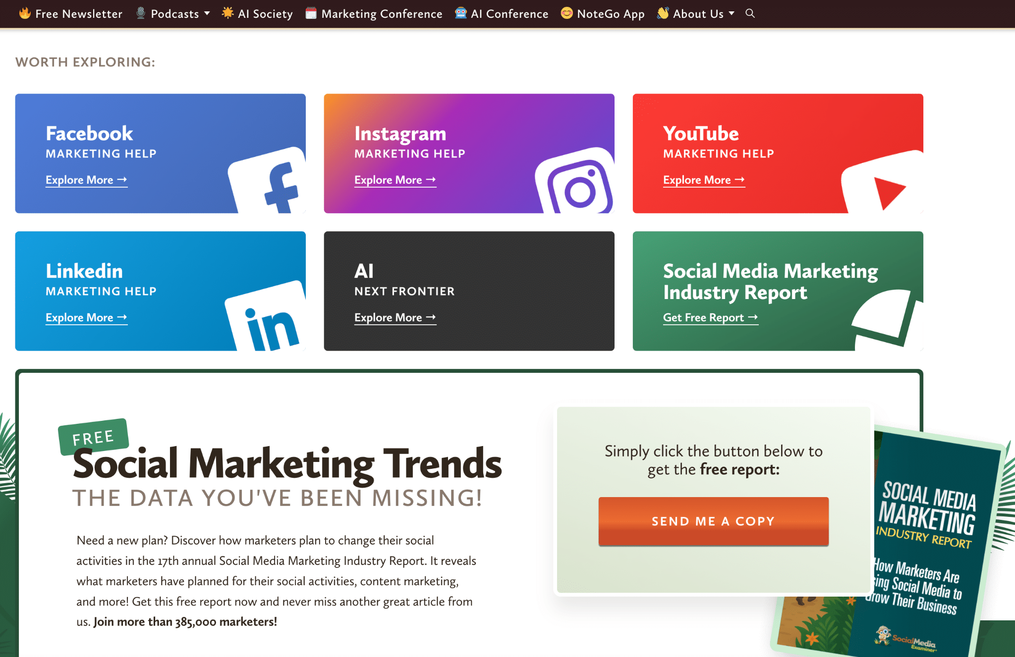
Social Media Examiner is always looking to keep people exploring. Content pieces end with a “Worth Exploring” section, getting people to click through to related resources, and it promotes its latest gated content piece for lead generation.
What to Borrow From These Examples:
To encourage more click-throughs, you can take the following landing page ideas from these:
- Direct people to more relevant, high-quality content
- Organize related content by category with clickable thumbnails
- Guide readers through the process of clicking through with simple directives
Long-Form Sales Landing Pages
Some other types of landing pages might contain more expansive content to persuade people to try or buy a product. These pages are better for businesses offering high-cost or complex products or services that require a bit more explanation.
Here are some sample landing pages with long-form content:
14. MasterClass
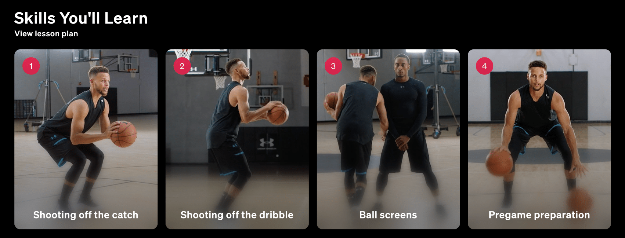
While MasterClass is doing a lot on this page, the on-page elements work well together. The page leads with a clearly defined value proposition and a description of what you get. As you move down, you can see specific skills you’ll learn, a sample lesson video, and other similar courses to help entice you by generating aspirational value.
15. Codecademy
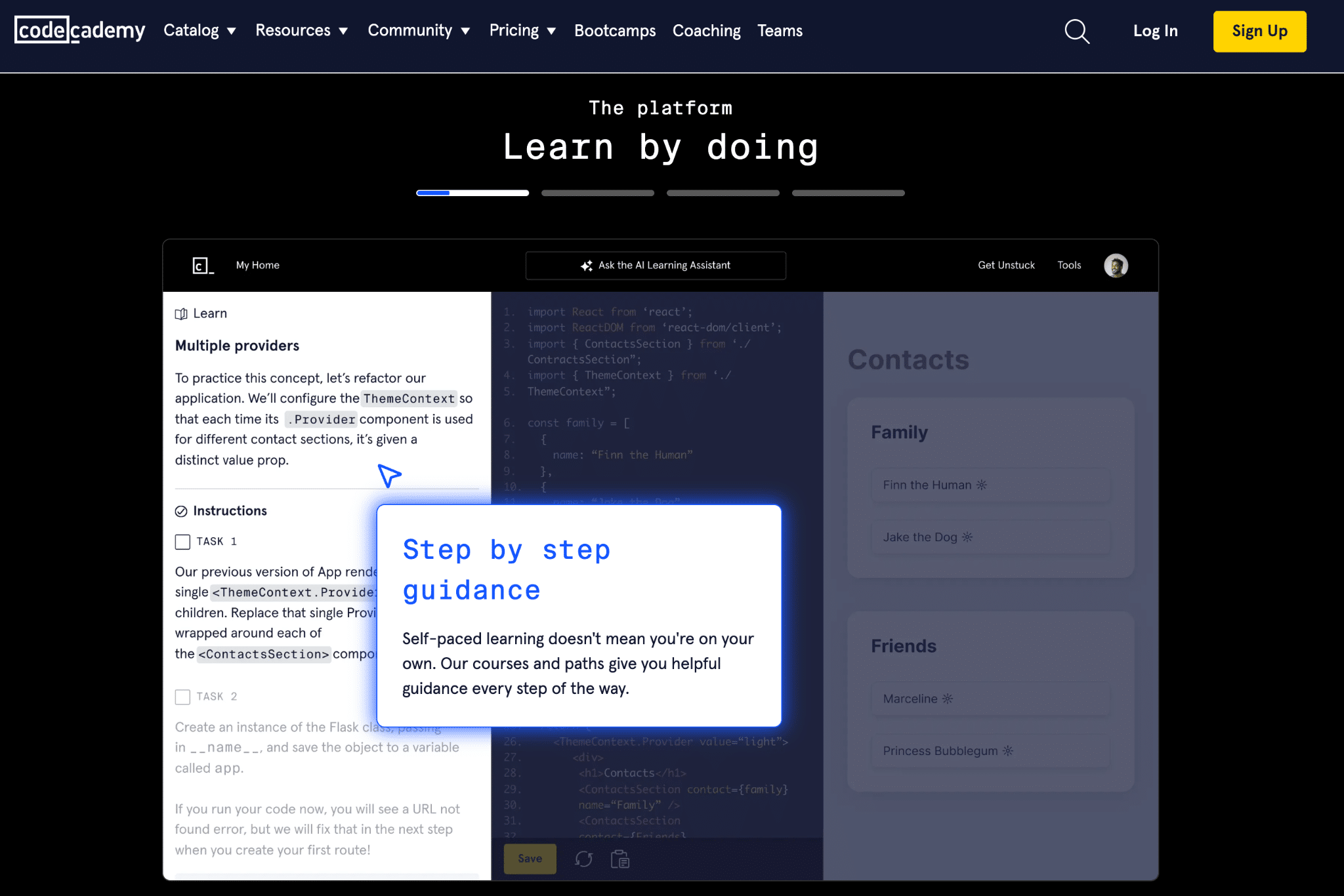
This landing page from Codecademy keeps things super minimal up top. While they’ve cut to the core value prop right off the bat, prospective customers will probably want a few more details before signing up. Included on the page is a long list of skills that coders can learn, along with top courses, a preview of the platform, testimonials, and specific benefits of using Codecademy.
16. Webprofits
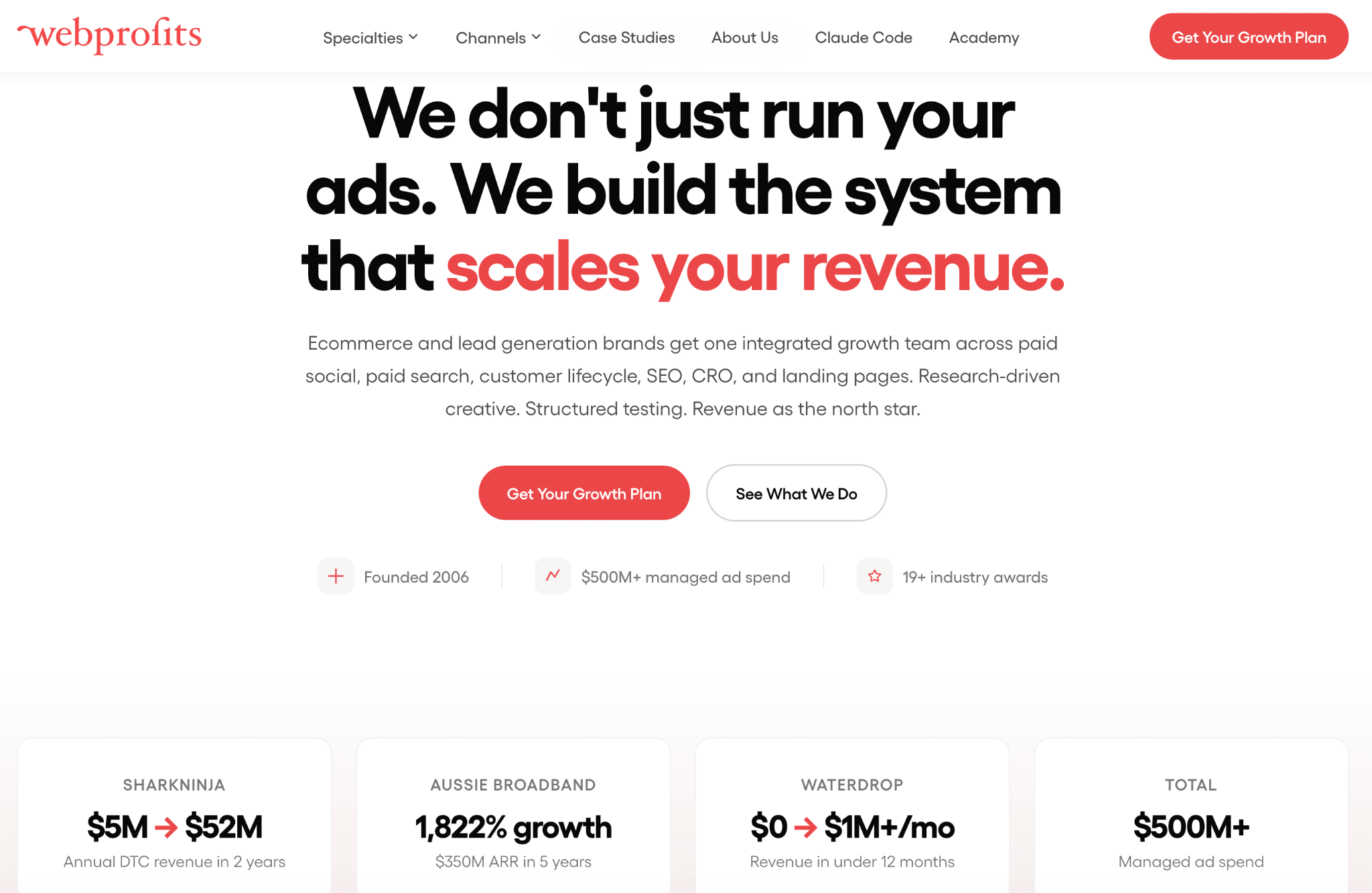
WebProfits builds credibility in a slightly different way. They’ve kept the copy to a minimum up top, focusing on the core benefit, driving growth. Want to know more about how they get results? The next section includes data-driven case studies for specific clients, allowing visitors to get a better sense that they’ve found a solution to their problem. This is especially important when hiring a website designer, as you want to ensure they can deliver the results you’re looking for.
What to Borrow From These Examples:
These long-form pages show how you can optimize conversions with the following approaches:
- Use videos to supplement text, potentially in the form of testimonials
- List press mentions when appropriate
- Focus on core benefits and explain your processes to build credibility
Product/Service Landing Pages
Many pages exist to promote particular offerings by listing benefits, making unique value propositions, and showing their products and services at work.
Some of the top landing pages promoting specific products and services include:
17. Thursdayboots.com
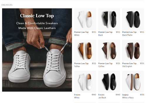
Their men’s product collection page does an excellent job of highlighting all their different styles by giving each style a section on the page with top featured products from that style, but also the option to shop all shoes/boots from that style. It allows users to effectively window shop and self-filter into a more refined and narrowed down selection of products that the user will be interested in.
18. ZenDesk
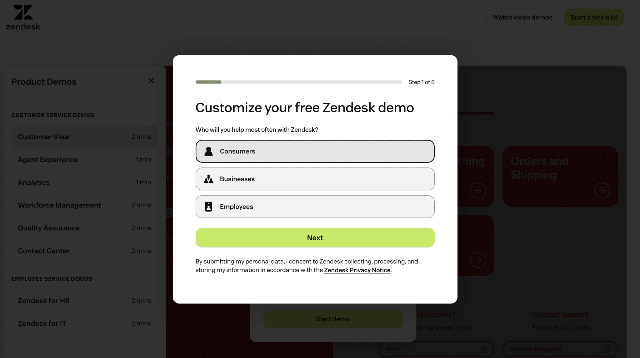
Zendesk really wants its users to get a personalized experience with its product demos, asking people about who will use the solution, with 8 steps total to deliver a tailored demo on the webpage. Users can then see demos for individual elements, including the customer view and analytics, helping people determine whether it’s right for them.
19. Class Creator
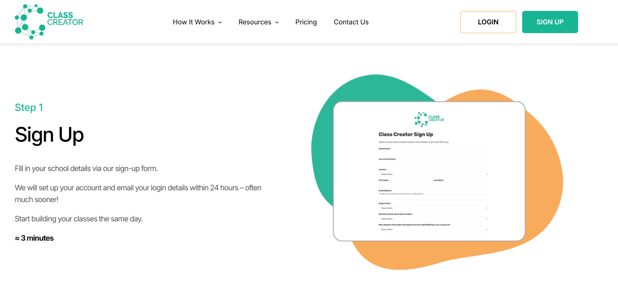
Class Creator enables schools to build class lists for effective student placement, with a “How It Works” page going into detail about the platform, with a step-by-step explanation and an image for each.
20. Hy’s Steakhouse
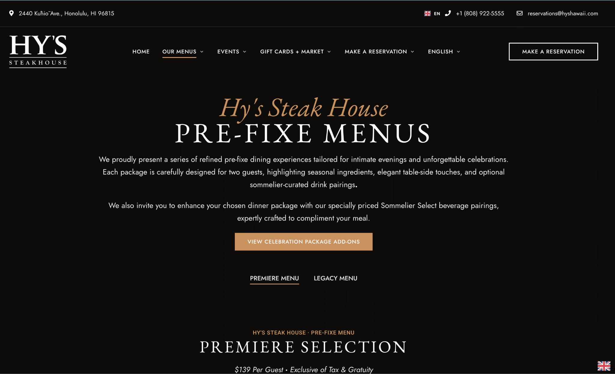
Hy’s Steakhouse wants its customers to know what they’re getting on the menu, promoting its pre-fixe menus, happy hour menu, and others in multiple languages, with descriptions and pricing for all items to add some transparency.
21. Gopro
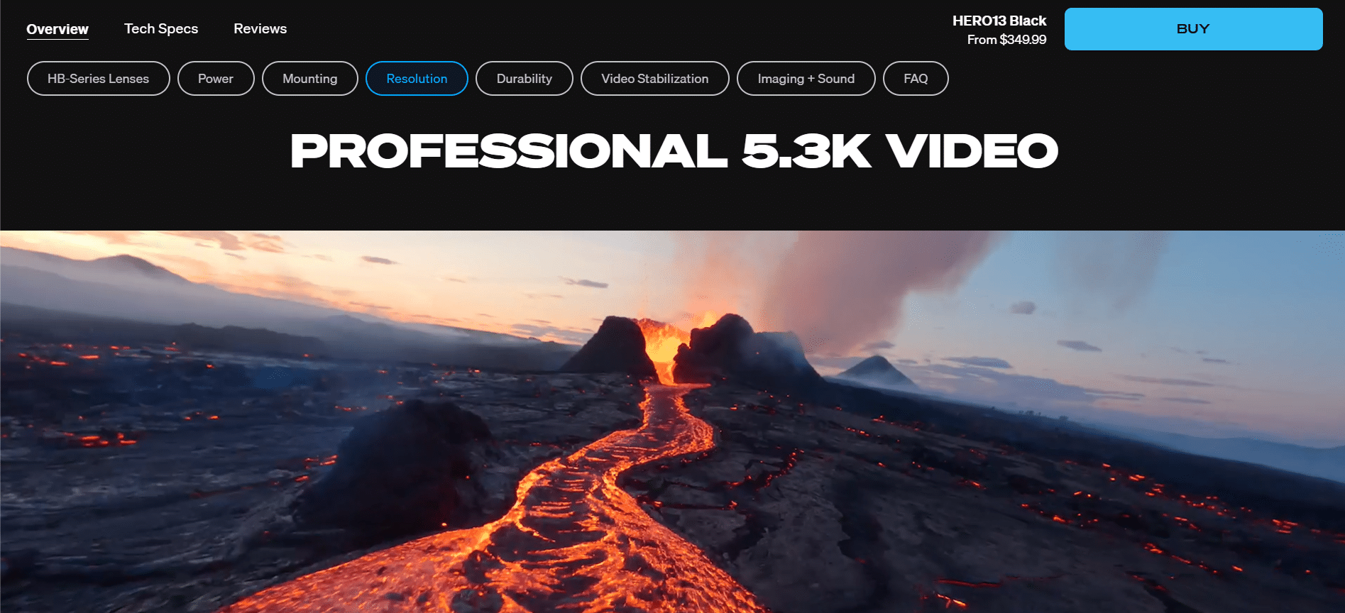
Gopro knows that their target audience is highly visual and wants to see examples of the product in action. For this reason, they diverted from the traditional PDP ecommerce layout and had a more narrative driven PDP that shows the real world examples of the products key features. And since the page is pretty long, they have a secondary nav with buttons for each content/feature section, allowing users to easily be anchored to the content they care most about without tons of scrolling.
22. Mooala
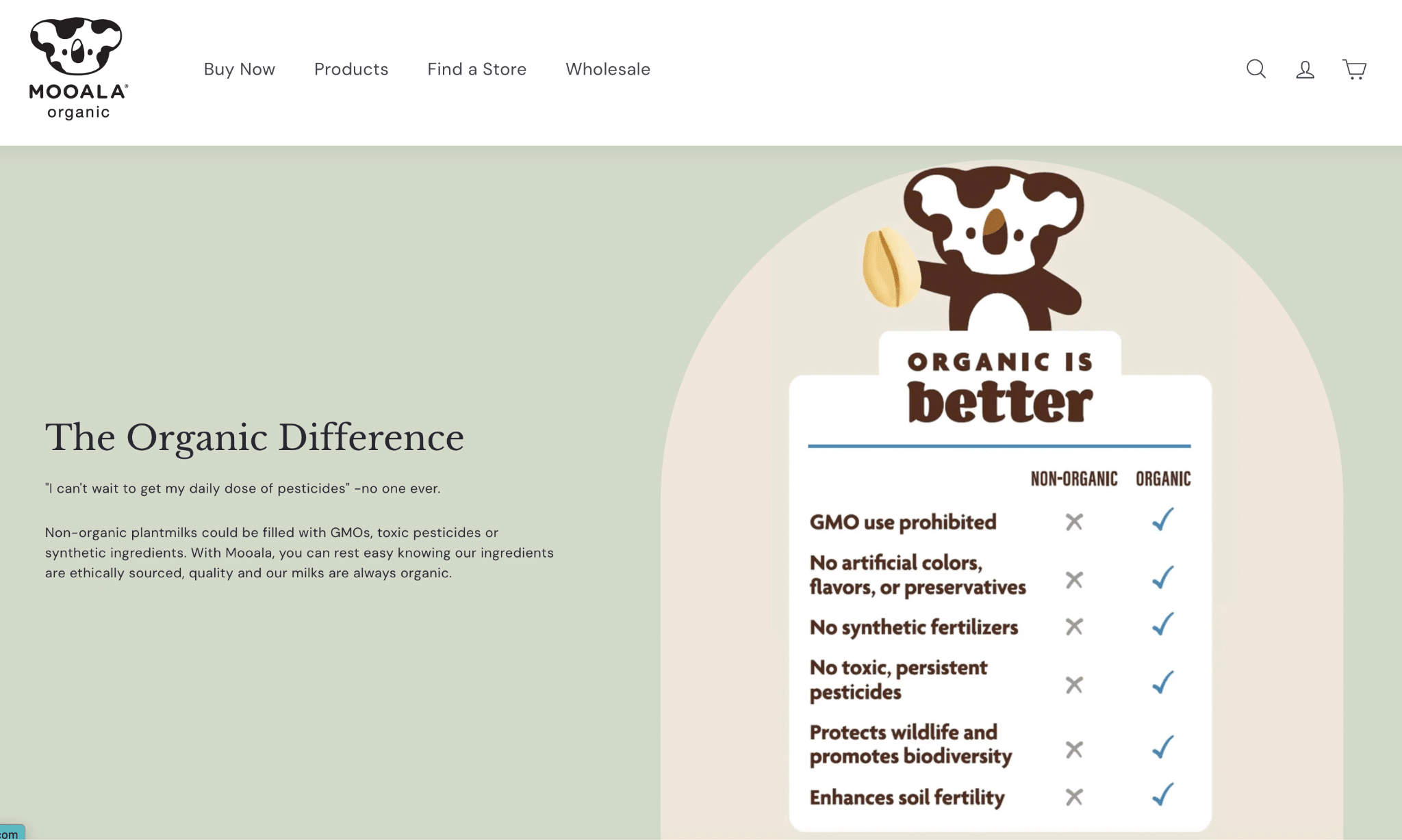
Mooala is an ecommerce brand specializing in organic “plantmilks.” Its main landing page (homepage) succinctly describes and showcases its products while differentiating it from competitors, with plenty of CTAs to “Shop Now” and a newsletter signup at the bottom.
23. Peak Design
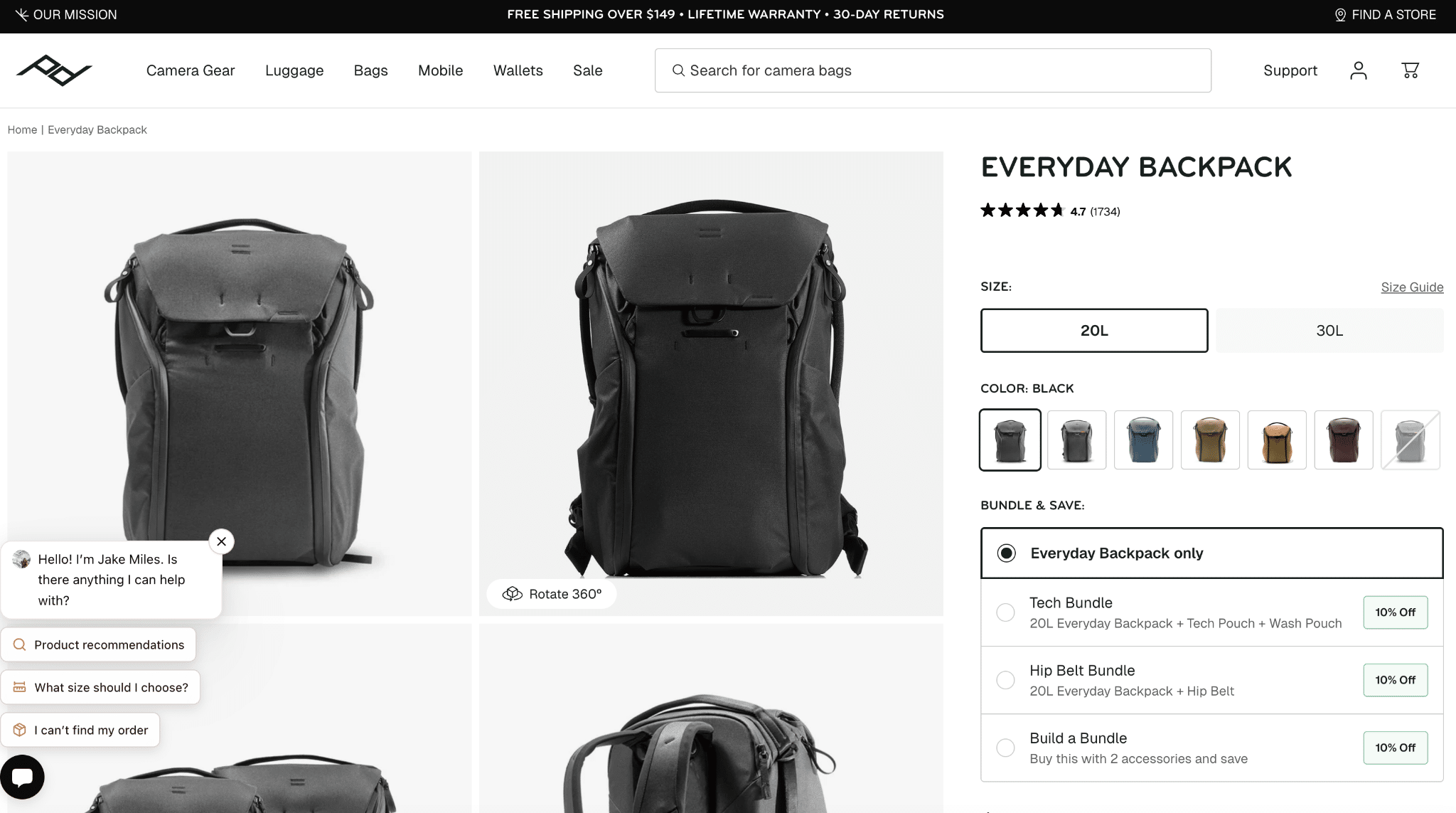
Peak Design provides many details about its products on each page, with size, color, and bundle options, as well as high-quality product images, a rich, well-structured description that encourages clicks with internal links, and recommended accessories to maximize cart value.
24. Allbirds
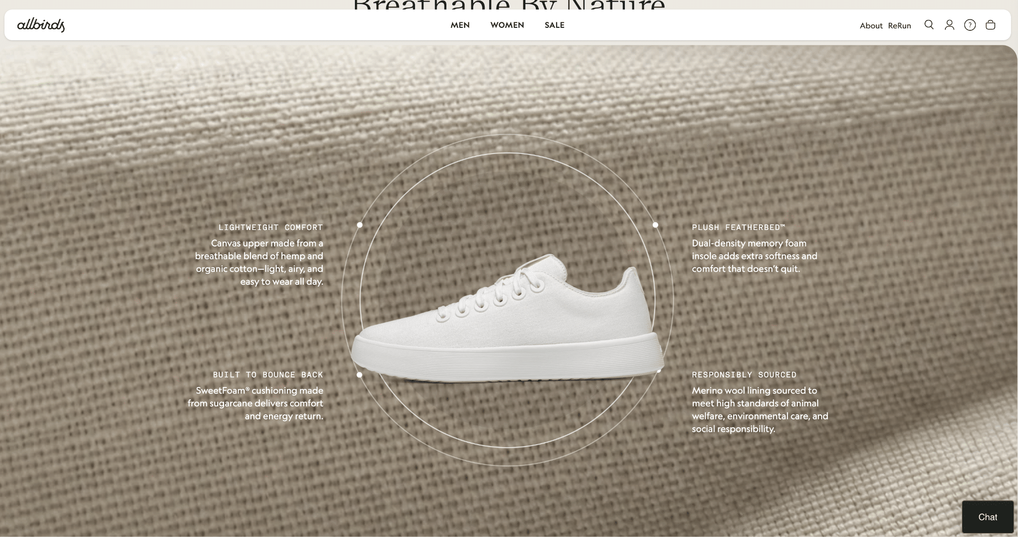
Allbirds’ apparel brand features animated landing pages that highlight specific features, include the “why” behind the product, detail materials and sustainability, and even add care instructions.
25. Fabletics
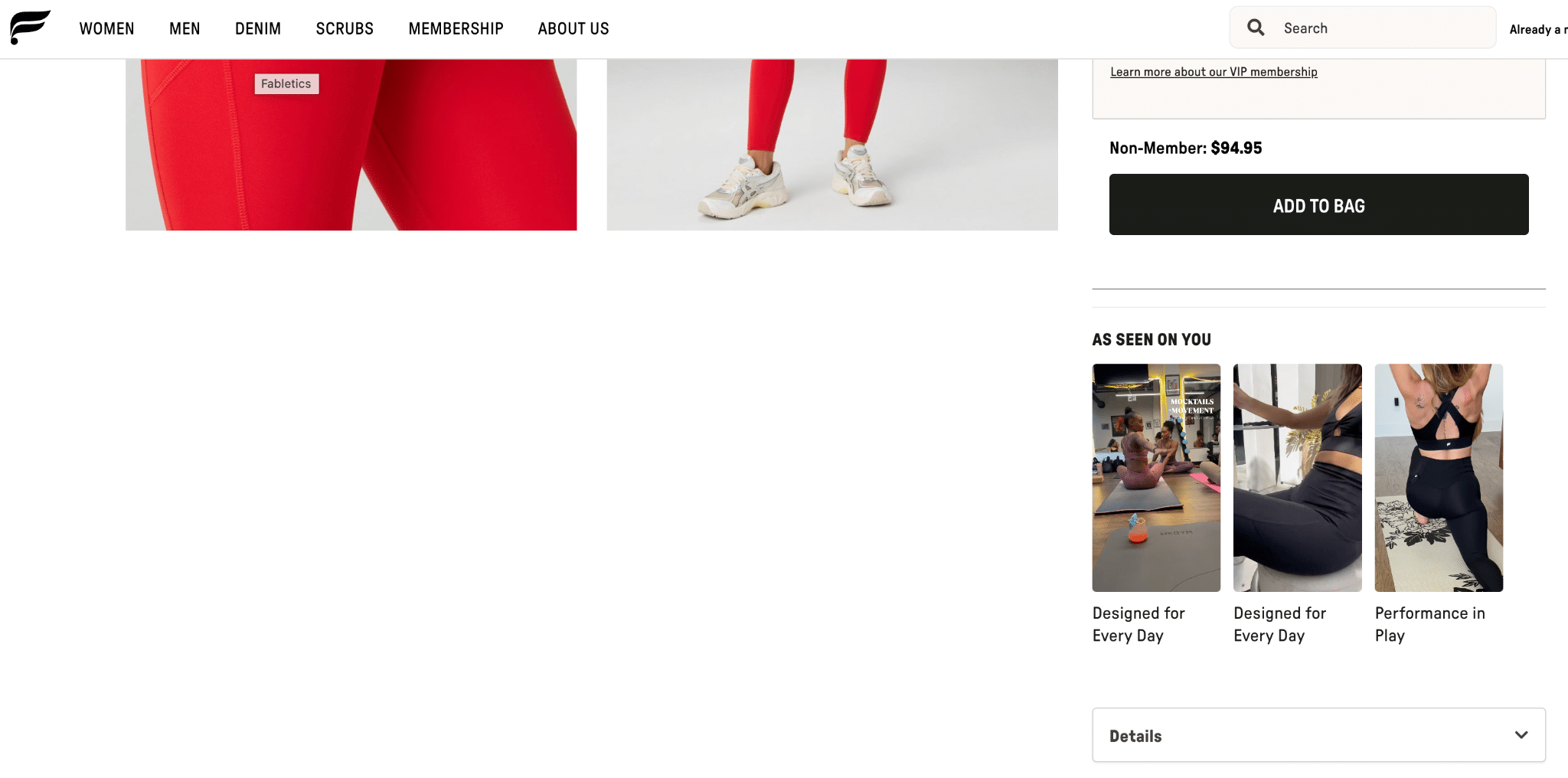
Fabletics uses video in a slightly different way–showcasing different product offerings in action to promote its leggings subscription service.
26. REI
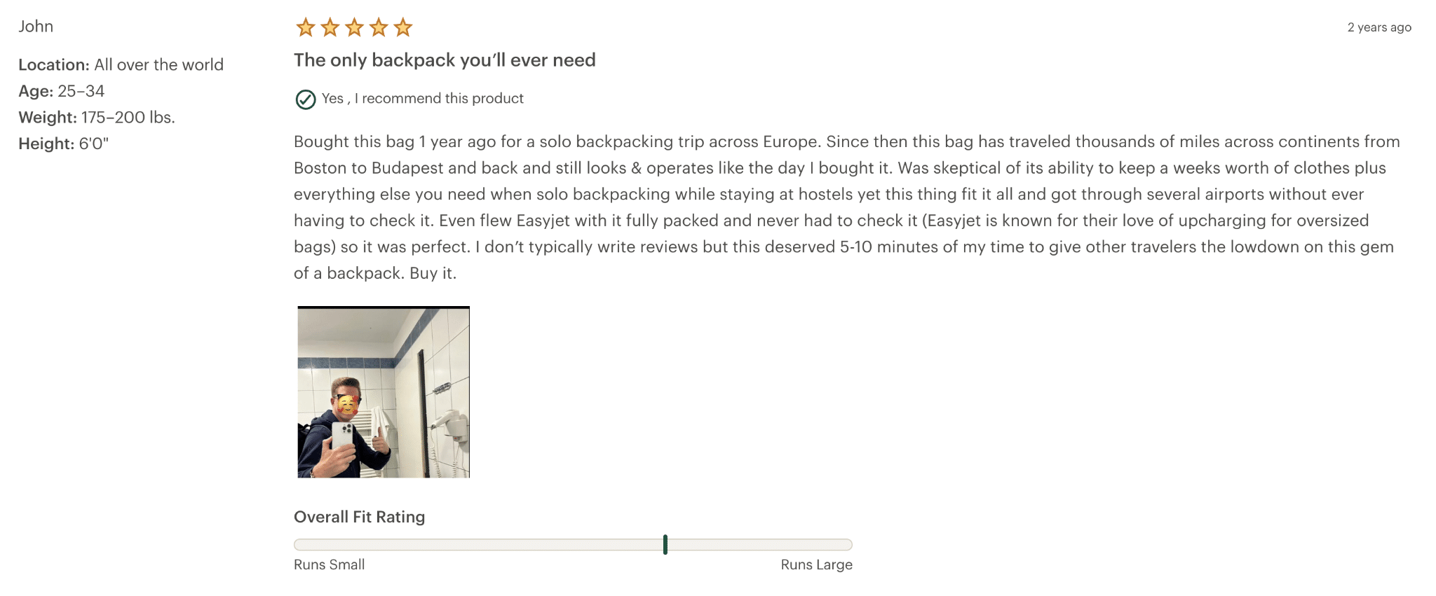
REI’s product pages do a lot more than simply describe and show off their products, with review sections below allowing customers to not only share a star rating and a comment, but also photos and an extra “fit rating” to help customers make a decision. Additionally, when a product is sold out, they immediately point you to similar products that are still currently available. This helps ensure you don’t lose potential customers just because their first option wasn’t available.
27. Zumba
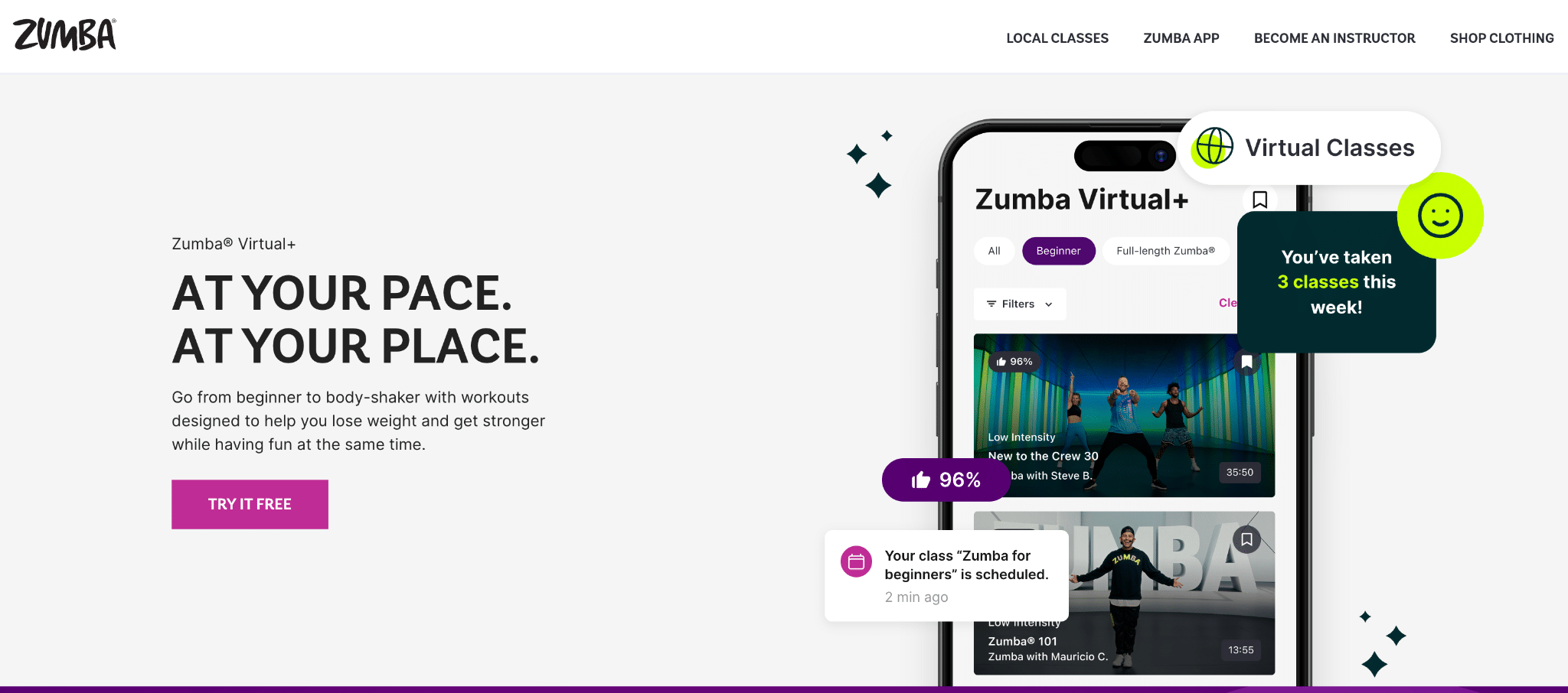
Zumba has a landing page to encourage more downloads of the Zumba app. Each section of the page details the specific benefits of the product and how to use it to supplement its classes.
28. Ethel’s Baking Co.
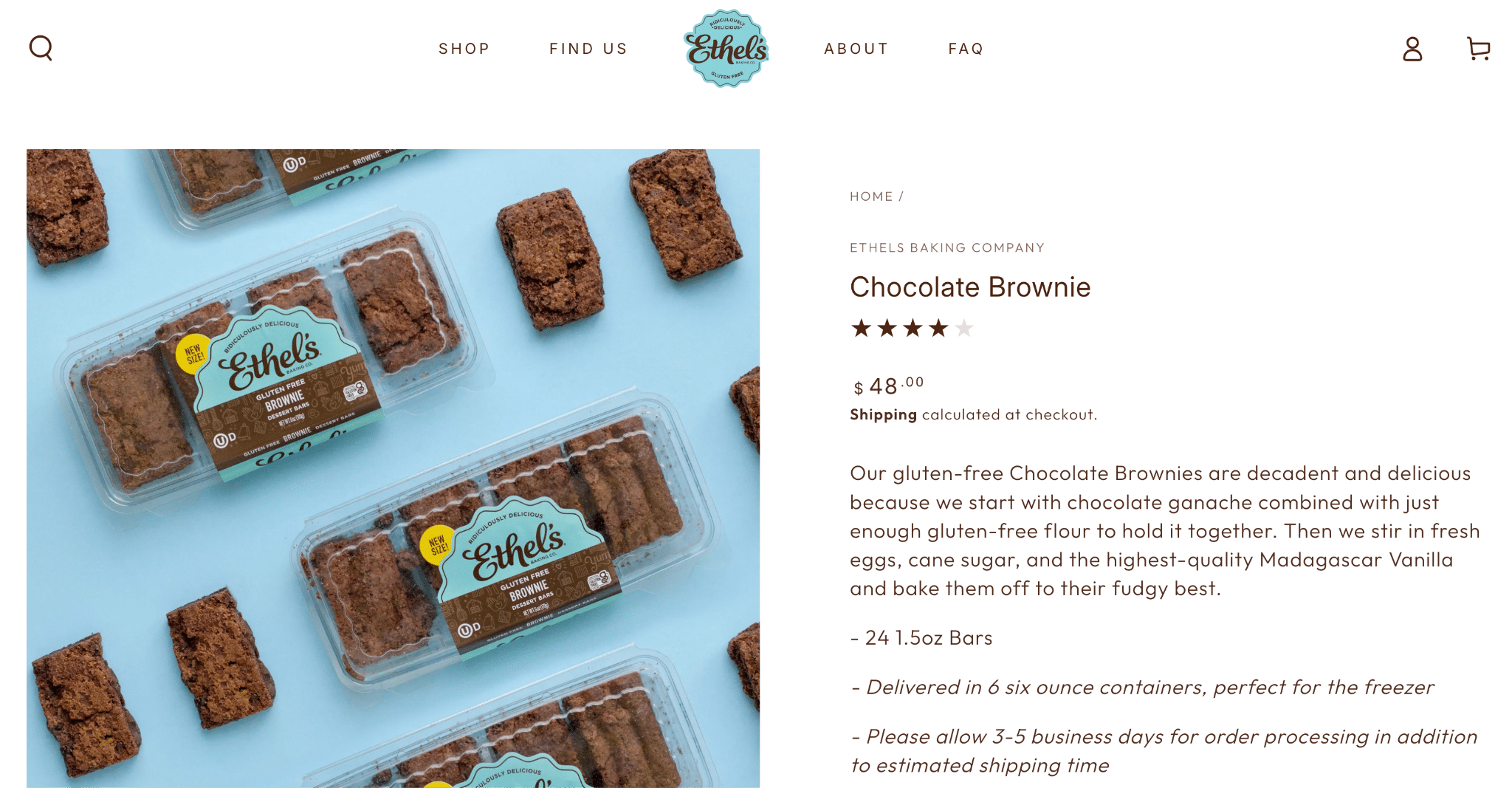
Featuring high-quality, appetizing product images, a detailed description, reviews, and recommended similar products, this landing page from Ethel’s Baking Co. shows an understanding of what its customers look for in baked goods products.
What to Borrow From These Examples:
Want to build a winning product- or service-based landing page? You can take the following advice from these examples:
- Use high-quality product images
- Make personalized recommendations for similar products or services
- Include plenty of social proof in the form of reviews and star ratings
Common Landing Page Mistakes
There are some key mistakes that can hinder a landing page. Let’s list these along with some helpful fixes:
| Mistake | Why It’s a Problem | The Fix |
| Too Many CTAs | Having too many CTAs on a single page can confuse users and make it unclear which action they should take | Use only one main CTA on each page, whether it’s to “Sign Up,” “Download the Ebook Today,” or another conversion |
| Weak Headline | Headlines might not clearly establish the value users get, which can lead to drop-offs | Keep your headline clear with an immediate value proposition |
| Poor Message Match | A landing page’s content might not align with the ad or SERP result that got them there, culminating in a high bounce rate and no conversions | Make sure each page matches the message of ad copy and search results to keep people moving down the funnel |
| Slow Load Speed | Pages that take longer than about 2.5 seconds to load will hinder the user experience and keep people from converting | Optimize images and text content to avoid taking too much time to load and optimize for Google’s Core Web Vitals |
| Too Many Form Fields | Giving people too many fields to fill on lead forms will increase friction and result in fewer completions | Only ask for critical information to collect for audience segmentation and personalization in lead forms |
| No Social Proof | A lack of reviews and testimonials from previous customers can reduce credibility | Include quotes from customers and, if applicable, a dedicated testimonials page |
| Generic Stock Imagery | Clearly unoriginal images will further reduce credibility and prevent you from standing apart from competitors | Create new images, including photos of your business and offerings, as well as behind-the-scenes footage and photos of your team |
| No Mobile Optimization | Neglecting mobile users could minimize conversions from smartphone and tablet users, especially if the user experience suffers on mobile devices | Keep your landing pages mobile-responsive and optimize SEO for mobile-first results |
| Unclear Offer | A landing page with a vague offer won’t encourage people to take the next step | Make your offer clear from the start, establishing what your audience gets from you over your competitors |
| Sending Paid Traffic to Homepage | Your homepage is there to help boost brand awareness, not convert people who find you through targeted, campaign-specific ads | Send all of your ad traffic to corresponding landing pages to both drive conversions and enable you to more easily track campaign performance |
FAQs
1. What is the difference between a landing page and a homepage?
Landing pages and homepages have unique differences to consider. The main difference is that a landing page promotes a particular offering, event, or business location, while a homepage has the main goal of introducing people to your brand. They also have different components branching from these purposes, including traffic sources and navigation.
2. What makes a landing page high-converting?
There are multiple factors that make a good landing page, including:
- User-friendly layout
- Benefit-driven headlines
- Single, clear CTAs
- Social proof in the form of testimonials and reviews
3. What is a good landing page conversion rate?
The definition of a “good” conversion rate for a landing page will depend on the types of landing pages, the goal behind them, the website’s industry, the brand’s maturity, and other elements, but a generally good conversion rate for these pages is around 2% to 5%.
4. How do you optimize a landing page?
You can take multiple steps to continually optimize a landing page for better performance, such as using A/B testing to try two different elements on a page, regularly measuring performance data against your goals, and implementing more targeted messaging to establish a stronger connection with audiences.
Build Some of the Best Landing Pages With Ignite Visibility
The top landing pages combine all of the right best practices to get lasting results, converting their target audiences with high-quality content, compelling offers, clear CTAs, and convenient forms. When building your pages, it’s best to work with professionals with plenty of experience.
Ignite Visibility can give you the support you need to develop winning paid media campaigns and corresponding landing page content that keeps people moving to the bottom of the funnel.
With our help, you’ll be able to:
- Put together comprehensive, highly targeted paid campaigns
- Connect ads and search results to relevant landing pages
- Optimize pages to convert traffic into high-intent customers
- Monitor performance for consistent optimization
- And more!
Want to find out how we can elevate your strategy? Learn more about our conversion rate optimization services to discover what our team can do for your business online.