Want to increase your conversions? You are in the right place. This is my quick method for reviewing and making conversion rate optimization recommendations for a website, using Google Analytics.
Sometimes the best tools are the ones that we already use. Even better, those tools are often free.
That’s the case with Google Analytics. It’s a tool that you’re (hopefully) already using, but might not be using to its full potential.
Start With the Age Breakdown
GA tracks a wealth of demographic information about the people who visit your site. That includes the age range of your visitors.
Fire up GA and click on “AUDIENCE” on the left-hand sidebar. Then, select “Demographics” from the drop-down menu that appears below. Finally, select “Age.”
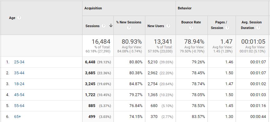
In the report on the right-hand side of the screen, you’ll see a table that displays the age breakdown of people who’ve visited your site. It will appear just below the line graph at the top.
That table gives you quite a bit of information about visitors in each age group, such as the number of sessions they started, how many of them are new users, and their bounce rate.
If you’ve set up goals, you’ll also see conversion rate information in the table. That metric will give you some insight for opportunities.
For example, you might find that visitors in the 45-54 age group have the highest conversion rate but they’re the fewest number of visitors overall. Immediately, you should look for a way to reach more people in that age group (such as with display advertising).
View the Gender Breakdown
Just below “Age” in the “Demographics” menu you’ll find “Gender.” Click on that to uncover some more ideas to increase sales.

You’ll see conversion rate information in the table if you’ve configured GA properly. Go over it to find marketing opportunities.
For example, you might see that men are converting at a much higher rate than women. That means you should target advertising to men as a way to boost sales.
Also, you should do a little bit of research to find out why women aren’t converting at the same rate as men.
View the Affinity Categories
While you’re in the “AUDIENCE” section, click on “Interests” and select “Affinity Categories” from the menu that appears below.
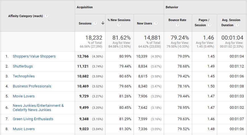
The table that appears at the bottom of the main screen breaks down your visitors by their interests. It’s likely that you’ll find quite a few lines in that table unless your market consists of people who share a common interest.
Take a look at the affinity categories that have the highest conversion rates. If you notice that some of them are noticeably higher than the others, then once again it’s probably a great idea to do some display advertising that targets people in that category.
Also, you might be surprised that people in one or more categories don’t convert very well. If that’s the case, do some research to find out why.
View the Geographic Breakdown
Also in the “AUDIENCE” section, you’ll see a “Geo” menu item. Click on that and select “Location” from the menu that appears below.
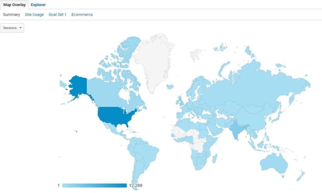
You’ll see a map on the right-hand side. It’s color-coded to show you where most of your visitors come from.
Below that, you’ll see a table that should look pretty familiar to you by now. It gives you a breakdown of your visitors by geographic region.
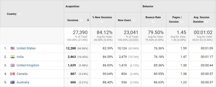
Take note of where you’re getting most of your visitors from. It’s likely that, on a global scale, most of them are coming from the United States.
If you want more detail on where in the U.S. your visitors are coming from, then just click on the “United States” link in the table.
Now, you’re looking at a state-by-state breakdown. It’s also an excellent way to look for growth opportunities.
For example, if you’re selling saltwater fishing tackle and finding that most of your conversions come from New Jersey, run a display ad campaign that focuses on fishermen who live in that state.
View the New Vs. Returning Breakdown
Another great report to check out is the New Vs. Returning breakdown. You can find it under “Behavior” in the “AUDIENCE” section.
Follow the drill as before. Take a look at your conversion rate for new and returning customers. Is there a wide discrepancy? If so, which one has the higher rate?
If you find that returning visitors convert at a much higher rate than new visitors, you should ramp up your retargeting campaign. Clearly, people who’ve had a chance to think about what you’re offering and come back for a second look are great candidates for conversion.
Also, consider a more aggressive approach to email marketing if returning visitors convert at a much higher rate. Offer a coupon code to people who join your mailing list and advertise that deal prominently throughout your website.
Another great thing to do with the New Vs. Returning report is to view the source for acquisition as a secondary dimension. Just click on the “Secondary Dimension” dropdown at the top of the table and select “Source” from the list that appears below.
If you find that some of your best converting customers come from Facebook, then that’s a great indicator that a little more Facebook advertising to the right demographic will give you a decent ROI.
View the Browser Breakdown
One very often overlooked report in GA is the browser breakdown table. It’s too bad that so many webmasters ignore it because it offers a wealth of info about technology related issues.
You’ll find the report under “Technology” in the “AUDIENCE” section. It’s called “Browser & OS.”
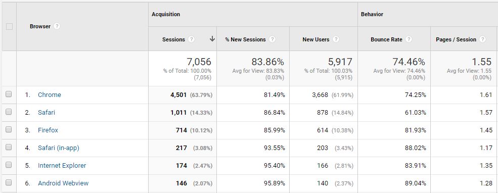
If you click on that, you’ll see the conversion rate by browser. If you notice that one browser has a very low conversion rate compared to the others, then it could be an indication that your site doesn’t work very well on that browser. In that case, do a little bit of extra research and hire a development team to fix your site if you find any problems.
View the Mobile Breakdown
Click on “Mobile” in the “AUDIENCE” section and select “Overview” from the menu that appears below. Once again, study the table on the right-hand side of the screen for opportunities.

For example, you might find that your mobile conversion rate is significantly lower than your desktop conversion rate. If that’s the case, it could point to a user-hostile experience for mobile visitors. That’s something you’ll want to get fixed.
You can also view the “Devices” report underneath “Technology” as well. That will give you a breakdown of visitors by mobile brand and model.
Again, look for significant discrepancies. If you find that Apple users are converting at a great rate but Android users are hardly converting at all, then you might have some design issues.
View by Source
Thus far, all of the reports we’ve looked at are in the “AUDIENCE” section. Now, let’s take a look at a couple of reports in the “ACQUISITION” section.
Click on “All Traffic” and select “Source/Medium” from the drop-down that appears. The table at the bottom of the main screen will show you a breakdown of where your traffic comes from.

Take a look at the sources that give you the best conversion rates. Look for ways to increase sales.
For example, if you see that people who arrive at your site from a Google organic search convert at a high rate, then run some search ads and see if you can add to those conversions.
Alternatively, if you see that people are converting from email marketing messages, then ramp up your email game.
View by Social Media Conversions
While you’re in the “ACQUISITION” section, click on “Conversions” underneath “Social.” The table that appears will give you a breakdown of your conversion rate by social media channel.
If you see that one social media site gives you a much better conversion rate than the others, focus some more social media marketing on that site. Consider running ads as well.
View the Behavior Flow
In the “BEHAVIOR” section of GA, you’ll find the “Behavior Flow” menu item. Click on that and you’ll see a graphical report on the right-hand side of the screen.
That graphic shows you how people traverse throughout your site. It’s different for every website.
You can see here the page at the top as way too much red, that is a clear red flag. Now we know we should focus on retaining visitors from the page, or implement a marketing strategy that accounts for this drop.
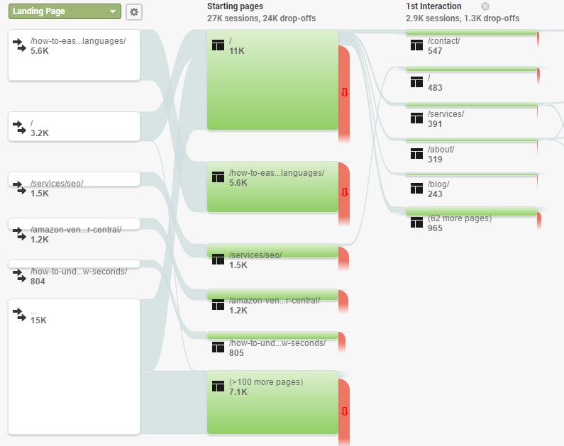
Let’s look at an example…
You might find that a lot of visitors hit your home page and then go straight to the “About” page or the “Contact Us” page.
That report will also show you how many people drop off from a given page.
If you find that people are dropping off your home page at a high rate, then you’ve just found an opportunity. Look for ways to improve the marketability of your home page so that you can reel in more customers.
Also, view the report for a dominant path. Is there a series of pages that people who visit your site prefer to follow? If so, you have just determined your best funnel and now know your what the most profitable path is. To take that a step further, you might choose to look at that path by browser, device, location, and then analyze it, and make adjustments accordingly.
View the Landing Pages Breakdown
While you’re in the “BEHAVIOR” section, click on “Site Content” and select “Landing Pages” from the menu that appears below.
Take a look at the table on the right-hand side. That shows you a breakdown of your landing pages.

Landing pages are appropriately named because they’re the pages people “land” on when they visit your site.
GA displays how well each landing page is converting. Use that info to look for opportunities to increase conversions.
For example, you might find that one page is converting very poorly compared to the others. Visit that page and look for a design problem that makes it difficult for people to complete the purchase.
Also, use the table to find out which pages have the highest bounce rate. It might be a good idea to add an exit-intent popup to those pages to see if you can convince those visitors to hang around for a little longer. Or perhaps create a distinct set of remarketing ads that serve to that person.
Review Top Exit Pages
Another report that is very important to look at is your top exit page report. This one shows you the pages which people most often abandon your website from. This often shows pages in a checkout process, important landing pages or even contact forms. It can be a very strong indicator that the area of the website needs evaluation and testing.
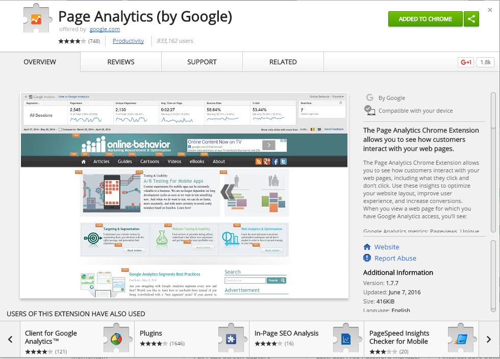
Review In-Page Analytics
One of my favorite reports in Google Analytics is the in-page analytics report.
This is only available now via a chrome plugin, but it is still great all the same.
As you can see below, the report allows you to see the click-through rate for every link on the page. This is a great way to evaluate a landing page. Run this report on your home page and top landing pages, it will allow you to see if people click on your links, or if they are skipping over them.
Recently, I reviewed a home page found that the most clicked on link was the “help” section. I was then able to go to the help page and see what people clicked on most there.
This allowed us to determine some really important information that was missing from the home page, which lead to higher conversion rates.
View Page Timings
Click on “Site Speed” in the “BEHAVIOR” section and select “Page Timings” from the drop-down that appears below. The report that appears on the right-hand side of the screen tells you how fast your site is loading on a per-page basis.

If you find that there are any pages that take longer than 2 seconds to load, then you’re hurting your sales. Visitors expect pages to load in less than 2 seconds. Every additional second a page takes to load reduces your conversion rate by 7%.
The report should show all green bars. If you’re seeing a lot of red bars on the screen, then you need to get in touch with a development team to improve your site speed.
Use Google Analytics To Improve Your Conversion Rates Now
These are just a few of the more simple ways you can use Google Analytics to do a quick conversion audit.
By doing a simple Google Analytics audit you can fix errors, refine funnels and determine where opportunity exists on the site.
Did you find this helpful? Can you see yourself using these strategies to increase conversions?


