
You’ve probably thought about your desktop SEO a lot. But have you given just as much thought to your mobile SEO? With more and more internet users connecting via mobile devices, mobile search engine optimization is critical in helping you connect with all audiences online.
In this mobile SEO guide, SEO Strategist Ray Day will go into what mobile SEO is, some of the main elements to include in your efforts, and a few tools that can simplify optimization for your website.
What You’ll Learn
- What is Mobile SEO?
- Does Mobile-First Indexing Impact My Rankings?
- 5 Key Elements of Mobile SEO
- Mobile SEO Guide: Common Mistakes to Avoid
- Mobile SEO Tools to Boost Your Campaigns
My Expert Insight on Mobile SEO
The number of global mobile users continues to increase exponentially, and 73.62% of Google visitors come from mobile devices. Therefore, you need to optimize your SEO campaigns for mobile users to get and stay ahead of competitors online.
Without effective SEO for mobile phones, you’re missing out on a crucial opportunity to connect with mobile audiences, regardless of your industry.
By making your website mobile-responsive, ensuring page loading speeds are at their fastest, and optimizing for mobile searches, you can harness the power of mobile SEO to maximize your rankings and reach on search engines.
Let’s look further into these strategies and what they entail.

What is Mobile SEO?
Mobile SEO is the process of optimizing your website to improve its mobile responsiveness. A variety of tactics are used in an attempt to increase rankings on Google and other search engines. This process largely relies on using traditional on-page, off-page, and technical SEO elements, but it also improves your user’s mobile experience to boost engagement and attract new visitors.
Mobile SEO vs Desktop SEO
While very similar to desktop SEO, mobile SEO has a few notable differences to keep in mind. Mobile SEO tends to focus more on the user experience and optimizing content for mobile searches. Most of the time, mobile users are searching for quick information. They need fast-loading pages, a responsive design, and touch-friendly navigation. They don’t have time to figure out how to navigate an unfriendly website.
For instance, the layout of search engine results pages (SERPs) is different for mobile devices, as they need to appeal to smaller screens and tend to emphasize visuals. Location data also tends to influence search results more because of the GPS accuracy of mobile devices over desktops.
On the other hand, desktop SEO can incorporate elements that display nicely on larger screens and require the use of a keyboard and mouse for navigation. Chances are, desktop users will spend more time on the site, consuming more detailed content. With desktop SEO, you can prioritize content-rich pages and aesthetically pleasing layouts that require more space.
The Role of Mobile SEO Services in a Digital Marketing Strategy
Regardless of the type of business you run, mobile SEO can have a huge impact on your website’s performance. You’ll connect with more users who might otherwise not find you, create the ideal mobile experience to keep users engaged once they land on your site, and ultimately dominate competitors that aren’t as mobile-optimized.
Mobile SEO is especially important for brick-and-mortar businesses that want to cash in on local searches. For example, if you’re a pizza restaurant, you should absolutely optimize your site so that it comes up first when someone uses their cell phone to search “pizza in [neighborhood].” If you don’t, you’re missing out on valuable traffic!
Does Mobile-First Indexing Impact My Rankings?
Yes.
Mobile-first indexing is how Google’s algorithm approaches search engine rankings, meaning that search engine bots crawl mobile websites before desktop versions, whereas the old-fashioned algorithm used a desktop-first model.
Mobile-first indexing takes into account a website’s user-friendliness and overall responsiveness when indexing. Because of this, you must focus on making your website ideal for mobile users along with their desktop counterparts. Otherwise, simply optimizing for desktop devices could compromise your rankings.
This doesn’t mean you can set it and forget it. Even if you’ve fully implemented mobile-first indexing, you should continue to optimize your site. This will help you maintain your ranking even when the algorithm shifts or changes.
6 Key Elements of Mobile SEO
The following are some of the main elements of a strong mobile SEO strategy, along with some tips to help you get the most from them:
1. Responsive Design
A critical part of mobile SEO is a responsive design. Your website needs to be able to adapt quickly to mobile devices.
You can facilitate mobile responsiveness by maintaining your HTML file while using CSS to modify the page’s layout based on the size of the user’s screen. In turn, regardless of whether a user is on a desktop, smartphone, or tablet, they’ll see a website that corresponds to that device.
When working to create a mobile-responsive site, it’s best to maintain the same URL for all versions of the site, as opposed to designating a separate “www.yoursite.com” and a mobile-specific “m.yoursite.com” domain.

2. Mobile-Friendly Content
Your website’s content must also work for mobile users, with text and images that properly fit mobile screens for easy viewing.
For example, you can use short paragraphs that read better on narrower screens. Meanwhile, make sure image placements won’t disrupt the flow of content for mobile users.
Understand the importance of Content Delivery Networks (CDNs). CDNs can improve load speed and reduce latency to enhance user experience. Leveraging them can be especially important for content that will be distributed globally.
Image and video sizes should also fit mobile devices for a fully responsive user experience.
3. Page Speed
Users across all devices want to visit websites that load fast, but this can be more of a challenge for mobile users. Keep in mind that while the ideal page load speed is one to three seconds, web pages on mobile devices load 70.9% slower than they do on desktops.
Google used to automatically enable faster mobile loading through Accelerated Mobile Pages (AMPs), but the platform is moving away from the AMP model to focus on new technologies and practices.
Instead of optimizing for AMPs, you’ll need to optimize PageSpeed in accordance with Google’s Core Web Vitals guidelines. With the help of Google Search Console reports, you can monitor your web pages’ loading speeds and subsequently make any necessary improvements.
When running a report, you can see multiple factors that influence page speed, with a breakdown of each:

Optimizing image file sizes, text, and other elements on your page can help you increase page speed to improve the user experience and, subsequently, image SEO.
4. User Experience (UX)
Your website’s mobile UX is also essential in boosting your site’s rankings on search engines. If people don’t continue to navigate your website after landing on it, this could negatively impact your SEO as Google doesn’t find it helpful to users.
Make sure your site is mobile-ready with optimized mobile navigation and overall usability. Can a smartphone user enjoy the same experience as someone on a tablet? Do objects on a page seem seamlessly integrated on a desktop but actively obstructive on a mobile screen?
You can improve the user experience for mobile by reducing clutter on each page and using various touch-friendly design elements. For instance, the buttons you use on each page should be responsive and make it easy for mobile users to tap on them, effectively carrying them to the next stage of the buyer’s journey.
5. Local SEO
If your business is locally based and you need to target audiences in specific areas, local SEO is everything.
Local SEO is particularly important for mobile devices, seeing as most local searches come from mobile devices.
You can optimize for mobile local SEO in a number of ways, such as:
- Getting relevant citations in directories
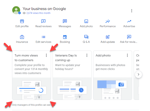
- Developing your Google Business Profile
- Using local keywords for mobile-friendly landing pages
- Creating mobile-responsive location pages
- Allowing for customer reviews
6. Conversational AI
With more and more people relying on voice search through devices like Amazon’s Alexa or Siri, it’s critical that you optimize your content to match those searches.
Voice search optimization requires:
- Using conversational language
- Incorporating long-tail keywords into your content
- Providing clear and concise answers to important questions
- Creating a FAQ page
- Using question-based terms that people would use when using a voice-activated device to search the web
Mobile SEO Guide: Common Mistakes to Avoid With Mobile SEO
Mobile SEO isn’t without its pitfalls. Knowing how to avoid these can help you get the best possible results with your strategy. Let’s get into some of these mistakes.
1. Blocking Content
One potential issue could involve blocking JavaScript, CSS, and images on your site. Ensure these elements are accessible and visible to mobile users, which will help Google bots crawl them for indexing while enhancing the mobile experience.
2. Using Non-Supported Mobile Elements
Websites might also use Flash or other formats that aren’t compatible with mobile devices. Only use formats that work well with these platforms, such as plain text and HTML for text content, MP4 and H.264 video formats, MP3 and MP4 audio formats, and PDFs or EPUBs for text documents.
3. Poor Site Structure and Navigation
Mobile sites should be easy to view and navigate for users across all devices. Optimize your site’s responsive design and test it while also allowing for ease of navigation across the site.
4. Slow Mobile Page Speeds
If pages take too long to load, visitors on mobile sites won’t likely stick around. You can keep them glued to your content by optimizing images and other content to minimize page load times.
Pro-Tip: Reduce the amount of JavaScript and CSS bloat on your page, as excessive use of these tools can significantly slow down your site. Implement lazy loading for images and use next-gen image formats like WebP to streamline load speed.
5. Not Optimizing for Local Search
Local businesses must do what they can do optimize for local search. Having local listings, up-to-date Google Business Profile information, and other locally optimized content will help dominate local SEO. Filling your profile with pictures, posts, and reviews will improve your location-based search efforts.
Mobile SEO Tools to Boost Your Campaigns
Here are a few helpful mobile SEO tools I recommend for optimizing mobile sites:
- Google PageSpeed Insights: Use this helpful tool to gauge your web pages’ loading speeds, including a detailed assessment of Core Web Vitals and performance issues slowing your site down.
- Google Search Console: Get in-depth mobile reports using this platform, including Core Web Vitals and general performance reports, along with instructions for how to fix certain issues.
- Lighthouse: This open-source tool will audit your page and generate a report of its successes and failures. Once you know what isn’t working, you can fix it to improve your site’s mobile experience.
- WebPageTest: Test your mobile speed using this free tool. It will test and analyze your mobile SEO and help you improve your website loading speed. This will help you monitor mobile SEO strategies and find ways to improve them.
- Bing Mobile Friendliness Test Tool: See how your website would perform on Bing for mobile users, complete with a preview of your site on a smartphone screen and a checklist for various elements.

Of course, with AI getting more and more involved in digital marketing, there are also some great AI-driven tools to help improve your mobile SEO.
- ChatGPT: When you use the right prompts, ChatGPT can provide valuable insight to improve your structured data markup, analyze loading speed, and improve the mobile experience of your site.
- SurferSEO: SurferSEO will provide you with tips on how to properly format your content, as well as optimize your site for voice search.
Elevate Your Mobile SEO Campaigns With Ignite Visibility
Want to succeed with mobile SEO? Ignite Visibility knows how to develop the ideal strategy for desktop and mobile users alike using innovative tools and best practices.
Our comprehensive mobile SEO services encompass all aspects of search engine optimization, from desktop to mobile, helping you achieve top rankings in your industry.
With our help, you can:
- Develop mobile-responsive websites that create a seamless experience on every device
- Create mobile-optimized content that connects with these users
- Optimize page load speeds to keep users scrolling
- Connect with local users via in-depth local search campaigns
- Work through a mobile SEO checklist
- Teach you exciting and effective mobile SEO techniques
- And much more!
Want to experience these and other benefits? Contact us today and we’ll put you in touch with an expert to discuss your needs.
