Once upon a time, mobile SEO was a novelty. Now it’s a necessity.
Why? Because, according to Google, there are more searches on mobile devices than desktop computers. Also, Google is going to be ranking sites based on their mobile experience, not desktop!
That means if you don’t take mobile SEO seriously, you’re limiting reach to such an extent that you’re likely not even competitive.
It’s that serious.
Fortunately, there are plenty of ways that you can make sure your site ranks well with the mobile search engine results pages (SERPs). Here are a few of them.
-
Zip It Up
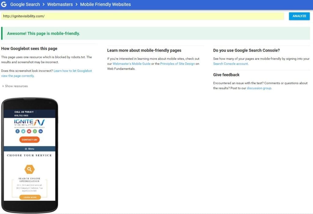
Perhaps you’re one of those frustrated webmasters who occasionally visits Google’s mobile-friendly testing tool or PageSpeed Insights tool only to find out that your site is reported as not so friendly to mobile users or shows a low score on the Mobile Speed test.
Although Google is kind enough to give you actionable recommendations as to how to fix the problem, you might think that the advice doesn’t make a whole lot of sense. That’s certainly understandable if you’re not a web developer.

One of the pieces of advice that you might notice from PageSpeed Insights is the recommendation to compress your website so that it loads faster. That’s what we call in the SEO business “low-hanging fruit.”
If you’re consistently scoring in the 20’s or 30’s on Mobile Speed with PageSpeed Insights, you’ll find that you can boost that score by as much as 40 points by just compressing your site.
Keep in mind, though, that the task of compressing your size isn’t something that should be left to a layman. Unless you’re extremely well versed in web technology, you shouldn’t try it on your own.
You could really mess up your website if you make a mistake while trying to compress it.
On the other hand, if you think you’re tech-savvy enough to give it a shot, you should do so immediately. You’ll spike your Mobile Score almost instantaneously.
Google loves fast sites, especially for mobile users who are often hampered by data connections. That’s why speed is important if you want to rank well in the mobile SERPs.
If you haven’t already done so, zip your site up so that you have a much better shot a ranking for keywords pertinent to your niche.
-
AMP It Up
AMP is an acronym that stands for Accelerated Mobile Pages. As the name implies, it’s a technology that enables web pages to load very quickly when viewed with a mobile device.
It’s also a great way to rank highly in the mobile SERPs.
Why? Remember from the section above that Google loves speed. That’s especially true when it comes to websites that are viewed with a mobile device.
Simply put: the faster the speed of your web pages, the more likely it is that you’ll rank well.
In addition to zipping your site, one of the best ways to give it some speed is to serve up AMP pages when people view it with a smartphone, tablet, or phablet.
Basically, the AMP pages are lightning-fast “alternative” pages that you only display to mobile visitors. People who are viewing your site with a desktop or laptop computer won’t see them.
How do you create this alternative pages? By using the so-called rel-amphtml tag.

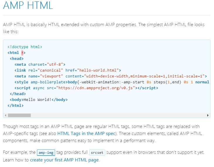
If you haven’t heard of that tag, it’s similar to the rel-canonical tag that you use when you’re informing Google about duplicate content. It looks something like this:
<link rel=”amphtml” href=”https://example.com/myamppage/”>
What does that do? It tells Google that you have an AMP version of the page that should be displayed to people with a mobile device.
Of course, before you do that, you should actually create an AMP version of the page. That’s basically a scaled-down copy with limited JavaScript, CSS, and imagery.
Once you’ve done that, give that new page a unique URL (a URL with “AMP” included somewhere in it is SOP) and then use that link in your rel-amphtml tag, as shown above.
Although the whole process sounds fairly tedious if you’ve got thousands of pages on your site, it’s really quite painless if you’re using WordPress. Just grab the WordPress AMP plugin, install it, activate it, and let the plugin handle the process of creating AMP-compliant pages and adding the appropriate rel-amphtml tags.
If you’re already using the Yoast SEO plugin (a great idea, by the way), you should also pick up the Glue for Yoast SEO & AMP plugin and use that as well.
The biggest benefit of AMP is that you can rank at the very top of the mobile SERPs. That’s because Google displays AMP results in a carousel that sits atop the organic SERPs.
Just recently, though, Google announced that AMP results will also appear in the organic SERPs. Given Google’s obsession with AMP, it’s likely that AMP pages have a much better chance at ranking well than non-AMP pages.
Important! Make sure to do a little CRO work on your AMP pages. When they launch, there is almost nothing on them and they kill your conversion rates. Here is what I did to the Ignite site.
See the calls to action at the top of the page?
-
Be Responsive to Increase Google Mobile Rankings Indirectly
Speed isn’t the only thing that matters when it comes to mobile users who visit your website. Usability matters as well. That’s why your website should be responsive.
If you’re not familiar with the word “responsive,” in this context, it means exactly what it sounds like it means. Basically, your website will “respond” to the size of the viewport that’s used to display it and present a user-friendly interface.
Honestly, if your mobile site is on a subdomain there will always be something lacking with your Google mobile rankings.
- You are more prone to technical errors.
- You are not using one URL.
- You could have analytics issues.
- Your social shares are on different URLs.
- I could go on…
-
Get Rid of Flash
There was a time, quite a while ago, when Flash was considered the next level of web technology. Now, Flash is more of a curse than a blessing.
If you’re stuck with a site that uses Flash to create a rich user experience, get rid of it in favor of something else (such as HTML5).
The best reason to divest yourself of Flash technology is because iOS doesn’t support Flash. Yes, Adobe has a workaround that involves HTTP dynamic streaming, but that just complicates the delivery of your content.
-
Add a “Contact Us” Page
One way to gain some favor with Google is to earn some trust. One way to earn trust is with a “Contact Us” page.
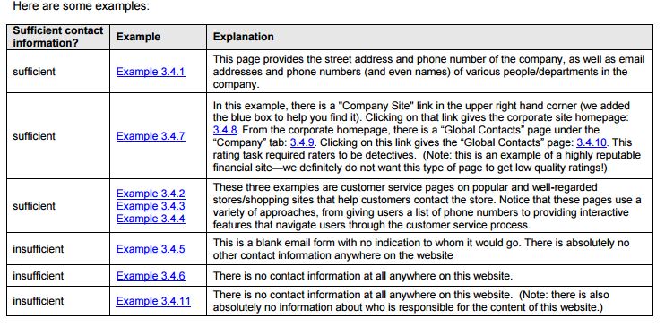
It may seem ridiculous that a “Contact Us” page might help you rank well, but the evidence is there. Check out Page 98 of the Google Guidelines. You’ll see this eye-opening paragraph:
Most websites are interested in communicating with their users. Usually, this means that websites offer paths of communication that at the very least include phone numbers and email addresses. High or highest quality websites will usually offer many ways by which users can get in touch, such as email addresses, phone numbers, and physical addresses. Sometimes, this contact information is even organized by department and provides the names of individuals to contact.

Note specifically the phrase about “High or highest quality websites.” If you want to have a quality website (and you do, if you want it to rank well), then you need a “Contact Us” page.
Also, feel free to add other contact information throughout the site as described in the paragraph above. That should help your site rank as well.
-
Do Mobile Keyword Research
Do you really want to rank well for particular keywords in the mobile SERPs? Then do some mobile keyword research.
Now, you might be asking yourself: “What is the difference between mobile keyword research and regular keyword research?”
A lot, actually.
Head on over to SEMRush and conduct a little experiment. Plug in the phrase “discount blue jeans” into the field on the front page and click the “Search” button.
In response, SEMRush will give you a list of sites that rank the highest for that phrase. Unsurprisingly, you see names like Overstock.com, Amazon.com, and Old Navy in the list under “Organic Search Results.”
As of this writing, Men’s Wearhouse is listed at #18.
Now, scroll back up to the top of the page. Next to the big, fat header that reads “Keyword Overview discount blue jeans,” you should see box that gives you the opportunity to click a “Desktop” or “Mobile” option. The “Desktop” option is highlighted by default.
Click on the “Mobile” option. Then, scroll down to the “Organic Search Results” again.
Look for Men’s Wearhouse. You’ll likely find that it’s not there.
Why? Because the folks at Men’s Wearhouse either have a website that isn’t quite as user-friendly as some of their competitors or the company didn’t optimize for “discount blue jeans” in mobile search.
That’s just one example. For some sites, you might find that absolutely no keywords show up in the mobile results. That means the site is very poorly optimized overall.
Tools like SEMRush are so valuable because you can not only use them for keyword research, but you can use them for mobile keyword research. That can give you a jump on your competitors.
In the case we just looked at, some savvy SEOs managed to push themselves ahead of Men’s Wearhouse in the mobile results. You might be able to jump in front of some of your big-name competitors with proper mobile keyword research.
Bonus Items: Increase Google Mobile Rankings
- Generate more links
- Focus on page speed scores of 80 or higher
- Make sure you have clean mobile usability reports
- Make sure your mobile user experience is 100% dialed in
- Give people a reason to search for you in mobile (contests, promotions, have a great product, etc)
More Resources
- Checkout our mobile SEO checklist
- Learn about all the different ways to rank in Google
- Mobile web design trends
- Learn more about mobile SEO
Put Your 99% of Your Focus on Mobile Right Now!
The Mobile Era is here and it’s not going away anytime soon. If you want to ensure that you have good Google mobile rankings you’ll have to pay attention to mobile SEO. Otherwise, you’re guaranteed to lose market share to competitors.

