A/B testing is one of the best ways to get meaningful feedback you can’t get anywhere else. However, running these tests without strategic direction can often lead to insignificant or incorrect results. By following A/B testing best practices, marketers can overcome the challenges of determining the right sample size, developing a clear hypothesis, and conducting sufficient testing to determine overall effectiveness.
In this blog, our CRO Sr. Strategist, Justin Kevalaitis, will explain what A/B testing is, why it matters, and how to run them successfully to get insights that will improve your messaging and increase conversions.
What We’ll Cover:
- What is A/B Testing?
- Benefits of A/B Testing
- 10 A/B Test Examples
- Top A/B Testing Tools and Resources
- Frequently Asked Questions About A/B Testing
My Expert Opinion on A/B Testing
One of the best ways to improve conversion rates is through A/B testing. Giving your audience a chance to tell you what resonates with them the most, gives you invaluable insight into their thought process. Using that insight, you can then craft copy, messaging, and images that are sure to increase conversions.
However, you can’t just run tests willy-nilly. Get to know your audience and craft a strategy behind your A/B tests. The more work you put in before your content rolls out, the higher the quality of your results will be.
Action Item: Take your most recent marketing campaign and run an A/B test using it as the control. Make a few changes to your graphics, copy, or header to produce your variation. Once your test is run, analyze your results. Which campaign performed better? Your control or your variable?

What is A/B Testing?
So, what is A/B testing in marketing? A/B testing is a randomized experiment that allows you to compare marketing assets side-by-side and see which one performs better. It’s an essential part of conversion rate optimization (CRO), as marketers often rely on it to determine how best to move people along the customer journey toward a sale or lead.
A/B testing involves creating multiple versions of your marketing assets, such as your website, social media posts, email marketing, video content, or paid ads, and sending a portion of your traffic to the control version and the other portion to one or more of your variants.
When it comes to A/B testing, it isn’t just the copy you can test. You can also test other things such as:
- Headings
- Subheadings
- Call-to-action buttons, both copy, design, and location
- Page copy
- Page structure
- Images
- Graphics
- Page navigation
- Subject line length
- Emoji v. no emoji
- Tone
- Image heavy vs. Text heavy
- Videos
- Personalization
- Time of send
A/B testing can be applied to any aspect or asset that may affect a consumer’s decision-making.
It’s never enough to settle for one A/B test. Doing so will give you limited data to work with and the elements you’re testing. The more you test, the more you’ll be able to learn about your target audience and uncover new ways to convert more visitors into leads, and more leads into loyal customers.

Benefits of A/B Testing
In addition to proving how A/B testing can impact your strategy in the short term, it can also help you prioritize how to proceed in the future.
According to Kyle Rush, VP of Engineering at Casper, “With A/B testing, you have so much more knowledge for what to roll out 3-to-4 years out.”
Here’s a high-level overview of some of the benefits you can expect with testing:
Improved user experience
A/B testing tools could help determine which UX elements on a web page, email, or other marketing materials create the ideal experience for users, encouraging them to engage with clicks and other conversion metrics.
Higher conversion rates
Higher conversion rates: An A/B testing project could ultimately help develop top-quality content with compelling copy and calls-to-action (CTAs) that lead to more conversions based on the desired action.
Lower bounce rates
A/B testing best practices will enable you to create engaging content that’s relevant to users’ needs, getting them to stay on landing pages for longer and, hopefully, move them down the sales funnel.
Reduced risks
Thorough A/B testing ultimately helps reduce risk by allowing you to make data-driven decisions. Rather than rolling out a change to your entire site, you can expose only a portion of your audience to the new version and monitor performance. If that variant underperforms, you can simply stop the test, limiting any negative impact. For example, in a 50/50 split test, only half your visitors see the weaker version; without testing, everyone would be exposed to a bad change, costing you conversions and budget. This controlled rollout is one of the core benefits of A/B testing.
Increased revenue
Improved marketing campaign performance will translate into increased revenue as you drive more conversions among marketing- and sales-qualified leads who become customers.
Actionable results
Google Analytics and other tools for A/B testing can give you rich data and actionable insights that can help you determine the best move to make with your campaigns next.
10 A/B Test Examples
Before you run off to start your own A/B test, let’s take a look at some real-life case examples. Here are some of our favorite A/B test examples according to specific categories:
Website Optimization A/B Test Examples
1. Simplifying Site Navigation
Our client had a huge banner across the top of their website with the call-to-action “Call Now,” but it wasn’t converting very well.
To understand why it wasn’t converting well, we put ourselves in the customer’s shoes and mapped their journey. This service is for people who are sick, and the last thing you want to do when you’re sick is get on the phone.
The Hypothesis: By removing the banner, users would have an easier time navigating the site and ultimately convert more effectively.
The Results: For this A/B test, we removed the banner, improving site navigation and overall user experience. This small test resulted in an increased conversion rate of 25% and $30,000 in additional monthly revenue, without any extra ad spend.
Key Takeaways:
- Large banners can sometimes be more obstructive than helpful in converting audiences.
- Prospects in the healthcare industry tend to prefer other contact methods than calling.
2. Classic vs Conversational Popup
The market for sunglasses is highly oversaturated. And for brands like Christopher Cloos, in competitive markets, it’s hard to become profitable.
After deep diving, the brand found the customer segment made up of new homepage visitors needed some attention.
The Hypothesis: Noting that new customers often feel overwhelmed the first time they visit a website, the team addressed their messaging. A conversational pop-up might be able to connect more directly with audiences.
By switching from a classic welcome popup, they created a conversational one, offering users the same deal, while inquiring about what products they may be in search of.
The Results: After a month of testing, the conversational popup converted at a 15.38% higher rate!

Key Takeaways:
- Conversational pop-ups are a way to stand out for brands in oversaturated markets.
- Trying different types of messaging for specific audience segments can help with targeting.
3. Addition of a Countdown Timer
Although Obvi saw pretty immediate success upon the launch of their product – a supplement line launched in 2019 – they saw an opportunity to turn more visitors into loyal customers.
After diving into their analytics and taking a closer look at customer behavior, the team noticed many customers adding items to their cart, but then exiting without purchasing.
The Hypothesis: Through an A/B testing project, the company could try certain cart abandonment reminder measures that would keep people returning to complete their purchases.
So what did they do?
They offered a unique cart abandonment popup with:
- A 10% off coupon
- An automatically generated coupon code as opposed to a fixed code
- A timer to create a sense of urgency and fear of missing out (FOMO)
- An auto-redeem feature to automatically apply the coupon at checkout
The Results: At the end of the A/B test, the popup generated a 25.17% conversion rate.

Key Takeaways:
- Cart abandonment reminders encourage potential customers to convert.
- Pop-ups are among the most effective methods to prevent cart abandonment.
4. Including An Incentive
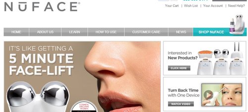
NuFACE is an anti-aging skin company that was seeking to enhance its online presence and ultimately boost sales. Although many of their potential customers expressed interest in their products, they weren’t taking the final step and completing their purchase.
The Hypothesis: Offering a specific incentive to customers will lead to more purchases and, subsequently, revenue.
They came up with the best A/B test for their business, offering a free shipping incentive to all orders exceeding $75.
The Results: This incentive ended up increasing orders by 90% and the average order value by 7.32%.
Offering potential customers an incentive to buy increases the likelihood of them buying now.
It’s estimated that the average ecommerce store loses more than 75% of its sales because of cart abandonment.

5. Replacing Old Homepage Elements
Groove is a Salesforce object agnostic that brings sales leaders and their team together to execute strategies in a smart, adaptive way.
The Hypothesis: Refreshing homepage elements would help to improve the user experience and lead to more conversions.
To try to increase conversions, the team rewrote the homepage copy, added real-life video testimonials, and included several new CTAs throughout the page.
The Results:
Some findings of the test:
- Audience resonated with real-life videos more than stock images
- Liked new web copy more
- Increased CTAs offered more options to convert

Key Takeaways:
- Optimizing homepage content can improve the user experience to boost conversions.
- Adding more CTAs could assist with moving people along the customer journey.
Landing Page A/B Testing Examples
6. Color Variations
Workzone is a portal that provides entrepreneurs with team management solutions. Users can see which projects are on track, who’s responsible, and access all related materials in one place.
The company noticed a decrease in the number of demos for their solution and decided to run an a/b test to try to increase leads.
The Hypothesis: Their hypothesis was that the colorful logos that were next to contact forms we’re pulling the readers attention away from the intended action – to get them to sign up.
The team created two variants, one with colored logos and the second with black and white logos.
The Results: The results the team saw were clear – their hypothesis was correct. The black and white variant achieved 34% more conversions than the original on the website.


Key Takeaways:
- Eye-grabbing page elements could take users’ attention away from CTAs and other more important content.
- Balancing visual appeal with more direction to converting elements can boost conversions.
7. Switching Button Colors
When you see the color green what do think of? What about the color red?
We often associate green with the idea of “go” or with terms like nature and environment. Red is eye-catching and used to communicate excitement, blood, and warning.
Knowing this, marketing automation company, Performable, decided to experiment with the button color on their website.
The Hypothesis: A simple color change in an A/B testing project would lead to an increase in conversions based on user psychology.
The Results: The switch from green to red resulted in an impressive 21% increase in conversions.

Key Takeaways:
- Users often react differently to specific page elements.
- Color changes could be all that’s needed to drive more conversions, tapping into the emotive power of colors.
Mobile A/B Test Examples
8. New Dynamic Booking Screens
Hospitality.net was experiencing some issues with their mobile booking. Rather than revamp the whole thing for everyone, they decided to perform an A/B test.
The Hypothesis: Giving users multiple types of screens would provide users with a more tailored experience for improved targeting and conversions.
In this test, some users were directed to a simple screen on their mobile device, while others experienced a more dynamic and interactive screen.
- The simplified booking screen had a limited number of dates on the screen and only showed promotions and offers when guests selected dates that met the specific criteria.
- The dynamic model displayed way more dates and the best daily rate per day, while the promotions and offers were shown on a different page, regardless of whether the booked dates met the criteria.
The Results: The company noted that, over 34 days, the dynamic experience improved their conversion rate by 33%.

Key Takeaways:
- Offering a varied user experience can help connect with broader audiences.
- Sometimes, simple works best, while dynamic experiences are more suitable in other cases.
9. Personalized Ad Copy
Sony, the tech-giant wanted to increase their ad conversions, so naturally they ran a test. In this A/B testing example, they started with banner ads.
The original banner ad a generic promotional ad, which was compared to another ad that was simpler, but had personalized copy.
The Hypothesis: Personalization would help to establish a more direct connection with target audiences.
The Results: The version with personalized copy resulted in a 6% increase in click conversions and a 21.3% increase to “add-to-cart” clicks.

Key Takeaways:
- Personalization is critical in speaking to audiences.
- Banner ads remain some of the most effective for driving conversions.
Email A/B Testing Examples
10. Email Subject Lines
MailerLite, the email marketing company, decided to play with their subject lines. They ran quite a few A/B tests to see what their customers reacted best to.
One element they were curious about were emojis. As a B2B company, emojis don’t always fit the company voice, but over the years they’ve grown increasingly popular.
The Hypothesis: Adding emojis to email subject lines would lead to more engagement by standing apart in people’s inboxes.
The Results: After running an A/B test, the team noted that the version with emojis had a higher open rate, concluding that B2B brands can see success with emojis.

Key Takeaways:
- Emojis are an effective way to differentiate emails from competitors’.
- Subject lines are among the most essential components of email campaigns.
Top A/B Testing Tools and Resources
Not everyone who runs a company has a computer engineering or programming background, but the good news is you don’t need either to conduct an A/B test.
Here are a few tools and resources to help you get started:
Google Analytics
From redirect tests to server-side experiments, Google Analytics offers plenty of data collecting and A/B testing solutions for free.
Optimizely
Optimizely is a leading conversion rate optimization platform, offering a comprehensive suite of tools, ranging from multi-page testing, advanced targeting and segmentation, and a visual editor that makes it easy to build variations code-free.
On G2, this particular tool has an overall rating of 4.2 out of 5 stars.
VWO
While similar to Optimizely, VWO is far more budget-friendly. Another feature that VWO brings to the table is behavioral segmentation, which enables users to target audiences in a way that many of the expensive tools do not.
This tool has a G2 rating of 4.4 out of 5.
Convert
Convert, another A/B testing tool offers full stack experimentation. With server side implementation, you won’t need to worry about third-party data issues either, making them GDPR compliant.
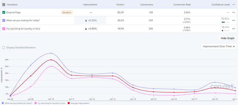
This solution has an overall G2 rating of 4.7 out of 5.
Dynamic Yield
Dynamic Yield has a “What You See Is What You Get” page editor, so you don’t need to know how to code to build experiments. And don’t worry about page latency either – advanced implementation techniques will reduce flickering and improve the customer experience.
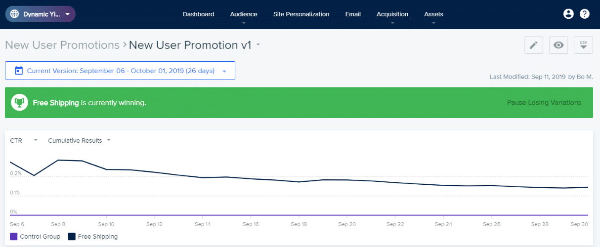
The G2 rating for this tool is 4.5 out of 5 stars.
Let’s take a closer look at the most popular tools for A/B testing and their various specs and use cases in the following comparison:
| Feature | VWO | Optimizely | Convert | Dynamic Yield |
| Focus | Comprehensive CRO suite with all-in-one A/B testing capabilities | Ideal for enterprises with content management | Agency-friendly and privacy-first A/B testing tool | AI-powered personalization and actionable results |
| Key Features | Visual editor, session recordings, server- and mobile-side testing, in-depth analytics, heatmaps | Visual editor, advanced targeting, multi-page testing, full stack experimentation | Code and visual element editors, integrations, compliance with GDPR and CCPA, efficient implementation | AI-driven personalization and recommendations, omnichannel optimization |
| Pricing | Tiered pricing with a free plan, with paid plans beginning at around $219/month | Enterprise-level with custom pricing upon request | Tiered pricing while remaining more cost-effective than other options | Custom pricing according to business needs |
| Business Size Compatibility | Ideal for small to mid-sizedd businesses and ecommerce brands with high traffic | Large enterprises in need of scalable and complex platforms | Mid-market businesses and agencies in need of a privacy-first and budget-friendly solution | Typically for enterprises, including consumer brands and retailers that need to personalize marketing at scale |
Common Mistakes in A/B Testing
Before completing any test, it’s important to know exactly how to do A/B testing the right way. Here are some common A/B testing errors and some corresponding A/B testing best practices:
- Insufficient sample size: An A/B testing project might have too few participants, making data inadequate and unreliable. To secure the right sample size, use an A/B testing calculator that can help determine how many people would be needed for a successful test.
- Testing multiple variables at once: Another common A/B testing mistake involves testing several variables simultaneously, which can make it difficult, if not impossible, to determine what’s working and what isn’t. Only try out a single element at a time in two versions to gauge the results of a change.
- Ignoring statistical significance: You may also stop a test before results provide any statistical significance. As such, one of the key A/B testing best practices involves waiting until the data is meaningful enough to call it a success.
- Lack of a clear hypothesis: As with any type of campaign or strategy, what is A/B testing in marketing without a goal to give it direction? Always establish a specific and provable hypothesis to help you determine what to measure and define as a success outcome.
Frequently Asked Questions About A/B Testing
1. What is A/B testing?
A/B testing is the process of comparing multiple versions of one marketing asset to see which one resonates more with your audience.
2. Why is A/B testing important?
A/B testing is important because it can give you insights into your audiences’ likes and dislikes that other types of market research cannot. This information can lead to improved user experience, higher conversion rates, lower bounce rates, reduced marketing risks, increased revenue, actionable results, and a higher return on investment.
3. What types of marketing materials or assets can be tested?
An A/B test can be run on any type of marketing material, such as websites, email marketing, social media, paid ads, and more.
4. What can be changed on the variable asset of an A/B test?
Almost anything can be changed on a variable asset of an A/B test! Feel free to adjust anything, including copy, banners, images, graphics, buttons, button locations, colors, and more. You never know what little change will inspire your audience to convert!
Get Started A/B Testing With Ignite Visibility
In today’s world of digital marketing, you can never have too much data on your preferred audience. Whether you need help running A/B testing on your website, email marketing, or paid media, Ignite Visibility has you covered!
Our team of conversion rate optimization experts can help you run A/B testing on:
- Your website’s copy
- Your email marketing’s subject lines
- Your paid media’s CTA button placement
- Your social media’s graphics
- And more!
Are you ready to find out what your audience really wants? Reach out and let’s discuss!