
To maximize the value of your website traffic, it’s essential to transform visitors into customers, which is why conversion rate optimization (CRO) is so important. It bridges the gap between mere visits and actual purchases.In this ultimate conversion rate optimization guide, Ilya Niazov, Director of CRO, will walk you through his process to help clients improve conversion rates on any website.
What You’ll Learn
- What is Conversion Rate Optimization?
- Why is CRO Marketing Important?
- Create Your Own CRO Process – Step-By-Step
- Other Conversion Rate Optimization Elements
- Conversion Rate Optimization Test Example
- Conversion Rate Optimization Tools
- FAQs: Conversion Rate Optimization
What is Conversion Rate Optimization (CRO)
Conversion rate optimization (CRO) is the process of improving your website’s user experience so that more visitors convert into actual leads or customers. It entails streamlining the customer journey to keep people moving to the bottom of the funnel with ease.
It can be broken down into a simple 4-step process:
- Determine user bounce & friction points
- Figure out why users are bouncing or dropping off
- Generate test ideas to improve the user experience and reduce points of friction
- Run tests and publish any winning variants
But holistically speaking, it’s so much more than that. CRO is about understanding your audience by putting yourself in their shoes, tweaking your website, and continually testing to provide users with the best experience possible that ultimately leads the user to the finish line.
CRO isn’t a one-size-fits all approach. All businesses need CRO, but not all best practices work well for each business. For example, what language works well for one audience, may deter another. Therefore, best practices cannot be applied everywhere; instead every business should run tests to see what elements fit best for them.
Remember, you’re not solely focused on user experience, you’re optimizing your whole business. Potential leads and customers must understand what you’re selling, why you’re selling it, and why you’re the best at it, in order to efficiently optimize your conversion rate.
Why is CRO Critical for Every Business?
Let’s dive into five compelling reasons why CRO is worth its weight in gold.
1. Lower Customer Acquisition Costs
There’s always more opportunities to increase your conversion rate and ultimately lower your customer acquisition costs.
However, most businesses aren’t aware they can do this simply by testing and implementing winning CRO strategies. If you increase the number of conversions from the same volume of traffic, then your cost per customer or customer acquisition cost is going to be much less, since you’re not spending any additional money on traffic but getting more conversions.
2. Increased ROI
By converting more visitors, you’ll ultimately benefit from a higher return on investment over time.
Reducing friction across the buyer’s journey will help turn more of your prospects into paying customers. Regular conversion rate optimization audits and implementing best practices could also increase the overall quality of leads, which will further increase the chances of maximizing not only sales but also customer lifetime value.
3. Better User Experience
A well-optimized website leads to higher conversion rates and improves user experience, turning casual visitors into leads or customers. Something as simple as improving the page load speed or creating a more intuitive user experience can save you from losing over half of your potential customers.
A great way to improve the user experience with a more intuitive flow is by reducing a user’s cognitive load. Cognitive load is the amount of mental effort required in information processing. It is all about how much information an individual can handle at one time without being overwhelmed.
Keep your users from getting overwhelmed, confused, or thinking too much and you’ll be that much closer to a much higher conversion rate.
4. Improved SEO Rankings
A well-optimized website isn’t just good for conversions; it also helps improve your search engine rankings. By providing a better experience on your website, you’ll decrease the likelihood of a bounce. Ultimately, in Google’s eyes, the more engaged a user is, the better your content is. Which means a boost in SEO rankings.
Consider that 39% of website visitors will leave your website if images don’t load or if the overall page won’t load in time. The longer people stay on your site following a search, the more this will signal to Google that your page is worth ranking, potentially improving your SEO.
My Expert Opinion on Conversion Rate Optimization
I believe that conversion rate optimization is an essential part of any marketing campaign if you want to convert more website visitors into leads or customers.
No matter how much traffic your website is getting with solid SEO tactics, you want that traffic to go all the way through the sales funnel. This is where CRO comes in. You’ll naturally get more bang for your buck by running tests and implementing changes that increase your conversion rate while securing more customers or leads without any additional spend on traffic.
Here at Ignite Visibility, we’ve seen how CRO marketing benefits businesses across all industries. For instance, we developed a full-funnel marketing strategy for a quick-service restaurant client, with SEO, PPC, and CRO efforts contributing to a significant growth in lead volume (1,144) and a 15% decrease in cost per lead.
CRO is the rising tide that lifts all boats. Imagine all the marketing campaigns you have in place are boats, and CRO acts as a big wave, amplifying all those marketing efforts, and increasing your overall ROI.
Is CRO Worth the Effort?
Excellent question and a very common one!
Here’s a very simple, conservative, yet realistic example of just a 1% increase in the conversion rate for a website that gets around 10,000 monthly visitors with a typical conversion rate of about 2%.

As you can see, just a 1% increase in the conversion rate yields an additional $15,000 in recurring monthly revenue with zero additional ad spend.
A 1% increase in the conversion rate can come from just one test so think of the endless opportunities and potential earnings that can come from additional CRO testing!
The CRO Process – Step 1: Research
Many CRO experts or service providers have their own processes but if you want to get the quickest and most impactful improvements in your conversion rate, feel free to follow this distilled process based on hundreds of successful tests and significant improvements in conversion rates across all industry types.
Before jumping into the testing process, you’ll need to do some research. Dive into your analytics to figure out where people are bouncing or dropping off your website.
Try to focus on the highest volume pages first and the bottleneck pages like the homepage, checkout flow or lead form pages. Those pages will generally have the highest impact on your conversion rate.
Here are some additional CRO expert tips for researching:
- Start with quantitative research to identify high-traffic pages with low conversions
- Engage in qualitative research to uncover the “why” behind low conversions, using heatmaps, session replays, or surveys to pinpoint the reason for dropoffs
- Look at your competitors with a conversion rate optimization audit to see what kind of conversions they get and establish traffic benchmarks
The CRO Process – Step 2: Build a Hypothesis
Once you’ve found the places your audience is dropping off, you’ll need to decipher why that is.
Begin by putting yourself in your customer’s shoes. What’s confusing? It is clear what your service or product is? Are you being too clever and making an assumption that all your visitors know exactly what your product or service is? Is there a gap in your customer journey? Is your webpage overwhelming with huge blocks of text? Is the website hard to use? Is there a lack of congruence between the advertisement they saw right before landing on your website and what they are shown on the site?
If you answered yes to any of those questions, you’re in the right place and in good company.
Now it’s time to use a few CRO tools to dive a little deeper and get some answers to get closer to the root causes.
Heatmaps: Provide a visual representation of how users click, scroll, or move their mouse. Hot spots are depicted in red, and cold spots are depicted in blue.
Screen Recordings: Capture actual user interactions in real-time, tracking user navigation paths, how users interact with site elements, and pain points or usability issues that cause confusion or frustration.
Customer Surveys: Collect direct feedback from users through open-ended or multiple-choice questions. They measure user satisfaction, user needs and desires.
In your research, you should come up with an idea of what you might want to address. It should identify a specific issue and theorize how a certain change can resolve it, resulting in a better conversion rate.
Let’s say you’re looking at your analytics and notice a high drop-off rate on your home page. After looking at a heatmap, you notice your users aren’t scrolling down the page. Your hypothesis may be that the hero section of your homepage doesn’t clearly explain your product or service, leaving your customers with more questions or confusion than answers.
You can develop a short and to-the-point if/then hypothesis to determine precisely which conversion optimization best practices will work for you. For example, you could find that people are not completing a form on a landing page that’s otherwise seeing a lot of traffic from PPC ads, in which case your hypothesis might look like: “If we remove this form field, we expect to see a X% increase in form completions.”
This statement will inform your specific objective, which will subsequently inform your measurements when analyzing the results.
Remember: if you can clearly explain what your product is, you’re one step closer to more conversions.
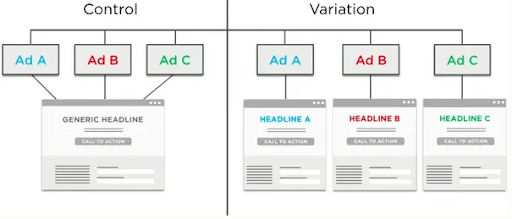
The CRO Process – Step 3: Testing
The next step in our conversion rate optimization guide is to come up with an idea of what might be a better version of the area you decided has issues and begin testing your ideas to see what works and doesn’t work.
How can you tell what works? By looking at which variant increases conversion rate the most within your testing platform.
A variant is another word for the alternative version of the section or page you’re trying to fix.
What Can You Test?
There are many elements of your website you can test in your conversion rate optimization checklist, including:
- Headlines
- Images
- Videos
- Forms
- Text content
- Banners
- Navigation menu
- Calls to action (CTAs)
- Checkout flow fields
- Site search
Here are some conversion rate optimization tips to help with the testing process:
- Focus on high-impact pages with plenty of traffic but low conversion rates, e.g., high-traffic landing pages, checkout pages, and product pages
- Test one change at a time to determine what actually makes a difference in performance
- Prioritize above-the-fold content that tends to drive the most conversions, such as CTA buttons toward the top of the page
- Leverage feedback from users to better determine what’s keeping people from converting, such as design elements that users find clunky or otherwise hurt the user experience
The CRO Process – Step 4: Analyze the Results
To determine whether your test ideas are paying off, you should analyze all results and measure the relevant metrics.
It’s important to keep in mind: not all tests are winners. Even if your test does not directly improve conversion rates, it’s still a valuable test because you’re learning what does not resonate with your user.
Sometimes the tests you run will be unsuccessful. This doesn’t mean the test itself was a loser, it may actually yield better results with more tweaks than your original idea. Maybe you need to try a different image or edit your copy to resonate better with your audience.
Wins: These are the glorious moments when your tests reveal significant improvements, sending your conversion rates soaring. Be sure to celebrate these victories, but also document and implement the successful changes to continue reaping the rewards.
Learnings: As mentioned earlier, not every test will be a winner, but that doesn’t mean you’ve failed. Tests that don’t yield positive results still provide valuable insights into what doesn’t work for your audience, helping you refine your hypotheses and informing future tests.
When it comes to testing, there’s no losing—only learning. So whether your tests result in wins or learnings, remember that each step brings you closer to CRO in marketing mastery.
The following are some recent stats that could guide your CRO marketing strategy:
- The average B2C conversion rate is 2.1%
- Adding a video to a landing page can boost conversions by as much as 80%
- The right conversion rate optimization tools can lead to a 223% ROI
- Only 39.6% of businesses have a specific CRO strategy in place, and 22% are happy with their conversion rates
- The tech stack is another issue for many business, with 25% stating outdated platforms are their main obstacle in boosting conversions
There are also several metrics you should track in your CRO marketing strategy, such as:
- Conversion rate
- Revenue per visitor
- Cost per acquisition
- Cart and checkout abandonment rates
- Click-through rate
- Average order value
- Return on investment
Just be sure that the metrics you measure align with your goals.
Let’s look at a couple of conversion rate optimization examples showing how effective analysis led to improved conversions.
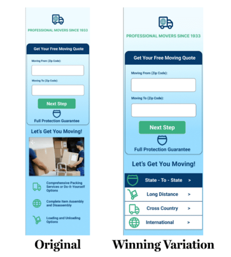
One case study comes from a national moving and logistics brand, Portent, which analyzed the performance of their website and mobile platforms, complete with A/B testing for landing pages to determine which versions worked best.
Rather than adding a new quote form, Portent tested a revised version of the page that kept the existing form in place but added more service-specific, trust-building content near it.
The winning variation replaced a simple generic service section with a tabbed content module highlighting different moving services, such as state-to-state, long-distance, cross-country, and international moves.
This gave visitors more context and reassurance before completing the quote form. The test resulted in a reported 4% increase in conversion rate and a 6.7% reduction in form abandonment.
Another brand, 3D design software company Vectorworks, wanted to reduce its cost per sales-qualified lead while converting marketing-qualified leads.
To do so, the company revamped its Google Ads strategy with new ad copy, keyword targeting, importing of SQL data into Google Ads, and implementing an automated bid strategy.
When analyzing the results, the company saw:
- A 139% increase in SQLs
- 118% higher customer volume
- A 54% decrease in cost per SQL
- A 21% decrease in cost per customer
The CRO Process – Step 5: Iteration of Successful Campaigns
You have a winning test where your variant had a higher conversion rate than the original version! So, what’s next?
Time to implement your winning variant to reap the rewards of your hard work!
Implementation is usually the process of actually deploying the winning changes on your website. You can either do it yourself or hire a developer.
Then, be prepared to iterate, innovate, and repeat the process. Stay curious and keep testing.
Keep in mind that CRO isn’t a one-time thing—it’s all about the long term, as with any other marketing strategy. There are always more elements to optimize, increasing your conversion rate as you work to perfect the experience you offer.
How to Calculate Conversion Rate
And just as a reminder a conversion can be anything from a product purchase to a form submission to a simple engagement – it all depends on the action you want your users to take.
So how do you measure the conversion rate? Here’s a handy little formula: Conversion Rate = (Conversions / Total Visitors) x 100.
For instance, if you had 100 visitors and 5 of them converted, your conversion rate would be 5%. Simple enough, right?
Let’s get one thing straight: not all conversions are created equal.
Macro Conversions are the ultimate goal. These are the primary actions you want visitors to take on your website, like making a purchase or signing up for a subscription.
Micro Conversions are the smaller yet still significant actions visitors take, leading them toward a macro conversion. A micro conversion could be as small as getting someone to add a product to their cart. Although it’s not a full conversion, it’s still important and moves potential customers further down the sales funnel.
Examples of Elements to Test to Yield High-Impact Results
In this section, let’s explore some specific examples of high-impact elements to test, from design elements and UX considerations to social proof and chatbots.
Website Design Elements Impacting CRO
Your custom website design can have a significant impact on your conversion rates. Here are some essential elements to consider:
- CTAs: Your calls-to-action (CTAs) are the gatekeepers of conversions. Make sure they stand out, are clear, and compelling. Unbounce found that simply changing the CTA button color can increase conversions by 35%.
- Headlines: Your headlines should grab attention and communicate your value proposition. 80% of people read headlines, but only 20% read the content, making headlines crucial for conversion.
UX Elements
User experience (UX) is paramount for optimal conversion rates. For that reason, you may want to think about custom website development.
Consider these elements:
- Navigation: Make it easy for users to find what they want with clear, intuitive navigation.
- Landing Form Flow: Streamline your forms to minimize friction and make the conversion process as smooth as possible. Reducing form fields can increase conversions by up to 120%.
Site Search: Help users find information with an effective site search function. According to Econsultancy, visitors who use site search are 1.8 times more likely to convert.
Social Proof
Social proof promotes credibility and trust, leading to higher conversions. Spiegel Research Center found that displaying customer reviews can increase conversion rates by 270%.
Chatbots
Chatbots can contribute to better CRO marketing by providing personalized assistance, answering questions, and guiding users through the conversion process. Forbes found chatbots can increase conversions by up to 45%.
Popups
Popups can be a powerful tool for capturing leads and boosting conversions, but it’s essential to use them wisely:
- Do: Time your popups strategically, ensure they’re relevant, and make it easy for users to close them.
- Don’t: Overwhelm users with too many popups or display them too soon, which can frustrate and drive visitors away.
Consistent Messaging
Consistent messaging across your website is crucial for building trust and guiding users toward conversion.
Ensure your copy maintains a consistent tone, style, and message, and consider using elements of urgency to nudge users toward taking action.
Two of Our Recent CRO Examples
Upsell Removal From The Add-To-Cart Confirmation Popup
A recent test we ran for a client resulted in a 118% increase in the purchase conversion rate!
For this test, we decided to focus on their upsell attempts every time a user decided to add any product to the cart. Heatmap data showed that more often than not, users clicked away from the upsell modal which appeared every time a user clicked on the add-to-cart button. The website data also showed that less than 10% of people actually purchased upsell options from this somewhat aggressive upsell popup.
The hypothesis was that the user felt overwhelmed when bombarded with additional options in the form of a lengthy upsell section within the confirmation popup modal. The obvious test was to remove the upsell portion of the modal to minimize the sales pressure and feeling of overwhelm in hopes that more people would continue adding the product to the cart and ultimately completing the checkout.
And that’s exactly what happened!
The 118% increase in purchase conversion rate resulted in a $11,600 increase in additional monthly revenue which more than offset any potential losses from not getting an upsell.

Banner Removal Test
Would you believe us if we told you we increased this client’s conversion rate by 25% just by removing what many CRO experts would say is actually a best practice?
With this simple banner removal test, they secured an extra $30,000 with no additional ad spend!

For this test, we put ourselves in the client’s shoes and realized an issue with the user experience – the banner at the top of the page has a CTA that said “Call Now.” This client offers a service for people that are sick, and we realized the last thing someone who is sick wants to do is get on a call. Not only that, but it was also hard for the client to navigate to the cart page and other product pages since the banner was blocking the entire navigation menu.
So what did we do?
We removed the banner completely. This improved visibility of the navigation menu significantly helped the client secure more conversions.
10 Helpful Conversion Rate Optimization Best Practices
To succeed with your CRO efforts, let’s get into some conversion rate optimization best practices. However, as mentioned earlier, not all best practices yield amazing results for all businesses. When implemented correctly, the following best practices often yield higher conversion rates.
1. Understand Your Audience
One of the most important steps in our conversion rate optimization guide is to know your audience well.
Find out how people are interacting with your site and content through heatmaps, session recordings, surveys, and feedback. Consider their specific pain points and what kind of experience they want to have, which you can find out through a competitive conversion rate optimization audit.
Exit surveys on landing pages are a great way to find out how people feel about your landing pages and discover why they’re dropping off.
2. Make Your CTAs Clear & Specific
Make sure your CTAs are clear but concise. If people know what they’re getting with a CTA, they’ll be more inclined to perform the desired action.
For example, don’t just include a button for an ebook download that says “Download Here!” Instead, you would want to write something more in-depth, like “Download Your Free Marketing ebook Here!”
Ensure people always know what they’re getting. Even if you can’t include many details in a button, you can supplement buttons with surrounding content, including a lead-in that segues into the specific CTA.

3. Sticky Navigation Menu
Include a sticky navigation menu or a fixed navigation menu that stays in place on the screen as users scroll.
This feature alone makes it easier for users to take the main desired action whether it is booking a demo or visiting the product page without requiring the user to scroll back to the top to access the main call-to-action.
4. Don’t Have Huge Blocks of Text
This one seems simple, but avoiding large blocks of text in your content is critical.
Break up your large text to enhance readability, to make your content more scannable and appealing. Shorter paragraphs improve comprehension, which is especially important on smaller, mobile devices.
Use concise language, include visual elements like photos and videos, and structure your content with clear headings.
5. Reduce Amounts of Form Fields
If your form has too many fields, there’s a good chance users will bounce once they encounter it, deciding it’s not with their time or effort.
In order to secure more customers or leads, you need to reduce form abandonment, which can be done by simplifying your forms and only asking for the information that’s truly required.
A form with fewer fields is faster to fill out, less daunting, and ultimately, just feels like less of a commitment. By reducing the number of fields a user needs to fill out, you’ll enhance their user experience, increase completion rates, and improve data quality.
6. Develop a CRO Roadmap
Another of the most important conversion optimization best practices involves setting up a clear roadmap.
A strong roadmap will help you identify specific variants to try for particular elements on each page. You can then determine when to begin and complete testing.
Create a spreadsheet or another template for your CRO roadmap and assign members of your team to manage and optimize it over time.

7. Keep Running Tests to Achieve Statistical Significance
While you may have the ability to stop running tests to implement changes based on early analysis, it’s best to wait until your results show statistical significance of at least 95%.
Once you get a feel for how your CRO marketing efforts are performing, you can then stop tests for iteration. Taking this approach will prevent you from making premature changes that could actually hurt conversions.
8. Don’t Overlook Micro Conversions
One of our biggest CRO expert tips is to emphasize micro conversions in addition to macro conversions.
Even seemingly little moments can get big results, from newsletter signups to button clicks. All of these elements can contribute to an effective funnel as people move from interested prospects to loyal customers.
9. Perform Quality Checks
Using your conversion rate optimization tools, make sure your testing is set up to yield high-quality analytical data.
Start by ensuring your goals are specific and well-defined, followed by setting up correct tracking with your tools based on the metrics that matter most.
Tests should also target the right audience, browsers, and devices.
10. Pull Back to Plan Ahead
One last best practice in our conversion rate optimization guide is to take time to plan for your next test during your current test.
While testing, get a full picture of your conversion funnel to determine other areas you would like to improve, which will help you decide what to test next, even if your current test doesn’t get the best results.
CRO Tool Chest
Want to excel with your CRO strategy? There are plenty of helpful conversion rate optimization tools out there you can use, but remember with 20% of tools you can get 80% of results.
- Hotjar – Provides heatmaps, session recordings, and surveys to gather direct feedback from users and visually understand their behavior.
- Visual Website Optimizer (VWO) – Conduct A/B tests across websites and mobile apps to identify clear winners. Also offers multivariate testing, behavioral targeting, heatmaps, and more.
- Microsoft Clarity – Analytics tool that shares insights into user behavior to identify where site visitors experience difficulties and tracks user interaction.
- Google Analytics – Perfect for website traffic reports and finding insights into user behavior, audience demographics, and website performance.
- AI Platforms – ChatGPT and Google Gemini can answer questions, generate content, provide explanations, and more. Learn about customer pain points and what they care about most in a product or service.
Here is a comparison of these conversion rate optimization tools to help you make the right selection for your strategy:
| Feature | Hotjar | VWO | Microsoft Clarity | Google Analytics 4 | AI Platforms |
| Primary Intent | Behavioral analytics | All-in-one CRO tool | Free behavior insights | Website analytics | AI personalization |
| Heatmaps | Visual | Browsable | Visual with Unlimited | N/A | Predictive heatmaps |
| Session Replay | Yes | Yes | Yes | N/A | Insight-driven replays |
| A/B Testing | N/A | Yes with the Visual Editor | N/A | Limited via integration | Automated and continuous |
| Qualitative Feedback | Surveys and interviews | Surveys and feedback | N/A | N/A | AI sentiment analysis |
| AI Capabilities | Session summaries | Experiment Copilot | Copilot summaries | Predictive metrics | Automated traffic routing |
| Starting Price | Free | Free | Free | Free | Mid to enterprise |
Conversion Rate Optimization FAQs
1. What is a good conversion rate?
The average and ideal conversion rate will depend on factors like your industry, but the generally accepted rate tends to be around 2% to 5% for most businesses. Ultimately, a “good” conversion rate will be dependent on your specific goals.
2. How long should a CRO test run?
A CRO test should run for a minimum of two weeks to get a good handle on behavioral cycles and collect sufficient data to inform your CRO marketing efforts.
3. What is statistical significance in CRO?
Statistical significance in a CRO marketing strategy refers to the probability of conversions increasing due to a change when measuring a control and variant, with the ideal outcome being around 95% or higher. A/B testing over a period can help determine whether changes improve your conversion rate.
4. What tools are best for CRO?
There are many conversion rate optimization tools you can use to test your CRO strategy and analyze results, including:
- Hotjar for developing heatmaps and recording sessions among users
- Visual Website Optimizer for A/B testing
- Microsoft Clarity for analysis and insights
- Google Analytics for monitoring traffic and user behavior
- ChatGPT and other AI platforms for content optimization
5. What’s the difference between CRO and SEO?
While SEO is about bringing in more traffic to your site through higher rankings in search engines, CRO entails optimizing the user experience to convert that traffic into paying, long-term customers.
6. What are common CRO mistakes?
There are multiple mistakes that marketers could make in a CRO marketing strategy, such as:
- Testing too many changes at once
- Overlooking qualitative data, e.g. why people are converting more with a certain change
- Failing to optimize for mobile users
- Blindly implementing conversion rate optimization best practices without testing
- Not testing long enough to gauge the effectiveness of changes
Launch Your Own CRO Strategy Today!
This conversion rate optimization guide can get you started with a CRO strategy, but you may need some expertise to get the best possible results.
For some help with your optimization efforts, consider Ignite Visibility’s digital marketing solutions. We’ll determine your individual needs and give you the guidance you need to succeed with CRO and much more.
With our help, you’ll be able to:
- Identify your biggest drop-off points
- Dive into analytics to understand why
- Determine what ideas you want to test
- Identify winners of tests and implement them
- Measure the results of your campaigns with detailed analytics and reports
- And much more!
To find out how we can help you boost conversions, learn about our CRO services and what they can do for your CRO marketing efforts.
