Want to increase your conversions?
If you’re succeeding in getting people to your website but having trouble turning them into paying customers, then it’s time.
In this article, I’ll offer several tips on how to do just that.
Increase Your Conversions Online
-
Increase Conversions by Adding a Global Button
Visitors should be able to take action no matter where they are on your website. That’s why you need to add a global button.
What’s a global button? It’s a call to action that appears on every page on your site.
You can put it in the sidebar, embed it within content, add it to the footer, or include it somewhere else so that visitors can easily find it. And click it.
If you force people to “fish around” for the CTA button on your website, you’re going to lose customers. Frustrated visitors will bounce away and go find one of your competitors.
At Ignite Visibility, we added a global button to one of our client sites. That was part of the reason that client saw a conversion rate lift of 64% and a revenue increase of 56%. In one week.
-
Include Social Proof to Increase Conversions
It’s a principle of human nature that when people lack the ability to make an informed decision, they tend to follow the recommendations of others. That’s why it’s important to add social proof to your website.
If you’re unfamiliar with social proof, it’s basically a recommendation of your product or service, usually from a satisfied customer.
Research also shows that social proof is effective. According to a Nielsen survey, 70% of respondents said they trust consumer opinions posted online. That compares favorably with only 40% who said they trusted ads served in search engine results and 36% who said they trusted online video ads.
If you don’t already have quotations from happy customers on your homepage, collect some now. If you’re running an ecommerce shop, email customers and ask them to review the products they purchased.
Pro-tip: it’s a great idea to get someone’s photo next to a review. That adds a dimension of credibility to the opinion.
You can see a great example of social proof, complete with photos of happy customers, on the Freshbooks homepage.
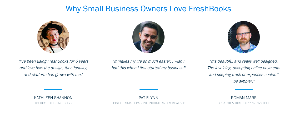
Increase conversions by using social proof, like Freshbooks does here
-
Increase Conversions With Trust Seals
Believe it or not, plenty of Americans are afraid to shop online.
According to a 2016 study by the U.S. Department of Commerce, 25% of households with four or more devices had a security problem. Of those using mobile data, 22% experienced a problem.
Here are a few of the top security issues that respondents identified:
- Identity theft
- Bank or credit card fraud
- Data collection by online services
Another study by hitwise found that ⅔ of online shoppers believe that e-tailers need to take stronger measure to protect their credit card and personal info.
What does all that mean for your website? It means you need to convince visitors that they can trust you.
Put them at peace with trust seals.
You’ve probably seen trust seals on websites you’ve visited throughout cyberspace. They’re digital badges used to verify that a site is safe for users to input personal and financial information.
Sprinkle trust seals on your homepage and on any other pages where people are requested to enter sensitive details.
Check out the USCutter website for an example of the Norton security seal. It’s located at the very bottom of the homepage.
In addition to the Norton seal, there are other trust seals you should consider adding to your site:
It’s especially important to use trust seals if you’re selling high-ticket items.
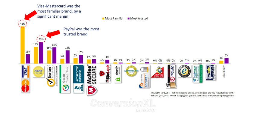
Use trust seals to increase conversions, like the ones proven most trusted in this study by CXL Institute
-
Change the Color of Your Call to Action to Increase Conversions
Sometimes, a color change is all that’s needed to increase your conversion rate.
Some people think that red is the perfect CTA color. That might not be the case on your page, though.
Pick a color that stands out from your usual color scheme. It can be something loud because you want to draw people’s attention to it.
At Ignite Visibility, we changed the color of the main call to action button on a client site to make it brighter. That was part of the same digital marketing strategy that resulted in a 56% lift in the conversion rate.
-
Increase Conversions by Using MAJOR Only One Call to Action Per Page
In digital marketing as well as in “old school” marketing, the KISS principle applies.
Keep It Simple, Stupid.
In other words, don’t complicate your website with an abundance of text and calls to action. Otherwise, you might confuse people.
That’s why you should have one and only one call to action per page.
If you must have multiple calls to action, keep the lower-priority CTAs muted. Don’t give them the same weight as the primary CTA.
Make the secondary CTAs smaller. Design them so they blend in with the overall color scheme and don’t stand out.
-
Adopt a “Mobile First” Design Strategy For Increased Conversions
Have you heard? Mobile Internet usage exceeded desktop Internet usage a couple of years ago.
Also, Google is currently in the process of rolling out its mobile-first indexing.
What does all that mean? It means mobile is everything.
It also means you should adopt a “mobile first” design strategy. Prioritize a mobile experience when you lay out your website.
That’s the opposite of the way that web developers used to do things. Years ago, they’d create a website that looked great on a desktop or laptop and then force-fit it onto a mobile screen.
Nowadays, designers need to take the exact opposite approach.
If your overall conversion strategy appeals heavily to people on smartphones and tablets, you’ll likely see more traffic and a higher conversion rate.
If you’re unsure about your mobile-readiness, run it through Google’s Mobile-Friendly Test.
-
Reduce the Number of Fields on Your Contact Form
Sometimes less is more.
If you’re asking potential leads for their name, address, phone number, home phone, work phone, cell phone, and other personal details, then you can expect your conversion rate to suffer.
Why not just ask for the info that you absolutely, positively need at that moment?
For example, if you want a person’s email address to add to your distribution list, then ask for the email address. You don’t need to collect any additional info.
According to Unbounce, ImageScape gained a 120% increase in their conversion rate by reducing their contact form from 11 to 4 fields.
-
Use a Single-Page Checkout to Increase Conversions
Here’s another great way to increase conversions: use a single-page checkout.
Again, the name of the game is to make it as easy as possible for people to convert. Also, you want to minimize the points of failure.
Every time someone has to click the “Continue” button to proceed with the checkout process, that’s a point of failure. The visitor could opt to bail without clicking the button.
So stick with a simple, clean checkout page. Make sure the relevant fields are pre-populated with the person’s important details if he or she is logged in.
The Official Vancouver 2010 Olympic Store saw a conversion lift of more than 21% by switching to a single-page checkout.
-
Use a Big Photo of a Person in Your CTA Page
A smiling face can get a you a lot of clicks.
Is your current landing page dry, boring, and too verbal? If so, consider spicing it up by adding somebody’s picture.
And, really, that might be the only change you need to make.
It sure worked for Highrise Marketing. That company found that adding a picture of a person to its CTA page lifted conversions by a whopping 102%.
The picture page even outperformed the long form content page.
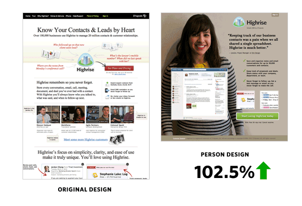
Try using a person on your CTA page. It certainly worked for Highrise.
It probably doesn’t hurt that Highrise used a model who appears friendly. That’s always a bonus.
So if you can’t seem to come up with an idea that might lift your conversion rate, go visit some stock photo sites. Pick up a photo of a smiling face and add it to your form. It might make all the difference.
There’s a bit of warning here, though: Highrise also found that if the page included both a picture and long form content, the conversion rate declined as compared with the basic long form page. That’s why you need to test strategies you think might work.
-
Add Videos to Product Detail Pages For Increased Conversions
If you’re running an ecommerce site, you probably already know about the importance of using high-quality digital images to showcase product benefits. But are you using video?
If not, you probably should.
Why? Because video can increase your conversions.
Ice, a jewelry company, added video to its product detail pages and saw conversions surge by 247%.
Without the video, the conversion rate averaged 2.2%. With the video, it averages 5.93%. You do the math.
Keep in mind, though: it’s not always cheap to add video to your product detail pages. Usually, videos that highlight the benefits of a product cost a lot more than still photos.
But if your conversion rate goes up by more than 200%, it’s probably worth the investment.
-
Increase Conversions by Offering a Free Trial
How would you like to increase your conversion rate by offering a freebie without losing any paying customers? You can do that with a “Free Trial” button.
Of course, this option only works if you’re running a service-oriented business. It’s not likely you’ll want to offer a free product on a trial basis.
If you are running a service, though, consider changing your call to action button from “Sign Up Now” to “Free Trial.”
Then, of course, when the visitor clicks that button, he or she begins the process of signing up for a free, 10-day trial (or whatever length of time you believe is appropriate).
Pro-tip: don’t even ask for a credit card during the free trial period. Just close the service to people who haven’t paid after the trial period expires.
Email service GetResponse went with the “Free Trial” strategy a while ago. The result: a 158% increase in signups.
Bonus: paid signups didn’t decrease one bit.
-
Use a Pop-up Form to Increase Conversions
Instead of directing people to a sign-up page, why not just display a sign-up page within a pop-up?
Fortunately, there are plenty of pop-up plugins and services you can use to make that happen. Take a look at OptinMonster, for example.
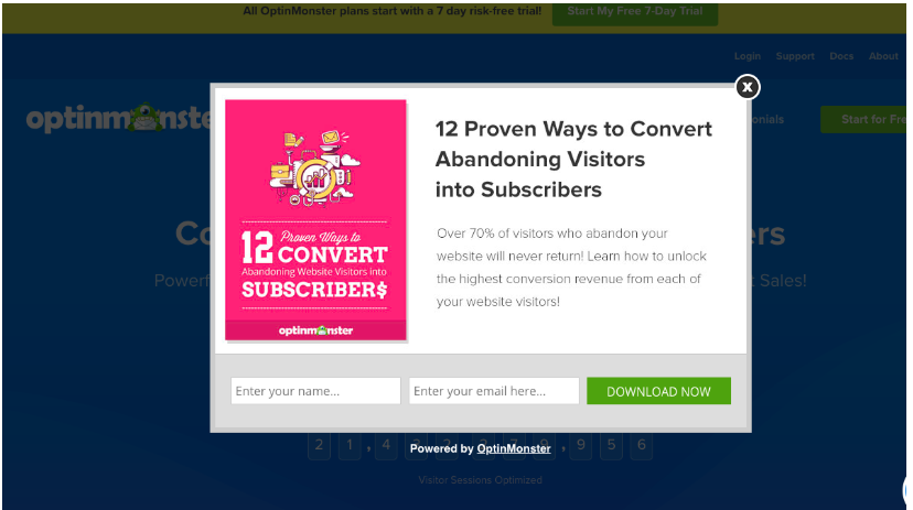
Pop-ups can help increase conversions, and tools like OptinMonster can help
When you display a pop-up form, you cut out a middleman. The user doesn’t need to click on a button or link to see the sign-up form.
Again: that’s one less point of failure.
Visual Website Optimizer used a pop-up form to increase sign-ups by 50%.
-
Increase Conversions With Free Shipping
If you’re looking for a “quick win” to boost sales, consider offering free shipping.
According to a recent study by Deloitte, 88% of holiday shoppers said that free shipping is more important than fast shipping.
In a 2016 Walker Sands Future of Retail report, 9 out of 10 shoppers said free shipping is their top incentive when it comes to shopping online.
Arvato has a much more recent study showing that 83% of consumers search for free shipping when shopping in cyberspace.
If your competitors aren’t offering free shipping, you can gain market share quickly by not charging customers for the cost to send them your products.
Right now, at the Macy’s website, you can see a big banner at the top of the homepage that advertises “Free Shipping on Everything.”
If it works for Macy’s, it can work for you.
Of course, free shipping will eat into your margins. There are ways to make it work, though.
Pro-tip: don’t try to get away with “discount” shipping. Your conversions will skyrocket if and only if you offer shipping that’s totally free.
In fact, if you try to sneak in a surprise fee during the checkout process after promising free shipping, you can expect shopping cart abandonment to go way up.
-
Create a “Discount Rack” to Increase Conversions
Maybe you’re one of those people who likes to go straight to the discount rack when you enter a department store like Sears or Kohl’s. You might even brag to your friends about the great deals you found at the discount rack.
So why not offer a virtual discount rack on your website?
Create a new menu item. Call it something like “Current Sales” or “Hottest Deals Now.”
When people click on that link, they’ll visit a page that shows them everything in your inventory that’s currently on sale.
Take a look at the 6PM website. Towards the right-hand side of the top menu, you’ll see an item labeled “Clearance.” Click that button and you’ll see all the current sales.

Try adding a discount section to your website for better conversions, like 6pm did here.
-
Handle Shopping Cart Abandonment
If you’re running an e-commerce site, there’s probably one stat you hate to look at more than anything else: shopping cart abandonment.
Of course, your site isn’t the only one plagued by that problem.
According to Sales Cycle, the shopping cart abandonment rate currently stands at 75,6%.
Those numbers haven’t improved over recent years. Barilliance put the cart abandonment rate at 68% in 2016 during Cyber Monday and Black Friday.
Now is the time to quit crying over cart abandonment and actually do something about. Here are a few possible solutions:
- Use an exit-intent popup to offer an incentive when people are about to leave the shopping cart. Offer a coupon code or some other promotion.
- Send an email to people who’ve abandoned the shopping cart. Again, give them an incentive to complete the purchase.
- Offer a guest checkout option. Don’t ever require someone to log in as a regular customer just to buy a product.
- Use remarketing. Sometimes, people bail on the shopping cart for completely innocent reasons (maybe they got interrupted). You can help those people finish their shopping journey by remarketing to them with Google display ads or Facebook ads.
-
Trim the Fat From Your Landing Page for Better Conversions
Sometimes, long sales pages work. That principle goes back to the old direct mail days of marketing.
On other occasions, short sales pages work.
If your landing page is excessively verbal, you might find that you can increase your conversion rate by trimming it down.
AssessmentDay is a supplier of aptitude tests to grads and job seekers. The company had a landing page that was just a little bit too long.
After scaling it down a bit, AssessmentDay increased sales by 62%.
Bonus Tip
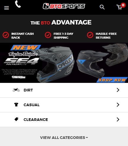
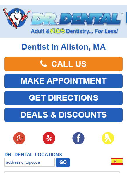
If you are a local business, eCommerce site or really anyone who wants to perform well on mobile, make sure to use clear tap targets. Here are a few examples.
BTO Sports has some great mobile tap targets.
Here we see an example of great location page conversion rate optimization on mobile.
Think about the three most important things any user needs on your mobile page and make buttons at the top for them. Even if it is just a way to anchor them lower on the page, it will help the mobile user. Test it. Trust me!
Wrapping Increase Your Conversions Online
There are plenty of ways to increase your conversions. Browse through the list above and find the suggestions that are best suited to your website. Then, make the necessary changes.
But don’t stop there. Make sure that you split-test every single one of your changes. Otherwise, you might find that your conversion rate actually drops.
Remember: no piece of advice is applicable to every brand or business model. Pick the ones that are best suited to your marketing strategy and start rolling them out today.
