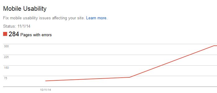
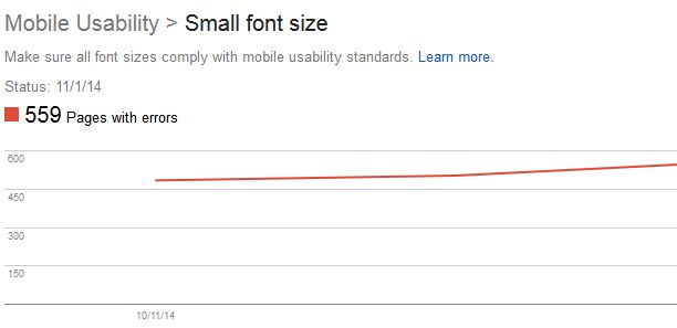
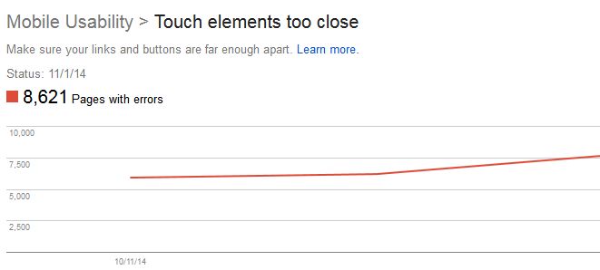
To further promote the user experience via mobile device, Google announced the unveiling of Mobile Usability reports to provide webmasters with a detailed error analysis to encourage mobile-friendly websites. The detailed reports can now be found in Google’s Webmaster Tools to allow webmasters to make necessary changes to a website in order to boost website navigation from mobile devices.
Why is Mobile Usability important?
With the new Mobile Usability reports, webmasters will view data and errors relating to: Flash content, missing viewport, tiny fonts, fixed-width viewports, content not sized to viewport, and clickable buttons that are too close to one another.
Google Webmaster Trends Analyst John Mueller states, “We strongly recommend you take a look at these issues in Webmaster Tools, and think about how they might be resolved.”
As the mobile experience may aid ranking signal, improving the use of mobile web needs to be a major focus. This new information allows a webmaster to increase the mobile function of a website to help maintain mobile viewers as Search Engine Watch reports that 61 percent of mobile users will leave a website and not return if the site isn’t mobile friendly. In addition, 48 percent of mobile users feel a company doesn’t care for their business if a site doesn’t function correctly on a mobile device. Plus, 67 percent of users admit to be more inclined to buy a product or service on a mobile-friendly site; therefore, resolving mobile site errors is essential.
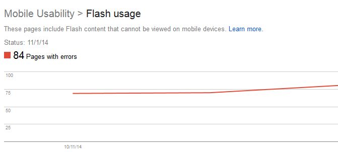
How do I fix Flash usage errors?
Most mobile browsers aren’t capable of rendering Flash-based content, causing a mobile visitor to be unable to view a page that requires Flash to display content, navigation, or animations. Google is alerting webmasters of Flash errors to promote the use of modern web technologies with their Look and Feel guide. Should you receive a Flash error, Google’s guide provides the necessary information for webmasters to fix animation performance, such as CSS vs. JavaScript Animations, custom easing, animation views, and animation timing.
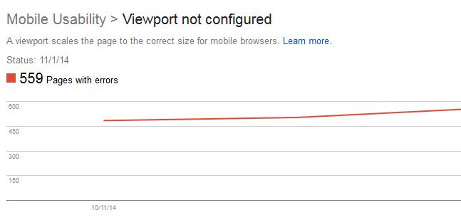
How do I solve viewport errors?
Despite the growing trend of responsive website designs to support all screen sizes when using mobile devices, there are still many viewports that aren’t configured. If a page lacks the “meta viewport tag” the website’s page won’t adjust to the mobile device’s screen size, causing errors with dimensions and scaling.
Using the Responsive Web Design Basics recommended by Google, these issues can be resolved to support layout changes based on the size and capabilities of a mobile device. This includes: setting the viewport, size content to viewport, CSS media queries for responsiveness, breakpoints, navigation principles and actions, and responsive web design and action patterns.
How can I resolve fixed-width viewport errors?
With the Mobile Usability reports, webmasters will be alerted when webpages are set to a fixed width for viewport. This may be due to a fixed pixel size to adjust to a non-responsive design. In order to resolve this issue, a responsive design for all webpages will need to be adapted to allow the viewport of each page to respond to any device’s width and scale. Google recommends using the meta viewport element to control the page’s dimensions and scaling.
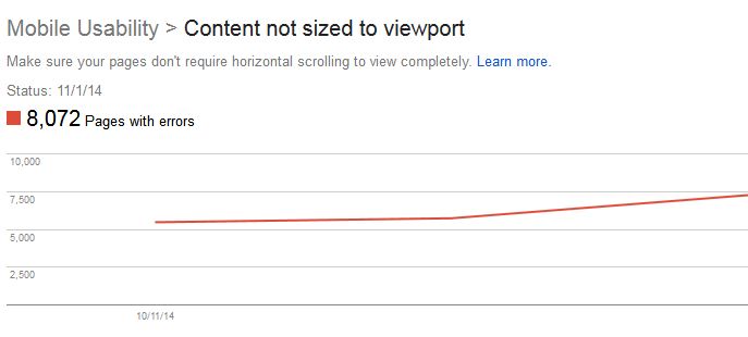
How do I fix content that’s not sized to viewport?
When absolute values in CSS declaration are used, horizontal scrolling is needed to view all of the words and images on a webpage when using a mobile device; thus, causing the “content not sized to viewport” error. This may also occur due to images set to specific browser widths. In order to fix the error, all pages need to use the relative width and position values for CSS elements, as well as an image’s ability to scale under Google’s recommendation to Size Content to Viewport.
What do I do if my font is too small?
Often, when viewing a website on a mobile device, the font can be too small to be read legibly and clearly unless a user zooms in to read. To increase the legibility of the font, set the font size to scale properly within the viewport after a viewport has been specified. To ensure the best font size methods are used, Google created the Use Legible Font Size guide.
How do I fix buttons that are too close?
If a mobile user is unable to easily tap a desired navigation link or button with their finger without tapping a nearby element, touch elements are too close together and Google will notify you. This problem can easily be resolved with the use of correctly sized buttons and navigation links according to Google’s Size Tap Targets Appropriately Guide. Google recommends setting commonly used tap targets to at least 48 CSS pixels tall/wide, while less visited tap elements are set to a smaller size with at least 10 mm spacing.
Why should I pay attention to Mobile Usability?
It’s critical to ensure you have a well functioning and appealing mobile-friendly site as Google considers mobile usability to be relevant for optimal search results. To promote the best experience possible, Google recommends creating defined viewing that’s adjustable based on screen size, a flowing content viewport that doesn’t require screen adjusting or horizontal scrolling, and appropriate font sizes that scale for screen size. In addition, buttons need to be well placed and not crowded by other items and the website’s design needs to focus on mobile technology.
In light of the new Mobile Usability, this only further supports the rumor that Google may add mobile user experience to it’s ranking algorithm. Should Mobile UX be used as a ranking signal, webmasters want to ensure all Mobile Usability errors are resolved now before the raking algorithm shift and to continue to encourage mobile traffic.
Sources:
“Google May Add Mobile User Experience to its Ranking Algorithm” SearchEngineLand
