
Google Data Studio offers everything a marketer dreams of in an executive dashboard.
But, you need to know how to use it.
In this blog, I’ll teach you how to create a Google Data Studio dashboard for marketing.
What You’ll Learn:
- What are Google Data Studio Dashboards?
- What Can You Do with Data Studio Dashboards?
- Getting Started with Google Data Studio Dashboards
- Tips for Using Google Data Studio
What Are Google Data Studio Dashboards For Marketing?
Google Data Studio is a way to deliver data to clients in a way they’ll understand.
Because here’s the thing about SEO reports: communicating and presenting key metrics to clients who aren’t familiar with the data can be pretty complicated.
Excel charts aren’t exactly the most user-friendly, and even Google’s default dashboard leaves a little to be lacking in terms of visually presenting data.
Add on to that the headache of trying to include data from multiple sources into one view or chart.
For example, data pulled from Facebook and AdWords used to be extremely hard to analyze side-by-side.
At least, it was until Google introduced Data Studio.
Google Data Studio offers marketers several main benefits:
- Interactive Reports: Data Studio pulls data in real time to create interactive reports. Clients receiving these reports can filter by source and data to get the precise data they need.
- Full Customization: Data Studio dashboards are fully customizable. You can start with a blank slate or use a template to include whatever data you need. Further, customize these dashboards with charts, widgets, and other data. You can also edit fonts and colors.
- Data Blending: Data Studios allow users to blend data from multiple sources into a single graph.
- Collect Data From Multiple Sources: Data Studio can analyze hundreds of data sets using hundreds of connectors (methods of pulling data from third-party sources).
- Collaborate in Real Time: Use Data Studio to work on reports with others live. You can also restrict the access of different users, only allowing them to perform specific tasks.
It’s part of the new Google Analytics 360 Suite, which includes a bunch of other cool tools for Google users.
But it doesn’t come cheap.
Luckily, there’s a free version available that offers Data Studio.
What Can You Do With Google Data Studio Dashboards For Marketing?
Data Studio comes with a few major features.
1. Visualize and Customize Your Data
First up is the ability to visualize your data through highly configurable charts and tables.
Data Studio stores your data in a dashboard that’s fully customizable.
Basically, you start with a blank canvas and choose exactly what you want to appear where.
Create single-page dashboards for your team or multi-page reports for clients, all with information tailored to a particular campaign.
It features an easy drag-and-drop editor, and visualization includes bar charts, pie charts, time series, geo maps, paginated data tables, and more.
There are no fixed columns or widget areas, so you can literally drag-and-drop data anywhere that makes the most sense for your specific report.
You can also include links and clickable images to create video libraries, product catalogs, etc.
The dashboard is also fully interactive, so you and your clients can click on dropdowns, etc. to update information in real time.
For example, I can include a full Source/Medium report like the one below, where I could pull data from different traffic sources and channels to show clients how each channel is performing, and which sources are bringing in the most traffic.
And, for added flair, you can customize reports with different color schemes and logos, so they reflect your business.
One more thing: you can add as many widgets as you want. Google Analytics limits you to twelve, but there’s no cutoff in Data Studio.
2. Connect Your Data
Here’s the really cool part about Google Data Studio SEO: you can add different data sources to your dashboard.
If you work in marketing, you know that’s worth a little geeking-out over, as there’s no way to do something similar in Google Analytics.
The ability to pull from different sources lets you mix and match what data appears in each report based on what’s most important to that client.
So, if your biggest PPC channels are Google AdWords and YouTube, you can put both sets of analytics side-by-side.
Even cooler? You can pull data from sources that aren’t associated with Google, like Facebook Analytics, Bing Ads, and Twitter Ads, through the use of third-party data connectors.
Using that, marketers can more easily show paid performance from different networks like AdWords and Bing Ads right next to each other.
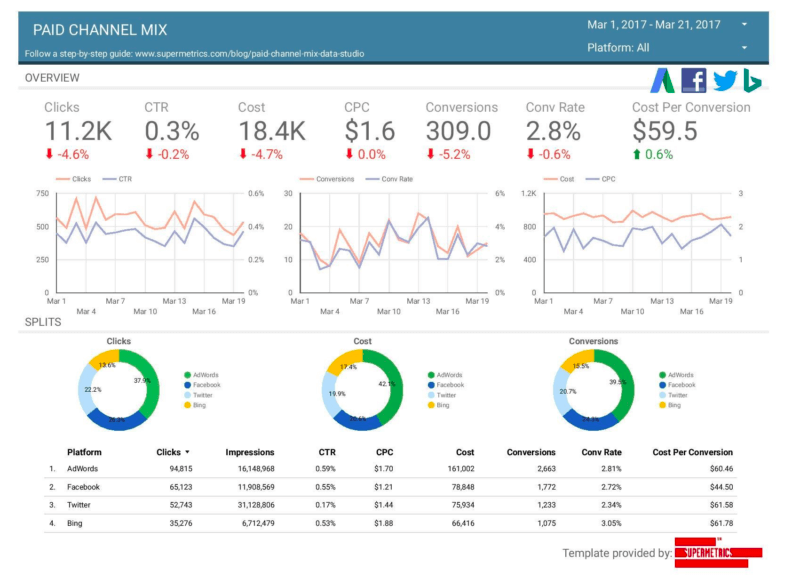
In the example below from Marketing Land, you can see campaign data from Adwords, Facebook, Twitter, and Bing Ads.
Popular Extensions
Google Data Studio offers integration with many extensions to maximize its data-visualization capabilities. In fact, integrations with these connectors are some of the biggest aspects of GDS’ popularity.
Here are some of the most notable:
- Supermetrics: Supermetrics offers connections to popular data sources, including Facebook and Instagram Insights, LinkedIn Ads, MailChimp, Microsoft Advertising, and more.
- Power My Analytics: PMA enables GDS users to connect with 30+ sales and marketing platforms. These platforms include Amazon, eBay, and Constant Contact.
- Adverity: Adverity allows fully-automated data integration from all sources a user might need. These sources include affiliate networks, ad networks, social platforms, television audience measurement tools, and more.
Whatever your third-party extension needs are, Google Data Studio is certain to meet them.
3. Easily Share and Collaborate
Google Data Studio is set up like Google Docs, which means you can easily share a report by sending them a link.
And, of course, set your permissions accordingly. Send it to team members to collaborate, or keep it in view only if you’re presenting to a client.
Getting Started With Dashboards For Marketing
First, let’s start with some good news: building a dashboard isn’t all that complicated.
And before you know it, you’ll be building something like this:

But before you begin, you should already have an active idea about the audience you’re preparing it for, the purpose of the dashboard, and what data should be available there.
For our purposes, we’ll keep it pretty general and use the Google Demo account to pull Analytics info.
Step 1: Sign in to Google Data Studio and Create a Blank Report
Start the old-fashioned way, by signing in at datastudio.google.com with the Google Analytics account you want to build the dashboard for.
Once you’re in, you’re ready to start creating.
At the top of the page, you’ll see a blank box with a + sign, as well as a few pre-built example templates for you to check out.
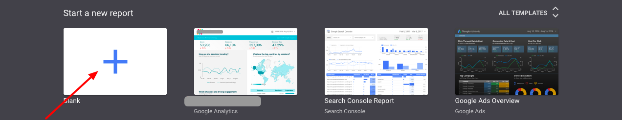
We’re building our own, so select the blank one.
Then, give it a name. This will more than likely be the name of the client you’re preparing the report for or the main purpose of the report, like “SEO Analysis.”
Step 2: Connect Your Data Source
Once you’re in and labeled, you can start connecting your data sources.
Remember, it pays off to have thought about this beforehand.
To add your first source, click the Create New Data Source button.
Adding Google Analytics
You’ll be taken to a page with a variety of source options. We’ll go with Google Analytics for right now, but as you get started, take some time to familiarize yourself with all the options.
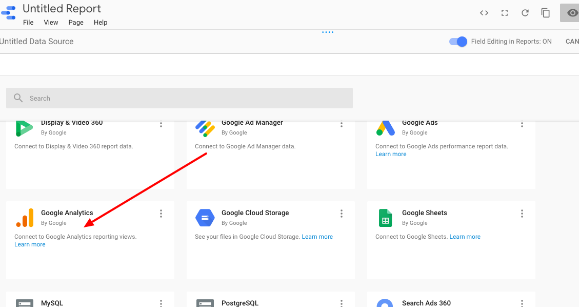
You’ll have to allow Analytics to be used and choose which account you’d like to pull from.
Next, choose your Account, Property, and View.

Click Connect, and Add to Report.
Adding Google Search Console
Adding Search Console to Data Studios follows a similar process as above.
Go to Google Data Connector, find Search Console, and complete the connection wizard.

Your account should already be authorized by adding Analytics, so you’ll be good to go.
Connect to Data Gallery
If you navigate to https://datastudio.google.com/data, you’ll find the Connect to Data Gallery.

Step 3: Add Your Second Data Source
Adding a second source differs slightly.
This time you’re looking at it from your main screen, so you’ll need to click the Resource dropdown and select Manage added data sources.

Going forward, this is where you’ll manage all data sources for your dashboard.
If you click on Add a Data Source, it will take you back to the list of data source options.
Click on the source you’d like to add and follow the same steps as above.
If you want to add a third-party data source like Facebook Analytics or Bing Ads, scroll down to the Partner Connections sections and select the applicable source.
Step 4: Creating Your First Report
It’s easy to create SEO reports.
Once you’re logged in, click the big multi-colored plus sign. Then, select Report.
You’ll see a panel of data sources that appears on the right. Select the sources that you’d like to use.
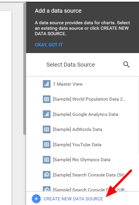
Keep in mind: if you want to use a data source you don’t see in the panel, you can create a new one on the fly. Just click on CREATE NEW DATA SOURCE at the bottom of the panel.
Once you’ve selected (or created) your data sources, just click ADD TO REPORT in the dialog that appears.
Finally, name your report.
That’s not your only option for creating a report, though. If you have a similar report structure with different data, you can create a report from a template. That gives you the ability to create an SEO template.
To do that, click Reports at the top of the page. Then, open the Template Gallery.
Select the template that you want and click USE TEMPLATE in the upper, right-hand corner.
Now you can use that SEO template to create your own custom report.
Step 5: Adding Elements to Your Dashboards For Marketing
Here comes the fun part: adding elements to your SEO report.
This is where you can mix and match the elements of your dashboard by selecting line graphs, pie charts, time series, geo maps, etc.
For example, let’s add in a Time-Series graph.
This lets us know how our traffic has grown or decreased over time.
It’s the first button on the left of the graph icons. Click it, and use the mouse to draw the outline of the graph on your dashboard. You can adjust placement and size later if need be.

Then, you’ll need to select the data that will appear in the chart.
From the right-hand menu, select the data source (Google Analytics, in our case.)
Because this is a Time Series graph, we’ll want a date range to show. Click the date icon and select an option from the menu that appears.
Next, you’ll need to add metrics.
These are under the Metrics section in the right-hand column, and you can click to expand the list of available metrics.

Choose whichever reflects the data you want to show in the graph, and notice that as you make selections, the graph will automatically update itself.
Most of the graph options will follow a similar setup. Just keep in mind that they will pull default metrics to display, so you’ll need to update them accordingly.
This is a section you’ll want to spend some time with, and I would recommend creating an example dashboard to get a feel for the different options available before beginning.
Step 6: Additional Dashboards For Marketing Features
There’s a lot to know in Data Studio, and again, the best way to really get familiar is through a little trial and error.
That said, there are a few features you should be aware of to help you create the best reports possible.
First, let’s talk about dates.
When you start editing your SEO dashboard, the default date will be set to Auto, which means it’s pulling data from the last 28 days.
But most marketers and clients will want to see data aggregated over a certain amount of time, whether it’s a quarterly report or comparing month-to-month data.
To change the date filter, select the calendar icon (third from the right) and draw a box where you’d like it to appear.
In the Data tab on the right, select the date range and then the start and end date from the calendars that appear.

Use the Style tab (in the same box as the Data tab), you can change the text style, font, etc.
Notice if you go to View to see your SEO dashboard in action, you’ll have the option to select a new date range from the date dropdown.
Okay, our next feature is text and images.
Add text headers to your graphs and different page elements to make navigation easier for anyone browsing.

As for images, you’ll most likely want to use these branding purposes to either your or your client’s logo to the report.
Again, the same scenario here: click the image button (right next to the text button) and draw a box where you’d like the image to go.
Then upload your image of choice from the right sidebar, and you’re good to go.
And the last thing here: your style options.
Because one of the biggest benefits of Google Data Studio is the ability to make it look pretty amazing, right?
So make sure you take a little time to play with your layout and theme.
You’ll find the Layout/Theme in the right-hand sidebar when you don’t have any element selected.
Here, you can change your primary and secondary background and text color, the colors that appear in your charts, and add border colors.
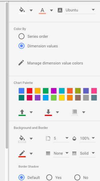
These are pretty cool features that allow you to match your dashboard to your brand. Incorporate colors from your logo or website to make it reflect your specific brand.
Tips For Using Data Studio Dashboards For Marketing
Google Data Studio comes with a bit of a learning curve.
The good thing is, it’s far more user-friendly than some of the more advanced options like Google Sheets or Excel.
Here are a few tips to help get started.
Google Data Studio Tip #1: Have a Game Plan
I’ve said it before, and I’ll say it again: Have a game plan ready.
Experimenting with the different graphs and elements available can easily become distracting, which is why it’s best to know exactly what your audience wants to see in these reports.
You should have a good handle on the metrics and KPIs that are most important to each client, so focus on those.
Trust me, it’s a huge timesaver.
Google Data Studio Tip #2: Use Google’s Resources
Google’s got you covered on this one.
They offer a range of free tutorials covering both reports and data sources, and most questions that arise can be answered right there.

Google Data Studio Tip #3: Apply Segments to Your Elements
Google recently introduced the ability to add segments to the elements in your dashboard – and it’s a really cool new tool.
Using it, you can choose to apply certain elements to only new users, returning users, paid traffic, organic traffic, etc.

You can use any custom segments you’ve created in Google Analytics and apply them to one or multiple elements on the dashboard.
Google Data Studio Tip #4: Diversity is Key
To make your report as appealing as possible, try to incorporate a variety of charts and elements.
I don’t mean go chart-crazy, but mix it up a bit.
Look at this one.
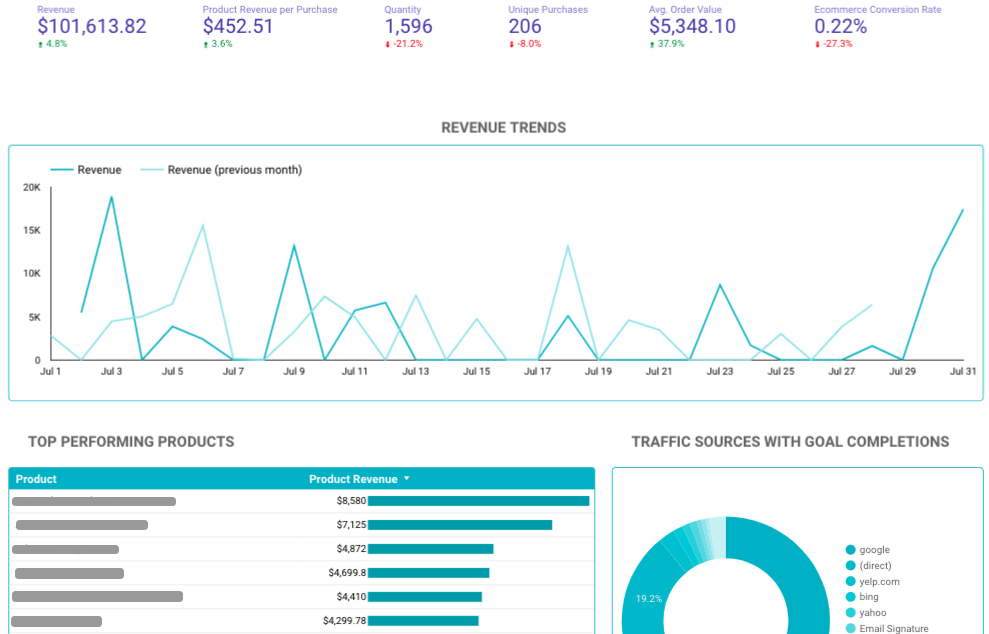
There are charts, drop-downs, scorecards, etc.
It’s more effective and just looks better.
And after all, that’s what the beauty of using Google Data Studio, right?
Google Data Studio Tip #5: Don’t Rely Solely on Data Studio
Look, I love data studio as much as the next marketer.
It’s easy to use, easy to present to clients, and frankly, it’s kinda fun.
But even though it has some pretty powerful data capabilities, it doesn’t fully replace the need for more traditional reporting.
So remember: Data Studio is one tool of many.
It may be great for monthly reports and quick meetings, but use it with more robust reporting tools to really go the extra mile for each client.
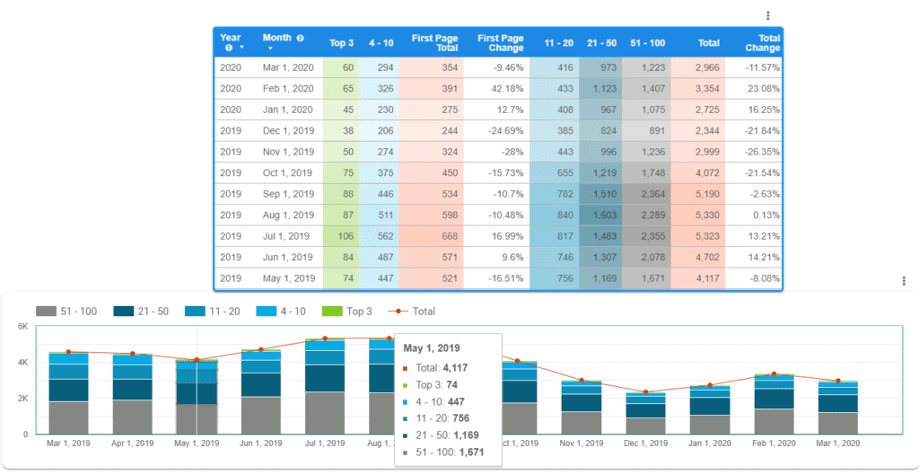
Google Data Studio Tip #6: Connecting SEMrush to Google Data Studio
Integrating SEMrush with Google Data studio adds tremendous value and visualization for your data.
First, create a google sheet document containing exported data from SEMrush that you’d like to include in your chart.
Second, create a blank table or chart in Google Data Studio, go to the data source option and connect it to the google sheet you previously created.
Third, customize with whatever data, date range, dimensions, filters, and metrics you’d like to appear on your chart as seen below.
Google Data Studio Tip #7: Use Data Blending
Due to the work involved, many smaller companies incorrectly assume they are incapable of high-level data analysis.
However, Google Data Studios has made advanced analysis available to firms of all sizes thanks to its data blending abilities.
You can combine data from many sources in Google Data Studio to create table controls and charts. Earlier, we showed how you could integrate Google Analytics and Search Console directly into Data Studios–both serve as data sources ripe for blending.

Users can gain a high-level understanding of their business data through blended data. By blending information, firms can make better business decisions.
Google Data Studio Tip #8: Create Reports With Multiple Pages
Google Data Studio lets you combine different data types into one report. Using multiple pages allows you to prepare comprehensive reports organized into different sections. For example, you can create summary pages of varying data sources before delving into more detail later.
There are two ways of creating a new page in Google Data Studio.
The first is navigating to Page in the top menu bar and selecting New Page.

Secondly, if you want to preserve the style and data of a given page, select Duplicate Page from the same menu featured above.
Whatever you choose, remember to name each page. Naming each page makes it easier for you and the client to understand.
ETL and ELT Processes in SEO Dashboard Creation
Understanding the differences between ETL and ELT helps you decide the best approach for your needs. ETL is often preferred when complex data cleaning and transformations are required before visualization. In contrast, ELT can be more efficient when dealing with large datasets and leveraging the powerful transformation capabilities within Google Data Studio.
ETL (Extract, Transform, Load):
- Extract: Collect data from various SEO tools and platforms. This involves pulling raw data from Google Analytics, Search Console, and other SEO tools.
- Transform: Clean and format the data to ensure consistency. This may include removing duplicates, handling missing values, and converting data into a unified format.
- Load: Import the transformed data into Google Data Studio. This step involves connecting your data sources to Data Studio and ensuring that the data is accurately represented in your dashboard.
ELT (Extract, Load, Transform):
- Extract: Gather raw data from your SEO data sources.
- Load: Directly load the raw data into Google Data Studio.
- Transform: Perform data transformation within Google Data Studio. Use Data Studio’s built-in functions and features to manipulate and format the data as needed for your dashboard.
Google Data Studio SEO Dashboard Templates
If you’re looking for inspiration and templates to choose from, check out these great resources from Sheets For Marketers.
You’ll find a great deal of ideas and variations that you can use for yourself, depending on what kind of report or analysis you need.
Wrapping Up Google Data Studio Dashboards For Marketing
There’s a lot to know about Google Data Studio.
But if your work involves presenting complex data to clients, it’s one of the best reporting tools on the market.
First, familiarize yourself with the dashboard. Watch the tutorials and take a look at all the data sources you can use.
Then get started creating your killer reports.