I’m about to show you a crazy effective, simple way to test your homepage in just seven seconds.
And of course, increase your conversion rates.
I should note I didn’t make this up, it’s a tried and true conversion rate strategy. But one we use here for clients.

Here’s how this works: in order to determine if your homepage is SEO and user friendly, you need to ask yourself a series of questions. Four, to be exact.
If your homepage delivers a big “yes” on all the questions below, then congratulations! Your homepage SEO is on point.
Let’s get started, shall we?
Homepage Test Question 1: What Do You Do?
Ever land on a site, scroll through, and still find yourself wondering what exactly this business is all about?
That’s a bad homepage.
A good homepage makes a business’s purpose very clear right away.
How you do that? Well, that’s up to you.
On the Ignite homepage, it’s pretty hard to miss that we’re a search engine marketing company (and throw in a little social proof to boot).

Or, you could go the show-don’t-tell route.
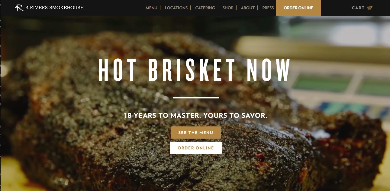
Take a look at 4 Rivers Steakhouse restaurant. The giant, mouth-watering steak leaves little to the imagination and even fewer questions about what this business does.
If you really want to go the extra mile (and if it makes sense for your brand), you can even highlight your individual services.
This one needs to be done tastefully; don’t overload your visitors with information from the get-go. Instead, find a way to slide in what you offer in a natural, tasteful way.
Case in point: Telerik.

They tell you right away that they offer UI frameworks and app developments (and even manage to make the whole thing not boring), and break it down a litte further to their .net, mobile, and HTML offerings.
Not the kind of thing the casual browser might care about, but if you’re in the market for UIs and apps, it’s helpful to know up front what kinds of services you can expect without having to dig for it.
Homepage Test Question 2: What Problem do you Solve?
This is a big one.
Because sure, you may leave a site knowing what the business does, but what you really want to know is what that business can do for you.
This is where the issue of pain points comes into play.
Pain points are pretty much just what they sound like: they’re problems. In this case, it’s the specific problems faced by your customers that your business aims to solve.
You may already have a good handle on what your customer’s pain points look like. But often, pain points aren’t so obvious. It’s the little things that make life easier for your customers that really sell products and services.
If you’re at all unsure of what pain points you should be targeting, check out my full guide on how to find your customer’s pain points.
Basically, to really find the pain point, you have to go beyond a surface issue. Sure, maybe someone wants to hire a digital marketing agency to get more traffic to their site. What you need to uncover is why that person wants more traffic. More money to grow their business and ultimately have more freedom in their schedule? More recognition so they can grow their reputation as a thought leader? These are the types of points you want to hone in on.
The cool thing is, once you’ve narrowed down the exact problems your business can solve, you’ve also honed in on your marketing angle.
Remember, people aren’t interested in what your business does. They’re interested in what your business can do for them. And under no circumstances should you make them hunt for the answer. It should be made obvious right on your homepage.
One of my favorite examples is from TrackMaven (I know, you’ve probably seen them before on the blog, but it’s that good.)

Why do I love it? Because it addresses a pain point without the customer even realizing they’re doing it.
TrackMaven is all about marketing insights and measuring ROI, a subject that to the uninitiated is a serious cause of headaches and confusion, not to mention a serious time suck.
Realizing what a stressful subject this can be, TrackMaven leads with “take a deep breath.” With that phrase alone, they’ve communicated that you, the customer, can relax and take a load off. They’ll handle your ROI measuring woes for you.
That’s exactly the kind of thing your homepage needs to be doing. Looking at it objectively, if you can’t easily identify the problems your products or services are able to solve, it’s time to refresh it for better homepage SEO.
Homepage Test Question 3: What Action Should the User Take?
Want your visitors to do something once they land on your site? Tell them.
Never assume that they’ll intuitively know what the next step is; instead, make it clear as day that you want them to call you today, download your ebook, subscribe to your service, or whatever it is you’re trying to accomplish.
Another thing? They’re far more likely to actually do it if the action’s explicitly stated, rather than simply implied.
Usually, this happens in the form of a call-to-action (CTA). These are your “sign up now’s!” and “click here’s!” that you’ll see on websites, usually with an attached button that takes them where they need to go to complete the process.
As marketing 101 will tell you, a clear, enticing CTA is non-negotiable when it comes to good marketing. You need them in your emails, at the end of your blog and social media posts, and in your PPC ads.
You also need them on your homepage. After all, you want your visitors to stick around. So tell them where to go.
Now, the context of a good CTA will depend on what it is you’re trying to accomplish. If you want them to explore more of your website, use CTAs to tell them where they should go – your blog, your service page, etc. If you want them to sign up for a service or download more information, send them to a dedicated landing page where they can input their information.
Do note that telling your readers what to do doesn’t necessarily have to be in the form of a big CTA button. It can be as simple as telling them to keep reading, contact you today for more information, or follow us on Instagram. The important part is that you’re giving them an actionable next step, not leaving them to figure it out on their own.
A few things to keep in mind:
- Be as clear and concise as possible
- Make it something the reader can take action on immediately
- It must be relevant to the content on the page
Homepage Test Question 4: Is the Call to Action and Text Above the Fold on Mobile and Desktop?
Another point about CTAs: it all needs to happen above the fold.
In this situation, “above the fold” refers to the section of a website that’s visible without scrolling. That means you need to fit your CTA – and the intriguing lead-up text – in that space to ensure readers won’t miss it.
Why the emphasis on above the fold? The obvious reason is that it requires no work on the reader’s end, not even a small scroll, which means it’s way more likely they’ll actually see it.
The other reasons is that unfortunately, today’s readers are fickle, and you don’t have a lot of time to convince them to stick around. In fact, it’s generally accepted that the average website session is only 15 seconds. Your job is to use those seconds wisely; your visitors need to see what you’re offering and be presented with the next step as quickly and prominently as possible.
That means above the fold.
But of course, it’s not enough to simply avoid the scroll on a desktop. Good homepage SEO standards dictate that it must appear above the fold on mobile as well.
Mobile generally gives less room to play around with, but it’s well worth finagling your text to fit the space. After all, according to CIODive up to 70% of internet traffic comes from mobile devices.
Here’s a great example from Slack.
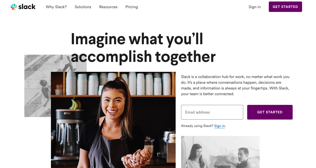
As you can see, their homepage is clean and clear, with a nice block of text explaining what the product is and what it accomplishes. All that, and the CTA is placed neatly above the fold.
Their mobile site features a similar layout, keeping just enough text to tell readers what problem their product solves.

Another thing to note: the CTAs themselves are slightly different. That’s totally okay, and in this case, helps make a more personalized experience for the user.
So, what makes a good CTA? A couple of things:
- As noted before, your CTA must be relevant to what’s on the page
- It must deliver instant results – one click, and they’re on the right page
- It should feature action words (“click here,” “contact us,” “schedule your free consultation,” etc.) that leave no room for interpretation
- When appropriate, use urgency or scarcity (“don’t miss 30% off”, “sign up today,”)
But remember, your key takeaway here is that the placement of your CTA matters just as much as the words you choose.
In fact, one strategy I’ve been doing recently is going through every page on a website, mobile and desktop, and making sure the call to action is above the fold.
When I did this recently, I increased conversions for a site 70%.
Wrapping Up the 7-Second Homepage Test
And there you have it: your quick and easy test to determine the overall user-friendliness of your homepage.
The key here is that this test should only take 7 seconds. If it takes you longer than that to answer all of these questions, then your homepage could use a little work to improve the user experience.